
To build a new visualization, first click on the Visualization icon (shown here) and then click on the type of visualization you want:

Once you select your visualization type, Watson will add a visualization frame to the dashboard, ready for you to set the properties of the visualization:

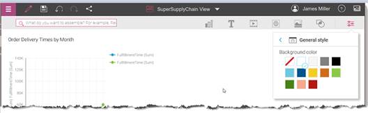
In the visualization frame, you can set the Axis label, Color by, and Value columns by dragging column names from the data tray (as we mentioned earlier in this section, the data tray is across the bottom of the dashboard) to the visualization frame. In the following screenshot, I have used the columns FullfillmentTime and Month:

As you drop in your selected column names, Watson will dynamically build and display the visualization; this helps you decide whether you are using the correct columns from your data. When you are happy with the visualization, click the down arrow icon on the edge of the visualization to save it to the dashboard. You can, at any time, select the visualization and resize it, move it within the dashboard, or remove it from the dashboard.
In the following screenshot, you can see our dashboard with the saved visualization. In addition, I have used the Text icon to add a heading above our visualization. Finally, note that the data tray is visible across the bottom of the dashboard:

Now that I have added a visualization, we can see that it has a white background, which is in contrast to the light gray background, so I will go back to the Properties icon and under General style, switch the dashboard background to white:
Now that we have seen how to create a new visualization in our dashboard, let's see how to add a collected asset. If you click on the Collection icon (in the upper right corner of the page), Watson displays your Asset Library, which you can scroll through and determine which asset you'd like to add to your dashboard:
Watson displays the Asset Library as follows:

You can click to select the asset you'd like to add to your dashboard and then drag and drop it onto the dashboard. You're done. Watson adds it; you can then resize it and place it as you wish.
Let's add a title for the asset we just added. This time rather, than using the Text icon, we will click on the label we had already added and click on the duplicate icon:
Watson will make a copy of the title, in which you can change the text and move it over the asset we added earlier.
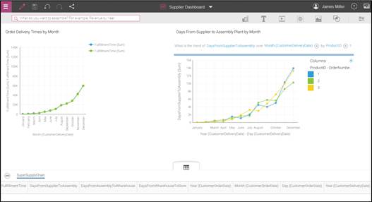
The following screenshot is our finished dashboard:
Our dashboard looks pretty nice, so let's save it by clicking the Save icon in the upper left of the page, then typing a name for the dashboard in the Save as popup:

Now that we have constructed and saved a nice Watson dashboard, we should share it. You can share your Watson Analytics insights with anyone, even those who do not have access to Watson. To do this, you can download the insights as a file.
Watson Analytics currently supports the following file formats:
- PNG image
- Microsoft PowerPoint presentation, PPT; you can share presentations only if you use the Plus edition or Professional edition of Watson Analytics
- Adobe PDF
The easiest way is to click on the Share icon and select from the supported formats. I want to be able to print copies of my dashboard to hand out at the next Surfboard store manager's meeting, so I will select PDF:

Once you select the PDF format, you can provide a name for your PDF file, then click Download:
