7.1. Inserting Pictures and Symbols
Most of the menu and toolbar options related to pictures are disabled until you place the cursor on a Web page open in SharePoint Designer. Inserting and working with pictures is simple enough, and once your Web page is open, you just have to choose Insert  Picture to pick a picture you want to insert on the page. You have the option of inserting a picture from a folder location on your computer where you saved it, from a scanner or camera, or from the pictures available in the Office clip art gallery.
NOTE
Web pages in general are expected to load fast. Thus, it's recommended that you insert pictures of reasonable sizes on Web pages. This helps in loading the page faster. The file types suggested for the Internet are GIF, JPEG, and PNG.
For example, to add clip art to your Web site, follow these steps:
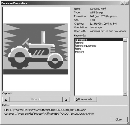
Type Designer in the Search for text field and then click Go. If you're connected to the Internet, you might just find j0438675.wmf. Or choose a picture you like and then hover over it in the Clip Art task pane. You can also double-click the image. A menu button appears on the right side of the picture.
Click this menu button and then click Insert. You can also drag and drop the clip art onto the Web page. Notice the Preview/Properties option in this menu. As shown in Figure 7.1, this menu opens the Preview/Properties dialog box, which shows the name, the size and resolution, and the location of the picture.
Figure 7.1. The Preview/Properties dialog box
When you insert the picture on the Web page, the Accessibility Properties dialog box opens. You can use this dialog box to specify the alternate text for the picture. If you don't want this dialog box to appear every time you insert a picture, deselect the Show this prompt when inserting images check box.
Click OK. The picture is then displayed on your Web page with the resolution indicated in the Preview/Properties dialog box.
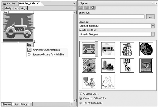
Click the picture, and the Design view shows a picture border with holders that you can use to change the width and height of the picture. Also, notice that the picture is inserted as an <img> tag on the Web page. A smart tag is also displayed at a corner of the picture, as shown in Figure 7.2.
Figure 7.2. A smart tag for pictures
|

The smart tag has two options:
Only Modify Size Attributes: This is the default option and signifies that only the width and height attributes of the picture are changed when you modify the picture.
Resample Picture to Match Size: When you choose this option, the picture is resampled to fit the size, which means SharePoint Designer tries to refine the picture in its modified width and height.
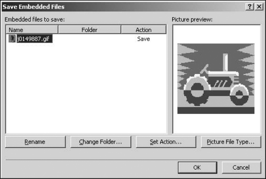
When you save the Web page with the picture on it, you're shown the Save Embedded Files dialog box, which allows you to specify where you want to save the picture you inserted on the page. As shown in Figure 7.3, the Save Embedded Files dialog box allows you to rename the picture and specify the location where you want to save the file.
Besides allowing you to change the picture name and save location, the Save Embedded Files dialog box lets you to perform the following operations:
Set Action: This option allows you to either save the picture within the Web site by clicking the Save File radio button or use the picture from its original location, such as a Web site on the Internet.
Picture File Type: Discussed in the next section, this button allows you to change the file type of the picture.
Figure 7.3. The Save Embedded Files dialog box
7.1.1. Setting picture properties
When you right-click on the picture you inserted on the Web page, a popup menu appears with a set of tools available for modifying the settings for the picture.
7.1.1.1. Reset Size
As the name suggests, you can use this option to reset the picture size back to the original size before modification. This option is only available in the menu if you've modified the size of the picture in the current Web page editing session. SharePoint Designer doesn't remember the original size of the picture after you save the page and close it.
7.1.1.2. Resample
This option can be used after you modify the size of the picture. Like the resample option in the smart tag for the picture, this option also resamples the picture after a change in size. Once used, this option isn't available until you modify the size of the picture again.
7.1.1.3. AutoThumbnail
The AutoThumbnail option allows you to automatically create a thumbnail of the picture on the Web page. Choosing the AutoThumbnail option tells SharePoint Designer to create a smaller thumbnail picture of the original picture.
As shown in Figure 7.4, the settings for how the thumbnail picture should be created can be specified by using the AutoThumbnail tab in the Page Editor Options dialog box.
You have the following options for configuring how SharePoint Designer generates the thumbnail for the picture you choose to create a thumbnail for:
You can specify the width of the thumbnail. Thumbnails are square images, so the width you specify is used as the height of the thumbnail image.
You can choose to have a border around the thumbnail image and specify the width of the border in pixels.
The thumbnail picture can also be set to have a beveled edge.
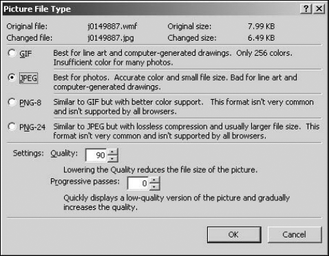
7.1.1.4. Change Picture File Type
If you want to change the file type of the picture, you can use the Picture File Type dialog box to choose a file type that matches your needs. As shown in Figure 7.5, the Picture File Type dialog box gives you a brief description of the file type, its recommended usage, and allows you to specify the quality of the picture.
For GIF and JPEG file types, you have options to specify how the picture loads when viewed in a browser. You can enable interlacing for GIF images and progressive passes for JPEG files by using the Picture File Type dialog box.
Figure 7.4. The AutoThumbnail tab in the Page Editor Options dialog box
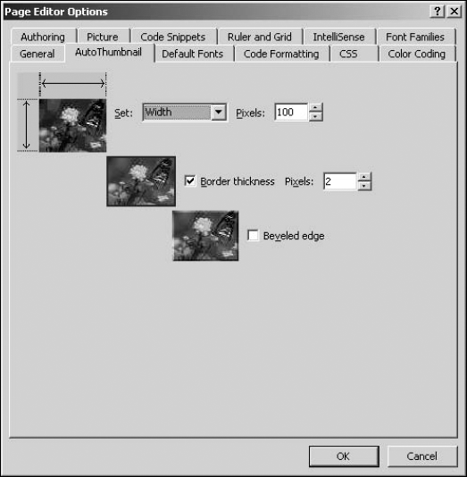
Figure 7.5. The Picture File Type dialog box
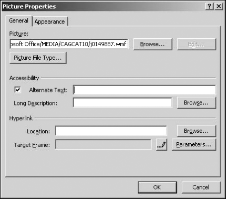
7.1.1.5. Picture Properties
As the name suggests, this dialog box can be used to change the general settings for the selected picture. As shown in Figure 7.6, the Picture Properties dialog box has the following tabs:
General: Allows you to change the name of the picture and specify its alternate text. Clicking Edit opens the picture in the associated picture editing program installed on your machine. The Hyperlink section allows you to create hyperlinks on the picture. The Accessibility section can be used to specify alternate text and description for the image so it can be read by text reader programs.
Appearance: Provides settings for positioning, margining, and resizing the picture. You can specify the border thickness as well as the picture's width and height.
Figure 7.6. The Picture Properties dialog box
7.1.2. Creating hyperlinks on pictures
You can create a hyperlink on your picture by choosing either Picture Properties or Hyperlink from the popup menu when you right-click on a picture in the Design view.
The Hyperlink option opens the Insert Hyperlink dialog box, which you can use to create a hyperlink or bookmark. The more interesting exercise, however, is to create multiple hyperlinks at specific locations on a single picture.
SharePoint Designer provides the ability to create hotspots by using the Pictures toolbar. Hotspots are hyperlinks that are active on a specific area within a picture. So, a single picture can have multiple hyperlinks on it. To create hotspots on a picture, follow these steps:
Choose View
 Toolbars
  Pictures to enable the Pictures toolbar and then drag it to the toolbar area in SharePoint Designer to dock it.
Open the Web page that has the picture on which you want to create hotspots. Ensure you're working in the Design view.
Hover over the buttons in the Pictures toolbar to find the Rectangular Hotspot button. The mouse pointer changes to a Pencil icon.
Using the mouse pointer, draw a rectangular box on a certain area of the picture where you want to create a hyperlink. After the box is drawn, the Insert Hyperlink dialog box opens.
Using the Insert Hyperlink dialog box, create a hyperlink for the hotspot.
Click OK. Repeat these steps to create multiple hotspots in different areas of the picture.
Save the page and then preview it in a browser.
Now, when you hover over the picture, a number of hyperlinks are available. SharePoint Designer implements hotspots using the <map> and <area> tags. Here is a piece of HTML code for a Web page that has a picture with hotspots on it:
<map name="FPMap0" id="FPMap0">
<area href="http://spdexplorer:8009/button5.jpg" shape="rect"
   coords="146, 36, 293, 95" />
<area href="http://spdexplorer:8009/button6.jpg" shape="rect"
   coords="17, 131, 142, 185" />
<area href="http://spdexplorer:8009/Figure15.2.JPG" shape="rect"
   coords="185, 183, 262, 269" />
</map>
<img alt="" src="http://spdexplorer:8009/MPj04386750000[1].jpg"
   width="384" height="351" usemap="#FPMap0"/>
Notice the <map> tag containing the <area> tags that have been created for each hyperlink in the previous code. The <map> tag's ID is then used as a reference in the picture's <img> tag to enable the hotspot.
7.1.3. Exploiting the Pictures toolbar
The Pictures toolbar, as shown in Figure 7.7, allows a Web site designer to perform some basic operations on pictures that have been inserted on a Web page. As discussed in the previous section, you've already used the Pictures toolbar to create and manage hotspots on pictures. Besides creating hotspots, you can also perform the following operations:
Figure 7.7. The Pictures toolbar
Insert Picture from File: Opens the Picture dialog box to allow you to choose a picture to be inserted from a specific location
Auto Thumbnail: Automatically creates a thumbnail for the selected picture
Bring Forward: Changes the z-order of the picture to bring it to the top
Send Backward: Reduces the z-order of the picture to take it to the bottom of other content on the page
Rotate Left 90°: Rotates the picture to the left by 90 degrees
Rotate Right 90°: Rotates the picture to the right by 90 degrees
Flip Horizontal: Creates a horizontal mirror image of the picture
Flip Vertical: Creates a vertical mirror image of the picture
More Contrast: Increases the color contrast
Less Contrast: Decreases the color contrast
More Brightness: Increases the brightness
Less Brightness: Reduces the brightness
Crop: Allows you to crop a picture to desired dimensions. To crop a picture, click the Crop button on the Pictures toolbar. Use the box that appears on a picture to set the cropped dimensions. Click the Crop button again to implement the cropping.
Set Transparent Color: For GIF picture file types, this option allows you to set the transparent color for the pictures. To use this option, you need to convert the picture to the GIF file type.
Color: Allows you to change the look of a picture to grayscale or washout
Bevel: Add beveled edges a picture
Resample: Resamples a resized picture to improve quality
Select: Selects a picture
Rectangular Hotspot: Creates a rectangular hotspot
Circular Hotspot: Creates a circular hotspot
Polygonal Hotspot: Allows you to create a multisided hotspot
Highlight Hotspots: Shows the hotspots that have been created on a picture
Restore: Undoes the changes made to a picture in the current editing session
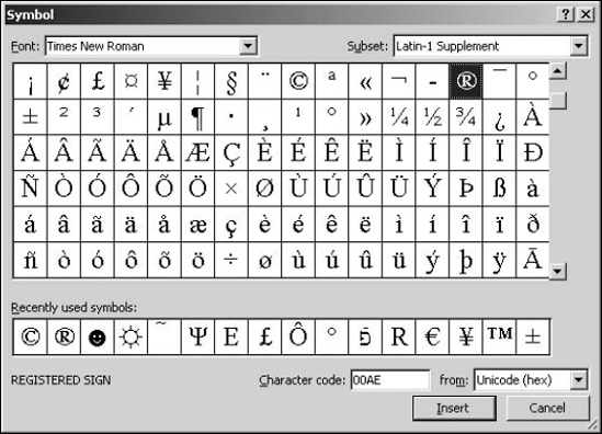
7.1.4. Using symbols
Sometimes, you might need to insert some special symbols on your Web pages that allow you to more accurately represent that data your Web pages are offering. Using the Symbol dialog box, as shown in Figure 7.8, you can insert a symbol you need.
To insert a symbol on a Web page, follow these steps:
Place the cursor at the location on the Web page where you want to insert a symbol.
Choose Insert
 Symbol to open the Symbol dialog box.
Choose the font you want to use for the symbol by using the Font dropdown menu.
Choose the symbol from the list of symbols in the dialog box or choose from the recently used symbols list. The Character code for the symbol is displayed in Unicode encoding format. Specify the encoding that you want to use in the from dropdown menu.
Click Insert to place the symbol at the cursor location on the Web page and then click Close to close the Insert dialog box.
While the font formatting is applied to the symbol using in-page styles and basic symbols, such as ®, ©, etc., are inserted as is in the code of the Web page, certain subsets of symbols are inserted as numerical encodings, which are interpreted by a browser to display the actual symbol. For example, the smiley symbol is inserted in the code of the Web page as ☻.
Figure 7.8. The Symbol dialog box