10.1. Using Standard Controls
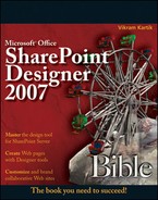
The SharePoint Designer Toolbox task pane includes most of the standard ASP.NET 2.0 controls. You use the Toolbox task pane to insert controls on an ASP.NET Web page. You can either drag and drop the controls at the location of your choice on a Web page or insert the cursor at the required location on a Web page and double-click the control in the Toolbox task pane to insert it on a Web page. Figure 10.4 shows the standard controls available for use in the SharePoint Designer Toolbox task pane.
NOTE
While similar controls available in the Form Controls section of the Toolbox are HTML controls, these controls are different in that they're ASP.NET 2.0 controls.
Figure 10.4. Standard controls in the Toolbox task pane
When you insert an ASP.NET control on an ASP.NET Web page, SharePoint Designer automatically places it in an HTML form that has the runat="server" attribute set.
<form id="form1" runat="server">
   <asp:MultiView runat="server" id="MultiView1">
   </asp:MultiView>
</form>
This means that the form controls are actually executed at the Web server where the Web site containing the Web page is being hosted. ASP.NET 2.0 controls expose a number of properties that can be used declaratively to set the control behavior at runtime. SharePoint Designer exploits this ability of ASP.NET controls to provide a user interface that can be used to modify these properties.
NOTE
SharePoint Designer isn't really a very useful tool for manually writing code-behind files (files with extensions .cs, .vb, etc.) for ASP.NET Web pages. For more involved custom coding using ASP.NET programming languages, such as C# or VB.NET, you need a developer tool, such as Visual Studio.
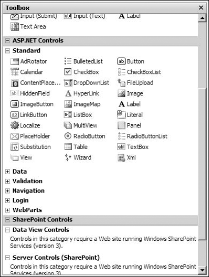
When ASP.NET controls are inserted on a Web page, SharePoint Designer displays a control-specific Common Tasks menu in the Design view. As shown in Figure 10.5, the Common Tasks menu allows you to set the most common and important properties for the ASP.NET control.
Figure 10.5. The Common Tasks menu for the DropDownList ASP.NET control
You can show or hide the Common Tasks menu for an ASP.NET control by using the small arrow button displayed in the top-right corner of the control in the Design view. The common operations available for ASP.NET controls in the Common Tasks menu include:
Choose Data Source: Allows you to bind the ASP.NET control to a data source.
Enable AutoPostBack: Allows you to set the AutoPostBack property of an ASP.NET control.
NOTE
ASP.NET controls implement a mechanism that allows for the Web page to be posted back to the Web server for processing based on certain events in the control. Called as AutoPostBack, a property is available for certain controls, which, if set to true, sends the request to the server when an event happens in the control. For example, setting the AutoPostBack property for the DropDownList ASP.NET 2.0 control to true posts the ASP.NET Web page back to the server for processing whenever a user selects a different value in the DropDownList control.
Auto Format: Allows you to choose from an out-of-the-box list of styling options for the ASP.NET control.
Edit Templates: For ASP.NET 2.0 controls that allow template-based editing, this menu option provides an access point to the user interface to change the templates associated with the control.
10.1.1. Working with the Tag Properties task pane
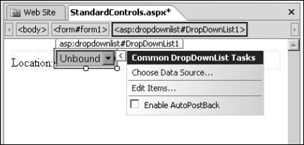
One of the more detailed panes for setting declarative properties for the ASP.NET 2.0 controls in SharePoint Designer is the Tag Properties task pane. As you already know, the Tag Properties task pane can be used to set properties and attributes for HTML form controls and tags. When you view Tag Properties for ASP.NET 2.0 controls, you make available a list of properties exposed for use by the control. The Tag Properties task pane provides a Visual Studio-like interface to Web designers for working with ASP.NET control properties. While you can use the IntelliSense feature in the Code view to set these properties, the table-like structure of the Tag Properties task pane lists the available properties and lets you set them without having to remember them. The Tag Properties task pane is especially useful for working with ASP.NET 2.0 controls, as it provides a tabular list of properties exposed by the control, and the designer can easily specify values for them. The Tag Properties task pane displays the properties in various categories, as shown in Figure 10.6.
You can enable the Tag Properties task pane by choosing Tasks  Tag Properties or by right-clicking the ASP.NET 2.0 controls and then choosing Properties from the popup menu. When you select an ASP.NET control to show its properties in the Task Properties task pane, the top section of the Tag Properties task pane shows the HTML tag for the ASP.NET control. The top section also has the following buttons:
Show categorized list: Sorts the properties in the task pane based on categories, such as accessibility, appearance, behavior, data, etc.
Show alphabetized list: Sorts the properties in the task pane alphabetically.
Show set properties on top: Displays the properties that have been manually set at the top of the list or the category.
Figure 10.6. The Tag Properties task pane for the DropDownList control
Besides categorizing the properties, the Tag Properties task pane also provides you with the option to expand or collapse property groups to attain more real state in the task pane. Many properties allow access points to the user interface that can be used to set them. For example, selecting the ForeColor property enables a dropdown menu that can be used to access the interface to choose a color to be set as a value for the property. The Items property on the DropDownList control has the ellipsis (...) button that allows you to access the user interface to create new list items in the control.
10.1.2. Working with standard controls
There are a number of commonly used controls in the Standard section of the Toolbox task pane. Many of these standard controls are pivotal in providing interface elements to ASP.NET forms. Controls such as Button, DropDownList, BulletedList, CheckBoxList, etc., are the primary controls that you use for designing server-side forms on ASP.NET 2.0 Web pages. Most of these standard controls can be bound to a source of data, such as a column in a table of a database, for displaying and using the data retrieved from it.
This section takes you through some exercises for using some of the controls available in the Toolbox task pane to familiarize you with the SharePoint Designer interface for declaratively working with ASP.NET controls.
10.1.2.1. Using the AdRotator control
The AdRotator control provides the ability to create banner ads on a Web page. The control is designed to shows images one after the other in a cyclic format. You can use the AdRotator control to create a banner on a Web page that switches images based on a frequency defined in an XML file. The XML file stores the configuration for the advertisements and is specified by the AdvertisementFile property of the control. A sample AdvertisementFile is displayed in the following code:
<Advertisements>
<Ad>
<ImageUrl>images/Image16.jpg</ImageUrl>
<NavigateUrl>http://spdexplorer:8009/Page16.htm</NavigateUrl>
<Impressions>16</Impressions>
</Ad>
<Ad>
<ImageUrl>images/Image21.jpg</ImageUrl>
<NavigateUrl>http://spdexplorer:8009/Page21.htm</NavigateUrl>
<Impressions>21</Impressions>
</Ad>
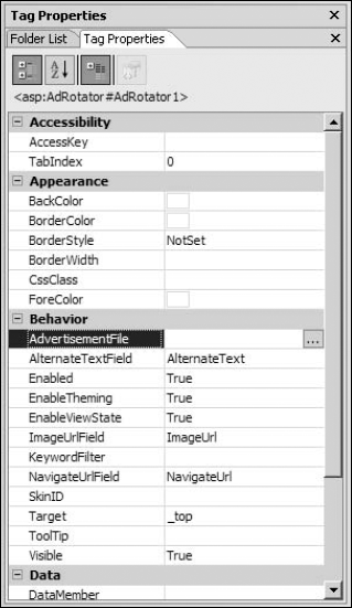
</Advertisements>In the previous XML structure, the <Ad> element is repeated for every advertisement that you want to schedule in the AdRotator control. The ImageUrl element specifies the image to be displayed for the advertisement, and the NavigateUrl can be used to set the URL the user is taken to when the image is clicked on Impressions allows you to define the frequency of the image in the banner. This means that the higher the value of the Impressions element for an image, the more it's shown. As shown in Figure 10.7, the elements of the advertisement XML file are actually properties of the AdRotator control.
Ensure that you have a valid XML file created by using the previous structure for use in the AdRotator control. To set up and use the AdRotator control, follow these steps:
Insert the AdRotator control on an ASP.NET Web page by using the Toolbox task pane.
Select the AdvertisementFile property and then click the ellipsis (...) button. The Select XML File dialog box opens, which you can use to specify the XML file to be used by the AdRotator control.
Choose the XML file you want to use for the AdRotator control.
Save the Web page and then preview it in a browser.
Whenever you refresh the Web page in a browser, the image displayed in the banner changes. How often the image is displayed is defined by how high the value of the Impressions property is for the Advertisement.
Figure 10.7. Properties for the AdRotator control in the Tag Properties task pane
10.1.2.2. Using the ImageMap control
The ImageMap control allows you to create images with hotspots on them. As you already know, hotspots are areas or regions on an image that have hyperlinks on them. You can choose whether a user clicks on the hotspot region to navigate to another URL or incurs a postback. To create hotspots on an image by using the ImageMap control in SharePoint Designer, follow these steps:
Using the Toolbox task pane, double-click the ImageMap control to insert it on a Web page.
Right-click on the ImageMap control inserted on the Web page and then click the Tag Properties menu option to open the Tag Properties task pane.
Using the Select Image dialog box, select the image that you want to use for the image map.
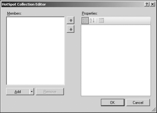
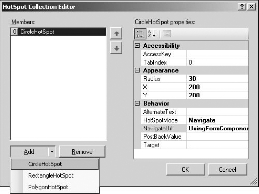
Select the HotSpots collection by using the Tag Properties task pane and then click the ellipsis (...) button. The HotSpot Collection Editor dialog box, as shown in Figure 10.8, opens. The Add button has an arrow indicating that it's a dropdown menu.
Choose CircleHotSpot to add a circular hotspot to the collection. The Properties list is filled with the properties that you can set for this hotspot
Change the HotSpotMode property to Navigate. The following modes are available for the hotspot:
NotSet: Indicates that the hotspot has not been set.
PostBack: Specifies that clicking on the hotspot should postback the Web page for processing.
Navigate: Indicates that clicking on the hotspot should navigate to the URL specified in the NavigateUrl property
Click the ellipsis (...) button in the NavigateUrl property, and using the Select URL dialog box, choose the URL that a browser should navigate to when a site visitor clicks the hotspot. The complete hotspot settings are shown in Figure 10.9.
Repeat the previous steps to create multiple hotspots by using the HotSpot Collection Editor dialog box.
Save the Web page and then preview it in a browser.
When you hover over the image containing the hotspots, the mouse pointer changes, and you can click the specific portion to navigate or postback. Also, if you have set the AlternateText property for a hotspot, a screen tip appears when you hover over that hotspot.
Figure 10.9. Creating a circular hotspot by using the HotSpot Collection Editor dialog box
10.1.2.3. Using the Wizard control
The Wizard control is a very interesting tool in ASP.NET 2.0 and allows you to create screens or multiple views for collection data from users. The control provides for implementing a step-based approach for developing user forms and surveys. Rather than having a single large form, the components of the form can be divided into steps (called WizardSteps). The user can go back and forth from one step to another while filling out the form without losing any data already filled in.
NOTE
It's important to note that while the Wizard control allows you to design the user interface for a seemingly multipage input form, it doesn't provide the implementation for actually saving the user data. The developer must implement the logic for saving the data collected to a data source.
In the next exercise, you use the Wizard control to create a multipage survey form's user interface. Follow these steps:
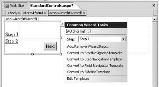
Using the Toolbox task pane, double-click the Wizard control to insert it on a Web page in the Design view. This inserts the Wizard control on the Web page and displays the Common Wizard Tasks menu, as shown in Figure 10.10. By default, two steps have been created for you in the Wizard control.
Figure 10.10. Inserting a Wizard control on an ASP.NET Web page
Click the Add/Remove WizardSteps link in the Common Wizard Tasks menu to open the WizardStep Collection Editor dialog box. Use this dialog box to create new steps in the wizard, as shown in Figure 10.11. The StepType property in the Behavior category in the Step 2 properties list determines the buttons that are displayed in the step:
Start: The step having this StepType displays a Next button.
Step: The step having this StepType displays the Next and Previous buttons.
Finish: The step having this StepType displays a Finish button.
Complete: The step having this StepType displays no navigation buttons and hides the navigation bar (called the SideBar) on the left if it's displayed.
Auto: If selected, one of the previous StepTypes is chosen for the step based on where the step is in the list of steps. For example, the first step is set to use the Start StepType.
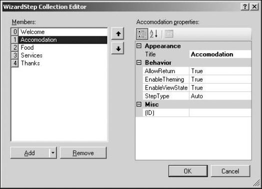
Click Add to add new steps to the Wizard control. As shown in Figure 10.12, each step can correspond to a page in the survey form. You can use the Title property to name the steps.
Figure 10.11. Creating new steps in the Wizard control by using the WizardStep Collection Editor dialog box
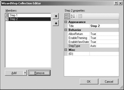
Figure 10.12. Corresponding steps to pages in the survey form
Click OK. In the Design view, the wizard with the steps is created. If you preview the Web page in a browser, the Wizard control lets you move from one step to another by using the navigation buttons: Start, Previous, Next, and Finish.
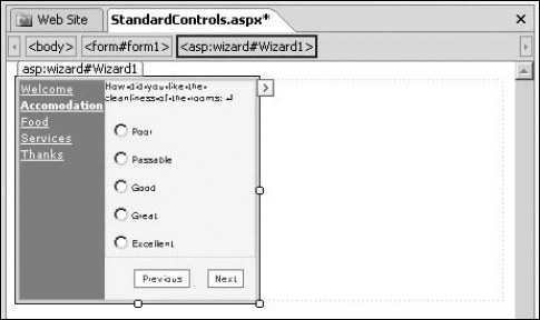
Using the Design view, you can now insert other controls to complete your survey form. Place the cursor in the main area of the wizard and then add the controls for user input, as shown in Figure 10.13.
After you finish creating one step of the wizard, you can click the link for the next step in the Design view to add controls and build the next step. When your wizard is complete and you preview the Web page in a browser, when you move between steps, the values that you filled in for the controls in each step are preserved.
Figure 10.13. Adding other form controls to a step in the Wizard control
10.1.3. Understanding Expressions
A common property found in most ASP.NET 2.0 controls is Expressions. Displayed in the Data section in the Tag Properties task pane for ASP.NET 2.0 controls, the Expressions property is a mechanism to bind properties of an ASP.NET control with settings defined in the application configuration file; that is, the web.config file of the ASP.NET Web application.
NOTE
The web.config file is an XML configuration file stored in the root of the ASP.NET Web application. This file is used to store general settings for the Web application, such as connection strings, authorization settings, application settings, etc.
You can create a web.config file for your ASP.NET Web site in SharePoint Designer. Follow these steps:
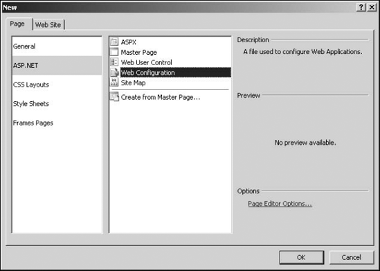
Choose File
 New to open the New dialog box.
Select Web Configuration in the ASP.NET section of the Page tab, as shown in Figure 10.14.
Click OK. SharePoint Designer creates a web.config file for a Web site, with some sections by default. The following code is written by SharePoint Designer by default for the web.config file it creates:
<?xml version="1.0"?>

<!--
    A full list of settings and comments can be found in
machine.config.comments usually located in
    WindowsMicrosoft.NetFrameworkv2.xConfig
-->
<configuration xmlns="http://schemas.microsoft.com/.
   NetConfiguration/v2.0">
    <appSettings/>
    <connectionStrings/>
    <system.web>

        <!--
            Set compilation debug="true" to insert debugging
            symbols into the compiled page. Because this
            affects performance, set this value to true only
            during development.
        -->
        <compilation debug="false"/>

        <!--
            The <authentication> section enables configuration
            of the security authentication mode used by
            ASP.NET to identify an incoming user.
        -->
        <authentication mode="Windows"/>

        <!--
            The <customErrors> section enables configuration
            of what to do if/when an unhandled error occurs
            during the execution of a request. Specifically,
            it enables developers to configure html error pages
            to be displayed in place of a error stack trace.

        <customErrors mode="RemoteOnly" defaultRedirect="GenericEr
   rorPage.htm">
            <error statusCode="403" redirect="NoAccess.htm"/>
            <error statusCode="404" redirect="FileNotFound.htm"/>
        </customErrors>
        -->
    </system.web>
</configuration>
The highlighted <appSettings/> and <connectionStrings/> section of the web.config file can be used to store some general settings and connection strings that can be referenced later in any ASP.NET Web page inside the Web site associated with the web.config file.
The Expressions property is used to bind the properties on an ASP.NET control to settings defined in these sections of the web.config file. For example, you can define a general connection string for a database in the web.config file and then use the Expressions property of the ASP.NET control to bind the connection string to a property of the control. The following exercise illustrates this. Here, you define an application setting in the web.config file of the Web site and then bind it to a property of an ASP.NET control by using Expressions. Follow these steps:
Create a web.config file for your Web site by using SharePoint Designer.
Open the web.config file in the Code view and then look for the <appSettings/> code.
Save the web.config file in the root folder of your Web site.
Open a Web page in SharePoint Designer and then insert a Label ASP.NET control by using the Toolbox task pane.
Click the ellipsis (...) button to open the Expressions dialog box for the Label control, as shown in Figure 10.15.
Figure 10.15. The Expressions dialog box
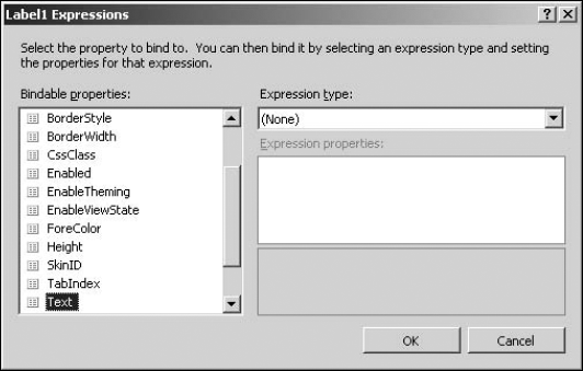
In the Bindable properties list, select the Text property.
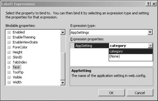
Select AppSettings in the Expressions type dropdown menu.
In the Expression properties list, select the category application setting as the value for AppSettings, as shown in Figure 10.16. That category is the AppSettings that you defined in step 3. If you add more AppSettings in the web.config file, they're all listed here.
Click OK. The value of the category AppSetting is substituted as the value for the Text property of the label control. Similarly, you can use the web.config AppSetting in multiple controls. When you need to make a change to the AppSettings, you just need to change the web.config file, and the changes are applied to all the controls bound by using Expressions.
The Expressions property is especially useful in binding the connection strings stored in the web.config file with the ASP.NET controls spread across a Web site. This way, you can keep the connection strings at a single location and then reuse them.
Figure 10.16. Binding control properties by using the Expressions dialog box
10.1.4. Editing ASP.NET control templates
While most of the ASP.NET 2.0 controls provide styling capabilities by using properties and styles that you can access in SharePoint Designer via the Tag Properties task pane, some ASP.NET 2.0 controls offer granular control on the layout of the control at runtime by allowing you to modify the control's look by using predefined templates. Templates essentially don't provide for changing the style or appearance of the control but allow you to add elements and controls to specific portions of the ASP.NET control.
Templates can be used to hold HTML and ASP.NET server controls. When the control exposing the template is rendered at runtime, the default HTML for the control is replaced with the contents of the template. For example, if you want to change the navigation buttons in a particular step in the Wizard control to LinkButton controls, you can do so by changing the templates associated with various WizardSteps. The following exercise takes you through the steps to change the Next button in the first step of the Wizard control to an ImageButton control. Follow these steps:
Using the Wizard control, create a wizard with two steps so that clicking the Next button in the first step takes you to the second step.
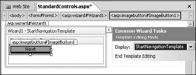
In the Common Wizard Control Tasks menu, click the Edit Templates link, as shown in Figure 10.17. In the Wizard control, the Next button that appears in the step with the StepType property set to Start is templated by using the StartNavigationTemplate.
Click the Edit Templates link to switch the Common Wizard Control Tasks menu to the Template Editing Mode and then choose StartNavigationTemplate from the Display dropdown menu, as shown in Figure 10.18.
Place the cursor in the StartNavigationTemplate and then double-click the ImageButton control in the Toolbox task pane to insert an ImageButton control in the template area.
Type MoveNext in the value column on the CommandName property for the ImageButton control in the Tag Properties task pane, as shown in Figure 10.19.
Click the End Template Editing link. The Next button is replaced with the ImageButton control
Save the Web page and then preview it in a browser.
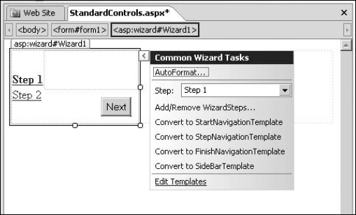
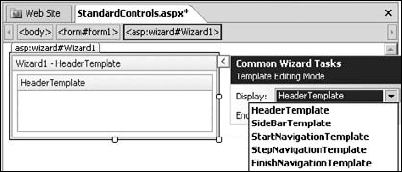
Figure 10.19. Setting the StartNavigationTemplate for the Wizard control
When you click the ImageButton control in the first step, it takes you to the next step in the wizard. You can change the other templates for the wizard in a similar manner to customize the layout of your Wizard control.
NOTE
While using templates, it's important to set the CommandName property of the controls you place in the templates. For example, if you want to customize the left navigation bar by using the SideBarTemplate of the Wizard control, keep in mind that the navigation bar is built up of a DataList control (having the CommandName=SideBarList), which has a Button control (with the CommandName=SideBarButton) in its ItemTemplate template. To customize, you have to place a custom DataList control in the SideBarTemplate, which has a Button control in its ItemTemplate template.