
So far, we have looked at various scenarios of creating plots using the ggplot2 library. In order to take the plotting to a new level, there are many libraries which can be referred to. Out of them, one library is plotly, which is designed as an interactive browser-based charting library built on the JavaScript library. Let's look at a few examples on how it works.
Bubble plot is a nice visualization in which the size of the bubble indicates the weight of each variable as it is present in the dataset. Let's look at the following plot:
> #Bubble plot using plotly

> plot_ly(Cars93, x = Length, y = Width, text = paste("Type: ", Type),


+ mode = "markers", color = Length, size = Length)

The combination of ggplot2 with the plotly library makes for good visualization, as the features of both the libraries are embedded with the ggplotly library:
> #GGPLOTLY: ggplot plus plotly

> p <- ggplot(data = Cars93, aes(x = Horsepower, y = Price)) +

+ geom_point(aes(text = paste("Type:", Type)), size = 2, color="darkorchid4") +

+ geom_smooth(aes(colour = Origin, fill = Origin)) + facet_wrap(~ Origin)

>

> (gg <- ggplotly(p))

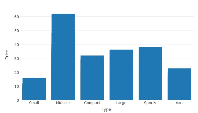
Bar charts using plotly look smarter than regular bar charts available in R, as a base functionality, let's have a look at the graph as follows:
> p <- plot_ly(

+ x = Type,

+ y = Price,

+ name = "Price by Type",

+ type = "bar")


> p
Representation of two continuous variables can be shown using a scatterplot. Let's look at the data represented next:
> # Simple scatterplot

> library(plotly)

> plot_ly(data = Cars93, x = Horsepower, y = MPG.highway, mode = "markers")

> #Scatter Plot with Qualitative Colorscale

> plot_ly(data = Cars93, x = Horsepower, y = MPG.city, mode = "markers",


+ color = Type)

Following are examples of creating some interesting boxplots using the plotly library:
> #Box Plots

> library(plotly)

> ### basic boxplot

> plot_ly(y = MPG.highway, type = "box") %>%

+ add_trace(y = MPG.highway)

> ### adding jittered points

> plot_ly(y = MPG.highway, type = "box", boxpoints = "all", jitter = 0.3,

+ pointpos = -1.8)

> ### several box plots

> plot_ly(Cars93, y = MPG.highway, color = Type, type = "box")

> ### grouped box plots

> plot_ly(Cars93, x = Type, y = MPG.city, color = AirBags, type = "box") %>%

+ layout(boxmode = "group")

The polar chart visualization using plotly is more interesting to look at. This is because when you hover your cursor over the chart, the data values become visible and differences in pattern can be recognized. Let's look at the example code as given next:
> #Polar Charts in R
> library(plotly)
pc <- plot_ly(Cars93, r = Price, t = RPM, color = AirBags,
mode = "lines",colors='Set1')
layout(pc, title = "Cars Price by RPM", orientation = -90,
font='bold')

Using the plotly library, there is one additional chart type which a user can create. It's called polar scatterplot. Instead of a two dimensional scatterplot, the points are plotted in a circular fashion:
> #Polar Scatter Chart
pc <- plot_ly(Cars93, r = Price, t = Horsepower, color = Type,opacity = 0.7,
mode = "markers",colors = 'Dark2')
layout(pc, title = "Price of Cars by Horsepower",plot_bgcolor = toRGB("coral"),
font='bold')

The graph polar scatterplot shows the price of cars by horsepower and the colors indicate the type of cars, the rings indicate proximity or closeness, one midsize car is very distinctly different from other variants as observed from the graph.
The polar area chart, also known as the radar chart or coxcomb chart as renamed in some other packages, is shown next using a sample code. It shows the relationship between the of cars and horsepower by car type:
> #Polar Area Chart
pc <- plot_ly(Cars93, r = Price, t = Horsepower, color = Type, type = "area")
layout(pc,title = "Price of Cars by Horsepower",orientation = 270,
plot_bgcolor = toRGB("tan"),font='bold')
