All clustering algorithms can be classified into four groups, as follows:
- Hierarchical clustering: Using this method, a number of clusters are prepared from the dataset, forming a hierarchy, and the clusters are then grouped using a tree structure so that the entire dataset can be represented as a single tree structure. The advantage of this method is that unlike partitioning-based clustering, we don't have to specify the number of clusters to be created from the dataset.
- Partitioning clustering: In this approach, the dataset is divided into a finite group of clusters based on a distance function in such a way that the within-cluster similarity is maximum and between-cluster similarity is minimum. K-means, which is a popular method in data mining practice, falls under this category.
- Model-based clustering: Using the data model, a group of clusters is created from the dataset; the methods used in the model-based clustering approach can be divided into two groups:
- Maximum likelihood estimation
- Bayesian estimation
- Other clustering algorithms: There are other clustering techniques available such as fuzzy clustering, bagged clustering, and so on. Fuzzy clustering uses a fuzzy logic on the data so that the same data point can be a part of more than one cluster. In other words, there is no exclusivity in terms of cluster membership. This method is basically different from the other three forms of clustering, where a data point belongs to a single cluster. Another algorithm that falls under this group is known as self-organizing maps (SOM).
Before analyzing various methods used for clustering of similar objects or observations from a dataset, it is important to decide on a metric or distance method to measure the similarity or dissimilarity between the observations. Based on certain predefined characteristics known as input features, how one observation is different from or close to another observation can be known by using this metric.
A similarity metric measures the degree of closeness of data points and a distance metric measures how different the data points are. Both similarity and distance metric calculations are part of the clustering process. Let's take a look at various similarity/distance measures:
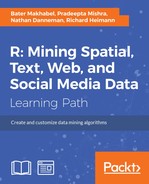
- Euclidean distance: The formula to compute the distance between two data points x and y is as follows:
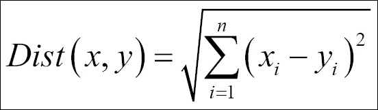
- Manhattan distance: This is the formula used to compute the Manhattan distance:
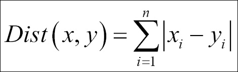
- Cosine similarity: The formula used to compute the cosine similarity is as follows:
Now let's start segmenting the dataset using various clustering methods by taking a dataset from healthcare (PimaIndiansDiabetes.csv [ref: 1]) and a dataset from retail/e-commerce (Wholesalecustomers.csv [ref: 1]). Before running a clustering exercise, data sufficiency conditions need to be checked.
K-means clustering is an unsupervised learning algorithm that tries to combine similar objects into a group in such a way that the within-group similarity should be maximum and the between-group object similarity should be minimum. "Object" here implies the data points that are entered into an algorithm. The within-group similarity is computed based on a centrality measure called centroid (arithmetic mean) and a distance function that measures how close the objects within a group are to the center. The "K" in K-means clustering implies the number of clusters that a user might be interested in. The following steps need to be followed for k-means clustering. Since the mean is used as a measure of estimating the centroid, it is not free from the presence of extreme observations or outliers. Hence, it is required to check the presence of outliers in a dataset before running k-means clustering.
- Checking the presence of outliers: Let's use the boxplot method of identifying the presence of any outliers in the
Wholesalecustomers.csvdataset:> r_df<-read.csv("Wholesalecustomers.csv") > ####Data Pre-processing > par(mfrow=c(2,3)) > apply(r_df[,c(-1,-2)],2,boxplot)The dotted points after the whisker line in each preceding boxplot for all the variables indicate that there are lots of outliers in the dataset. The capping method is mostly used by practitioners to remove the outliers from the dataset. If any data point exceeds the quantiles, 90th percentile, 95th percentile, or 99th percentile for each variable, then those data points need to be capped at the respective percentiles:
        > #computing quantiles

        > quant<-function(x){quantile(x,probs=c(0.95,0.90,0.99))}

        > out1<-sapply(r_df[,c(-1,-2)],quant)
Now, this
quantfunction computes the three percentiles and the same are applied to the dataset, excluding the first two variables. The following code is used to modify the variables:> #removing outliers > r_df$Fresh<-ifelse(r_df$Fresh>=out1[2,1],out1[2,1],r_df$Fresh) > r_df$Milk<-ifelse(r_df$Milk>=out1[2,2],out1[2,2],r_df$Milk) > r_df$Grocery<-ifelse(r_df$Grocery>=out1[2,3],out1[2,3],r_df$Grocery) > r_df$Frozen<-ifelse(r_df$Frozen>=out1[2,4],out1[2,4],r_df$Frozen) > r_df$Detergents_Paper<- ifelse(r_df$Detergents_Paper>=out1[2,5],out1[2,5],r_df$Detergents_Paper) > r_df$Delicassen<-ifelse(r_df$Delicassen>=out1[2,6],out1[2,6],r_df$Delicassen)
Next, let's check the dataset to find out whether the outliers have been removed, using the same boxplot method:
      > #Checking outliers after removal

      > apply(r_df[,c(-1,-2)],2,boxplot)
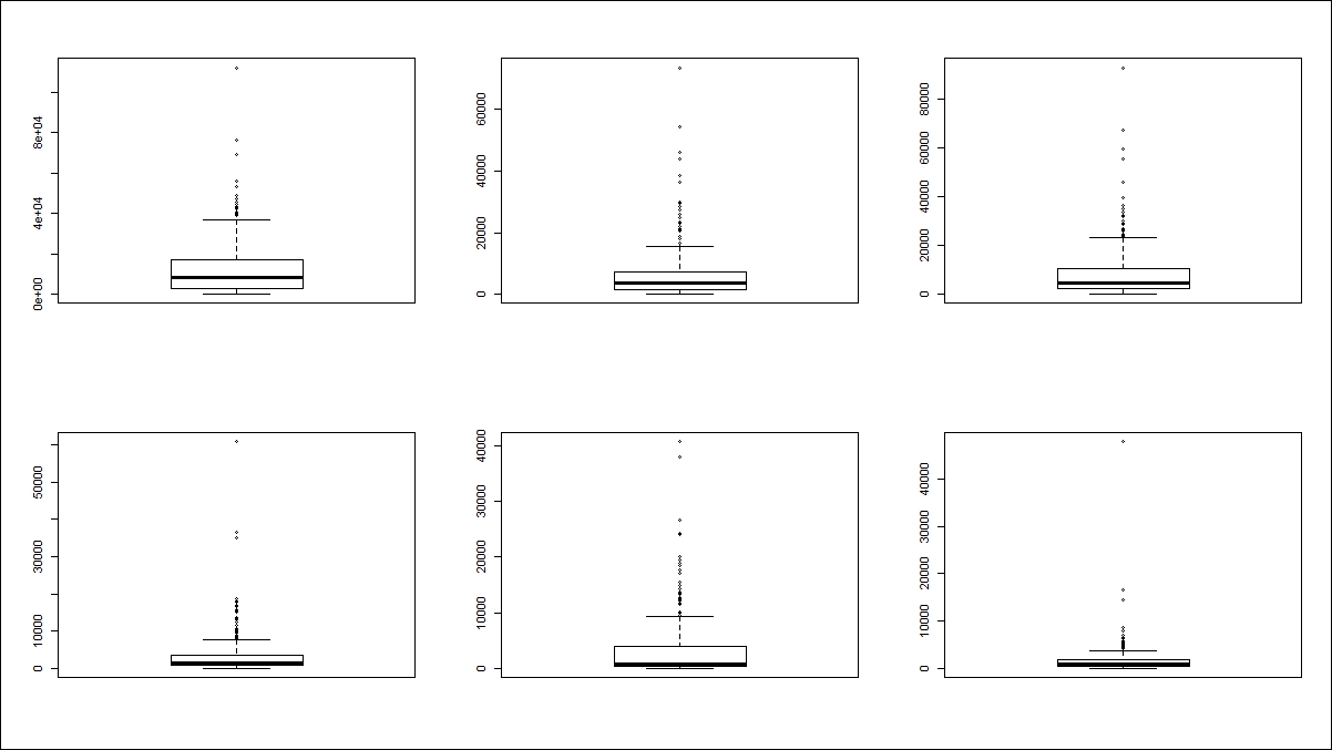
From the preceding graph, we can conclude that all the outliers have been removed by capping the values at 90th percentile value for all the variables.
- Scaling the dataset: Inclusion of only continuous variables in the K-means clustering exercise does not guarantee that all the variables would be on the same scale. For example, the age of a customer ranges from 0-100 and the income of a customer ranges from 0-100,000. Since both units of measurement are different, they might fall into different clusters, which becomes more complex when we have more data points to be represented. In order to compare segments in a clustering process, all the variables need to be standardized on a scale; here we have applied standard normal transformation (Z-transformation) for all the variables:
    > r_df_scaled<-as.matrix(scale(r_df[,c(-1,-2)]))

    > head(r_df_scaled)

    Fresh Milk Grocery Frozen Detergents_Paper Delicassen

    [1,] 0.2351056 1.2829174 0.11321460 -0.96232799 0.1722993 0.1570550

    [2,] -0.4151579 1.3234370 0.45658819 -0.30625122 0.4120701 0.6313698

    [3,] -0.4967305 1.0597962 0.13425842 -0.03373355 0.4984496 1.8982669

    [4,] 0.3041643 -0.9430315 -0.45821928 1.66113143 -0.6670924 0.6443648

    [5,] 1.3875506 0.1657331 0.05110966 0.60623797 -0.1751554 1.8982669

    [6,] -0.1421677 0.9153464 -0.30338465 -0.77076036 -0.1681831 0.2794239
- Choose initial cluster seeds: The selection of initial random seeds decides the number of iterations required for convergence of the model. Typically, initial cluster seeds chosen at random are temporary means of the clusters. The objects closer to the centroid measured by the distance function are assigned the cluster membership. With the addition of a new member into the cluster, again the centroid is computed and each seed value is replaced by the respective cluster centroid. In K-means clustering, this process of adding more objects to the group and hence updating the centroid goes on until the centroids are not moving and the objects are not changing the group membership.
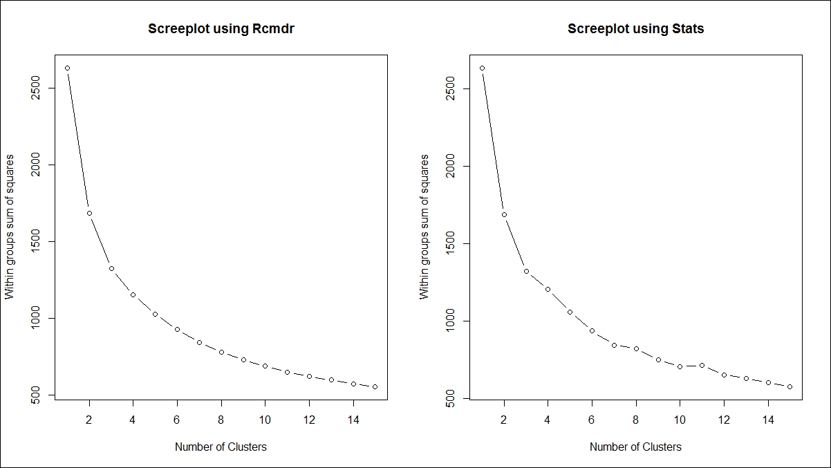
- Decide the number of cluster K: In the R programming language, there are two libraries,
Rcmdr(R Commander) andstats, that support K-means clustering and they use two different approaches. TheRcmdrlibrary needs to be loaded to run the algorithm, but stats is already built into base R. To compute the number of clusters required to represent the data using K-means algorithm is decided by the scree plot using the following formula:> library(Rcmdr) > > sumsq<-NULL > #Method 1 > par(mfrow=c(1,2)) > for (i in 1:15) sumsq[i] <- sum(KMeans(r_df_scaled,centers=i,iter.max=500, num.seeds=50)$withinss) > > plot(1:15,sumsq,type="b", xlab="Number of Clusters", + ylab="Within groups sum of squares",main="Screeplot using Rcmdr") > > #Method 2 > for (i in 1:15) sumsq[i] <- sum(kmeans(r_df_scaled,centers=i,iter.max=5000, algorithm = "Forgy")$withinss) > > plot(1:15,sumsq,type="b", xlab="Number of Clusters", + ylab="Within groups sum of squares",main="Screeplot using Stats")
The following graph explains the scree plot. Using both approaches, the ideal number of clusters is 4, decided by looking at the "elbow" point on the scree plot. The vertical axis shows the within-group sum of squares dropping as the cluster number increases on the horizontal axis:
Once the number of clusters is decided, the cluster centers and distance can be computed, and the following code explains the functions to use in K-means clustering. The objective here is to classify the objects in such a way that they are as much dissimilar as possible from one group to another group and as much similar as possible within each group. The following function can be used to compute the within-group sum of squares from the cluster centers to the individual objects:
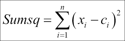
The sum of squares from each of the clusters is computed and then added up to compute the total within-group sum of squares for the dataset. The objective here is to minimize the within-group sum of squares total.
- Grouping based on minimum distance: The K-means syntax and explanation for the arguments are as follows:
    kmeans(x, centers, iter.max = 10, nstart = 1,

    algorithm = c("Hartigan-Wong", "Lloyd", "Forgy",

    "MacQueen"), trace=FALSE)
x
Numeric matrix of data, or an object that can be coerced to such a matrix (such as a numeric vector or a data frame with all numeric columns)
centersEither the number of clusters, say k, or a set of initial (distinct) cluster centers. If it's a number, a random set of (distinct) rows in x is chosen as the initial centers.
iter.maxThe maximum number of iterations allowed.
nstartIf the center is a number, how many random sets should be chosen?
algorithmCharacter. This may be abbreviated. Note that
"Lloyd"and"Forgy"are alternative names for one algorithm.Table 1: The description for the K-means syntax
    > #Kmeans Clustering

    > library(cluster);library(cclust)

    > set.seed(121)

    > km<-kmeans(r_df_scaled,centers=4,nstart=17,iter.max=50000, algorithm =
    "Forgy",trace = T)
The scaled dataset is used to create clusters, with four clusters and 17 initial starting points. Given the 50,000 iterations with the Forgy algorithm, the following results are obtained from the model:
    #checking results
    summary(km)
    Length Class Mode
    cluster 440 -none- numeric

    centers 24 -none- numeric

    totss 1 -none- numeric

    withinss 4 -none- numeric

    tot.withinss 1 -none- numeric

    betweenss 1 -none- numeric

    size 4 -none- numeric

    iter 1 -none- numeric

    ifault 0 -none- NULL

    > km$centers

    Fresh Milk Grocery Frozen Detergents_Paper Delicassen

    1 0.7272001 -0.4741962 -0.5839567 1.54228159 -0.64696856 0.13809763

    2 -0.2327058 -0.6491522 -0.6275800 -0.44521306 -0.55388881 -0.57651321

    3 0.6880396 0.6607604 0.3596455 0.02121206 -0.03238765 1.33428207

    4 -0.6025116 1.1545987 1.3947616 -0.45854741 1.55904516 0.09763056

    > km$withinss

    [1] 244.3466 324.8674 266.3632 317.5866
The following code explains how to attach cluster information with the dataset and the profiling of various clusters with their respective group means:
    > #attaching cluster information

    > Cluster<-cbind(r_df,Membership=km$cluster)

    > aggregate(Cluster[,3:8],list(Cluster[,9]),mean)

    Group.1 Fresh Milk Grocery Frozen Detergents_Paper Delicassen

    1 1 16915.946 2977.868 3486.071 6123.576 558.9524 1320.4940

    2 2 8631.625 2312.926 3231.096 1434.122 799.2500 660.5957

    3 3 16577.977 7291.414 9001.375 2534.643 2145.5738 2425.0954

    4 4 5440.073 9168.309 15051.573 1402.660 6254.0670 1283.1252
Now, let's look at visualization of the groups/clusters using a scatter plot:
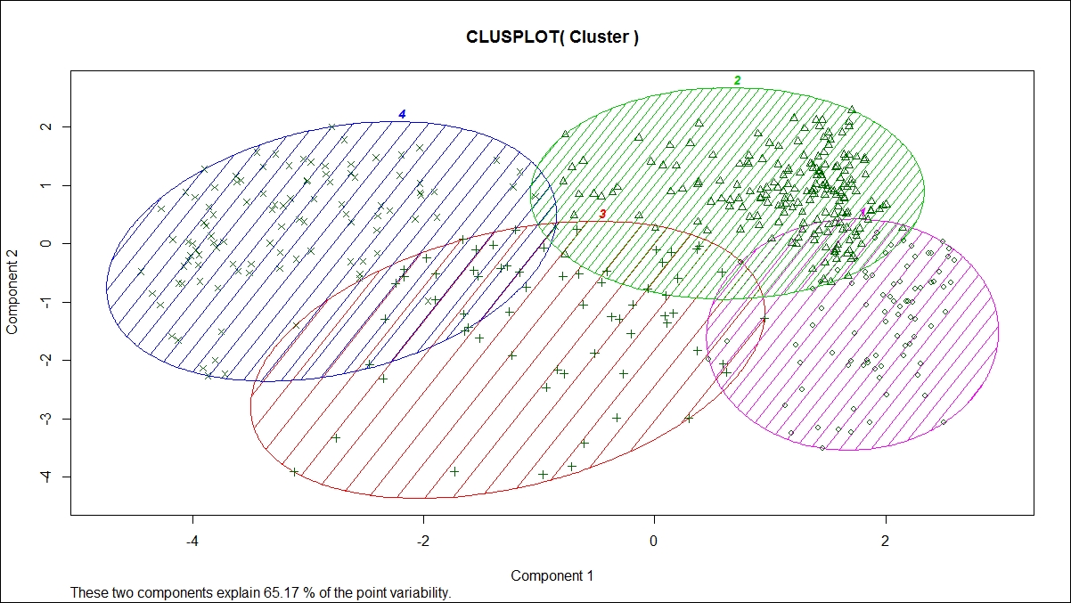
From the preceding graph, we can see that all the four clusters are overlapping each other to a certain extent; however, the overall objective of a clustering exercise is to come up with non-overlapping groups. There are six variables; hence, six dimensions represented in a two-dimensional space show 65.17% variability explained by two components. This is acceptable because the degree of overlap is less. If the degree of overlap is more, then post clustering, the similar groups can be merged as part of a profiling exercise. Profiling is an exercise performed after K-means clustering to generate insights for business users; hence, while generating insights, similar groups can be merged.
- Predicting cluster membership for new data: Once the K-means clustering model is created, using that model, cluster membership for a new dataset can be created by using the following predict function:
    > #Predicting new data for KMeans

    > predict.kmeans <- function(km, r_df_scaled)

    + {k <- nrow(km$centers)

    + d <- as.matrix(dist(rbind(km$centers, r_df_scaled)))[-(1:k),1:k]

    + n <- nrow(r_df_scaled)

    + out <- apply(d, 1, which.min)

    + return(out)}
For the same dataset, we can predict the cluster membership, and the actual cluster membership versus the predicted cluster membership can be represented in the following table:
    > #predicting cluster membership

    > Cluster$Predicted<-predict.kmeans(km,r_df_scaled)

    > table(Cluster$Membership,Cluster$Predicted)

    1 2 3 4

    1 84 0 0 0

    2 0 188 0 0

    3 0 0 65 0

    4 0 0 0 103
- Implementing K-means in live applications: For implementation of K-means clustering with any other statistical software and web applications, PMML script can be used. PMML stands for Predictive Model Markup Language, which is recognized as an industry standard for deploying predictive models:
    #pmml code

    library(pmml);

    library(XML);

    pmml(km)
When we save a model in PMML format, it prepares an XML script for the model where the model parameters are embedded in the script. It is written in such a way that any other external statistical software can read the model.
There are two different ways of implementing the hierarchical clustering algorithm, but one thing is common; both use a distance measure to estimate the similarity between cluster members:
- Agglomerative method: Bottom-up approach
- Divisive method: Top-down approach
To perform hierarchical clustering, the input data has to be in a distance matrix form. The method selected has to be from one of "single", "complete", "average", "mcquitty", "ward.D", "ward.D2", "centroid", or "median".
The hierarchical algorithm follows these steps:
- Start with N singleton clusters (nodes) labeled −1, . . . , −N, which represent the initial set of input points.
- Find a pair of nodes / cluster with minimal distance among all pairwise distances using a distance function.
- Combine the two nodes into a new node and remove the two old nodes. The new nodes are labeled consecutively 1, 2, . . ..
- The distances from the new node to all other nodes are determined by the method parameter.
- Repeat N − 1 times from step 2 until there is one big node that contains all original input points.
If the method chosen to perform hierarchical clustering is ward, then the distance measure to be used for clustering is Euclidean. The following code shows how to perform agglomerative hierarchical clustering:
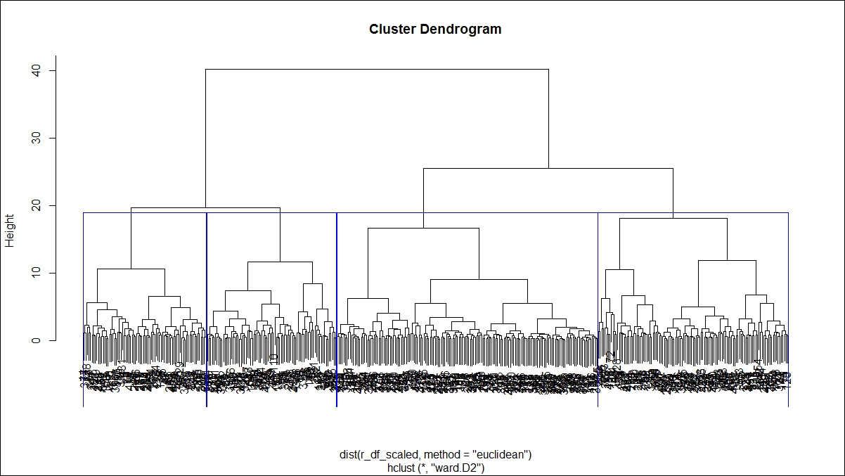
> hfit<-hclust(dist(r_df_scaled,method = "euclidean"),method="ward.D2")

> par(mfrow=c(1,2))

> plot(hfit,hang=-0.005,cex=0.7)

> hfit<-hclust(dist(r_df_scaled,method = "manhattan"),method="mcquitty")

> plot(hfit,hang=-0.005,cex=0.7)

> hfit<-hclust(dist(r_df_scaled,method = "minkowski"))

> plot(hfit,hang=-0.005,cex=0.7)

> hfit<-hclust(dist(r_df_scaled,method = "canberra"))

> plot(hfit,hang=-0.005,cex=0.7)
Here is the first dendrogram graph:
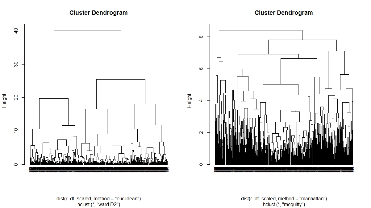
Here is the second dendrogram graph:
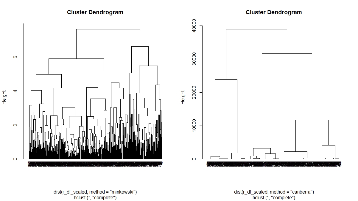
Various methods are used to show how to perform agglomerative hierarchical clustering in the preceding two dendrogram graphs. The parameter method is one of the strings single, centroid, median, ward, and the argument method is one of the strings single, complete, average, mcquitty, centroid, median, ward.D, ward.D2. Each method is different. Single linkage uses the smallest minimum pairwise distance to merge two clusters. Complete linkage uses the similarity between the dissimilar objects in two different clusters. Likewise each method has a unique way to compute the similarity between different clusters:
> summary(hfit)

Length Class Mode

merge 878 -none- numeric

height 439 -none- numeric

order 440 -none- numeric

labels 0 -none- NULL

method 1 -none- character

call 3 -none- call

dist.method 1 -none- character
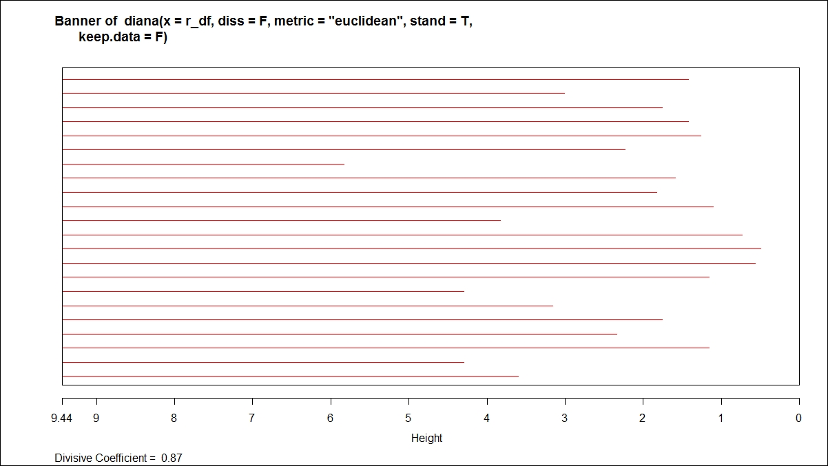
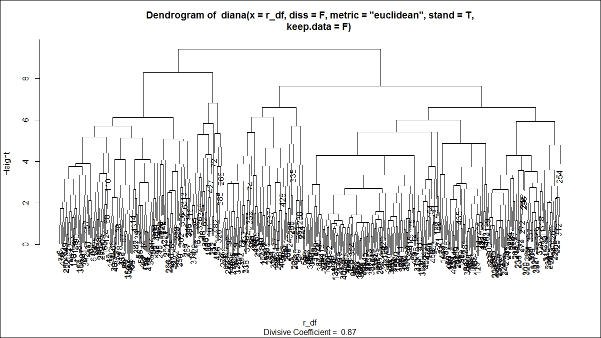
Divisive hierarchical clustering can be performed using the diana function from the library cluster. The syntax is shown as follows:
diana(x, diss = inherits(x, "dist"), metric = "euclidean", stand = FALSE,

keep.diss = n < 100, keep.data = !diss, trace.lev = 0)
To apply the diana function, the input data should be in matrix or dataframe type. The diana function accepts both a distance matrix as well as a dataframe as an input. There is a logical flag argument meant to control the input structure to the function. The metric argument is a character string specifying the metric to be used to calculate distance; it has two options, "euclidean" and "manhattan". Euclidean distances are root sums of squares of differences and manhattan distances are the sums of absolute differences, for which the mathematical formula has already been explained in this chapter. If x, the input dataset, is already a dissimilarity matrix, then this diss argument will be ignored from execution. The argument stand if takes the value as true, this implies that the raw dataset is used and further the distance matrix needs to be created.
The diana function constructs a hierarchy of clusters, as the name suggests, starting with one large cluster containing all observations. Clusters are divided until each cluster contains only a single observation. At each hierarchy, the cluster with the largest diameter based on the distance from the cluster center to the outermost data point as measured by the distance function is selected:
dfit<-diana(r_df,diss=F,metric = "euclidean",stand=T,keep.data = F)

summary(dfit)

plot(dfit)
The plot command on divisive clustering provides two graph options, a banner indicating the divisive coefficient and a dendrogram displaying the tree structure:
For the hierarchical clustering algorithms, one additional step is to cut the dendrogram tree structure into a finite group of clusters so that the results from various clustering methods can be compared. The following function is used to cut the tree structure:
> #cutting the tree into groups

> g_hfit<-cutree(hfit,k=4)

> plot(hfit)

> table(g_hfit)

g_hfit

1 2 3 4

77 163 119 81

> rect.hclust(hfit,k=4,border = "blue")
This graph shows the tree structure:
There is a library in R known as mclust that provides Gaussian finite mixture models fitted via EM algorithm for model-based clustering, including Bayesian regularization. In this section, we discuss the syntax for Mclust and the outcome, and the rest of the results can be analyzed using profiling information. The model-based approach applies a set of data models, the maximum likelihood estimation method, and Bayes criteria to identify the cluster, and the Mclust function estimates the parameters through the expectation maximization algorithm.
The Mclust package provides various data models based on three parameters: E, V, and I. The model identifiers use the three letters E, V, and I to code geometric characteristics such as volume, shape, and orientation of the cluster. E means equal, I implies identity matrix in specifying the shape, and V implies varying variance. Keeping in mind these three letters, there is a set of models that is by default run using the mclust library, and those models can be classified into three groups such as spherical, diagonal and ellipsoidal. The details are given in the following table:
|
Model code |
Description |
|
|
Spherical, equal volume |
|
|
Spherical, unequal volume |
|
|
Diagonal, equal volume and shape |
|
|
Diagonal, varying volume, equal shape |
|
|
Diagonal, equal volume, varying shape |
|
|
Diagonal, varying volume and shape |
|
|
Ellipsoidal; equal volume, shape, and orientation |
|
|
Ellipsoidal, equal volume and shape |
|
|
Ellipsoidal, equal shape |
|
|
Ellipsoidal' varying volume, shape, and orientation |
Table 2: Model description using finite mixture approach
Now let's use the Mclust method of doing clustering and grouping of observations based on the E, V, and I parameters:
> clus <- Mclust(r_df[,-c(1,2)])

> summary(clus)

----------------------------------------------------

Gaussian finite mixture model fitted by EM algorithm

----------------------------------------------------

Mclust VEI (diagonal, equal shape) model with 9 components:

log.likelihood n df BIC ICL

-23843.48 440 76 -48149.56 -48223.43

Clustering table:

1 2 3 4 5 6 7 8 9

165 21 40 44 15 49 27 41 38
From the preceding summary, there are nine clusters created using the VEI model specification and the BIC is lowest for this model. Let's also plot all other model specifications using a plot:
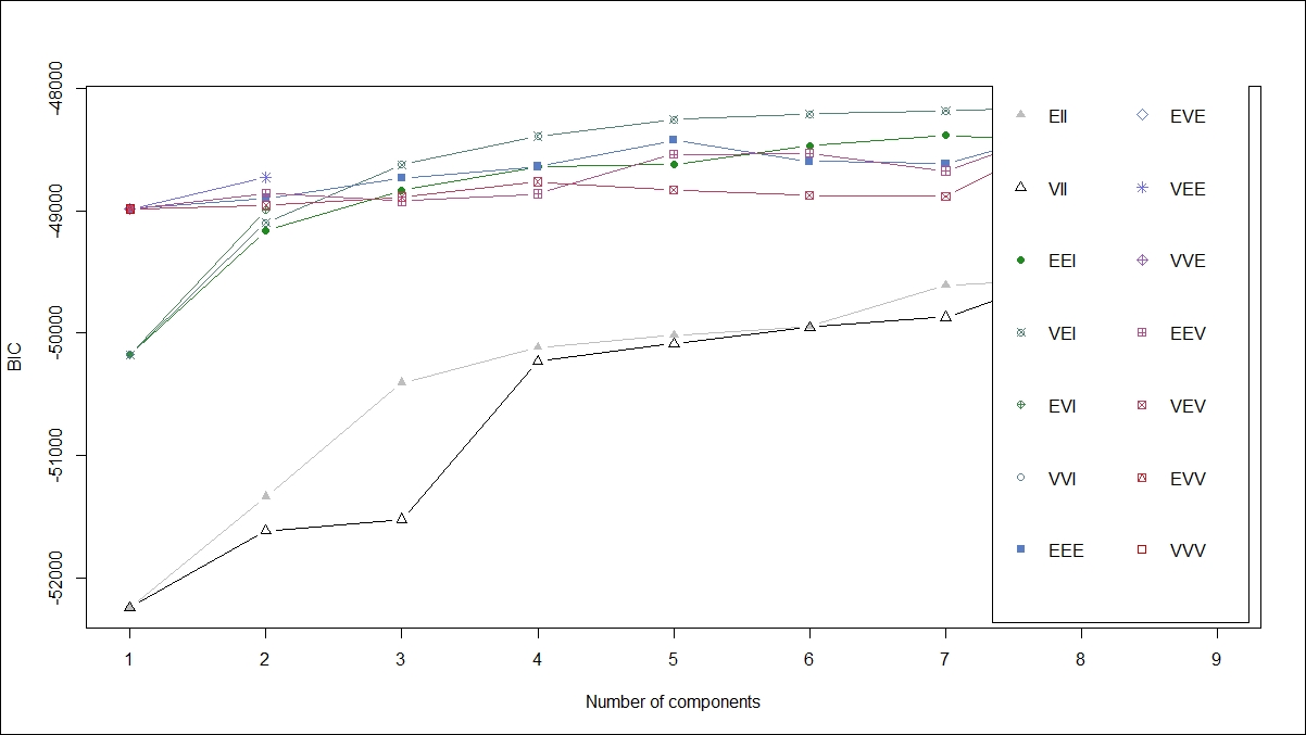
From the preceding graph, it is clear that the VEI model specification is the best. Using the following code, we can print the cluster membership as well as the number of rows in each of the clusters:
# The clustering vector:

clus_vec <- clus$classification

clus_vec

clust <- lapply(1:3, function(nc) row.names(r_df)[clus_vec==nc])

clust # printing the clusters
Using the summary command with parameter is true, mean, variance and probability for each variable we can compute:
summary(clus, parameters = T)
Self-organizing map (SOM) is another approach to clustering; it uses the visual method of representing data. SOM is basically used to derive unique nodes. SOM creates a network structure where the data objects would be connected by nodes and edges. Using those nodes, the similarity between different objects can be drawn to create clustering solutions. The kohonen library contains the SOM function:
> library(kohonen)

> som_grid <- somgrid(xdim = 20, ydim=20, topo="hexagonal")

> som_model <- som(r_df_scaled,

+ grid=som_grid,

+ rlen=100,

+ alpha=c(0.05,0.01),

+ keep.data = TRUE,

+ n.hood="circular")

plot(som_model, type="changes",col="blue")
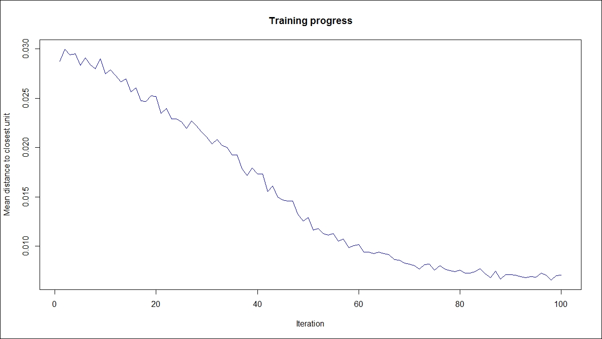
The preceding graph explains how the mean distance to the closest unit changes with increase in the iteration level:
> plot(som_model, type="count")
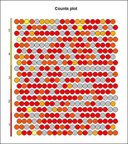
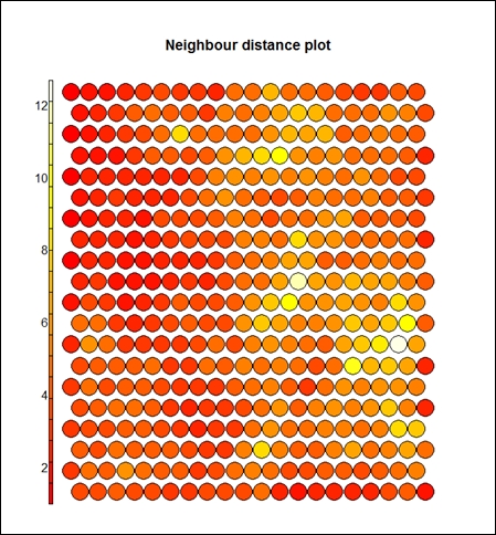
The preceding graph displays the counts plot using the SOM approach. The following graph displays the neighbor distance plot. The map is colored by different variables and the circles with colors denote where those input variables fall in n-dimensional space. When the plot type is counts, it shows the number of objects mapped to individual units. The units in gray color indicate empty. When the type is distance neighbors, it shows the sum of distances to all immediate neighbors. This is shown in the following graph:
> plot(som_model, type="dist.neighbours")
> plot(som_model, type="codes")
Finally, the next graph displays the code using all the variables:
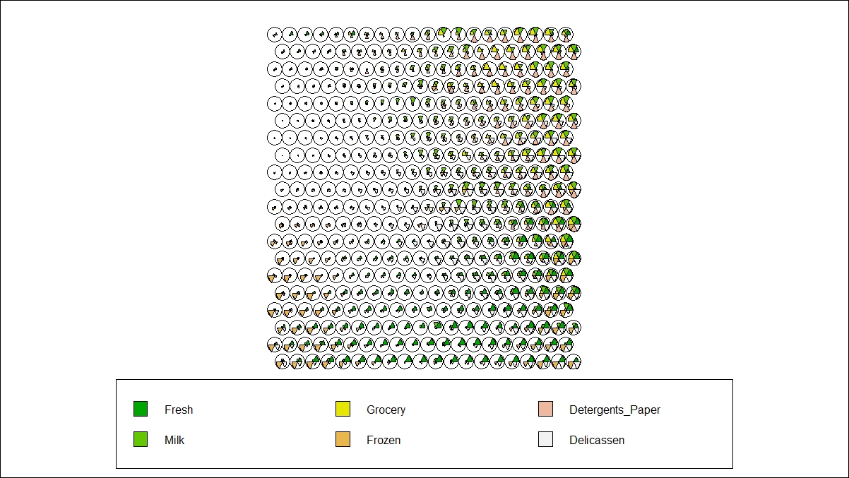
In R, the kohonen library is used to create self-organizing maps using hierarchical clustering. When the type of graph is codes, as it is shown in the preceding graph, this shows the code book vectors; each color indicates a feature from the input dataset. The preceding results and graphs show how to create a clustering solution and how clustering can be visualized using the SOM plot function. SOM is a data visualization process used to show similar objects in a dataset based on input data vectors. Hence, the conclusion from the results would be how clusters or segments can be created by visual inspection.
Here are some of the advantages and disadvantages of various clustering methods:
For K-means clustering:
|
Merits and demerits of K-means clustering | |
|
It is simple to understand and easy to interpret |
It is not based on robust methodology. The big problem is initial random points |
|
It is more flexible in comparison to other clustering algorithms |
Different random points display different results. Hence, more iteration is required. |
|
Performs well on a large number of input features |
Since more iteration is required, it may not be efficient for large datasets from a computational efficiency point of view. It would require more memory to process. |
For SOM:
|
Merits and Demerits of SOM | |
|
Simple to understand visually |
Only works on continuous data |
|
New data points can be predicted visually |
Difficult to represent when the dimensions increase |