
Chapter 6
Going Beyond Beta and Launching Your Site
IN THIS CHAPTER
 Figuring out what you must know before publishing your website
Testing your site for form and function
Trying before flying
Launching the site
After taking the trouble to design a site, fill it with quality content, and find the perfect place to host it, you would think that that’s the end of the story. We don’t want to disappoint you, but you have to deal with another major phase before you launch.
In this chapter, we break this final stage into smaller segments to make it easy to follow. For one moment, let us summarize what all those segments mean in layman’s terms: Test, test, and test again. Then, and only then, blast off!
Some Things to Know Before You Start Uploading
Both launching and uploading your site are terms used to represent the point when you finally make a site viewable by the public over the Internet. Before you upload your site for the world to see, though, it should be fully functional. Keep in mind, there may be some plug-ins, features, or backend functionality that may not fully work until your website is live for the universe to see, but these components should be the exception, not the rule. Your site design and content should be complete, your navigational tools should work properly, and all parts of your website, even the smallest parts and pieces, must be in place and working (or ready to start working!).
Okay, you can throw caution to the wind and launch an incomplete site. We don’t advise it, though. Why not? Doing so isn’t professional, and your customers will become easily frustrated when form falls short of function.
 An incomplete site diminishes your business’s credibility.
A haphazardly constructed and prematurely launched website can cause you to lose customers. If a section or feature of your site isn’t fully developed or functional, frustrated customers may never bother coming back again.
If you take away anything from this chapter, remember these two points:
- Fully complete your site before launching it.
- Make darn sure that every element works.
You should know about a few other helpful concepts before launching:
- Little details count. Bring out the magnifying glass when you’re reviewing your site for mistakes before launching. Check for misspellings, broken links, malfunctioning applications and widgets, and other problem points.
- Some functions are limited until after the launch. As we mention, a few features might function fully only after your site is live. For instance, forms frequently can be activated only after the site is up for good. These components should still be in place and ready to test once you launch. Remember to check all forms after the site goes live and correct problems immediately.
- Third-party data takes time. If your site must integrate with any third-party applications or widgets, or you use a newsfeed or syndicated content or another type of data from outside sources, the application might not be instantly available when the site launches. Your site might have to wait several hours or even a full day before it is entered into a customer database, the switch is flipped, and the site goes live. If the information isn’t accessible after two business days, contact the service provider to report the problem.
- Rankings aren’t immediate (or guaranteed). After your site goes live, you can submit it to be reviewed and possibly included in various search engines. (We go into the art of optimization in detail in Book 6, Chapter 6.) Right now, all we ask is that you remember that it takes a while for a search engine to scan and rank your site after it’s up, so don’t expect it to show up in the search engines right away. Even after your site is spidered, or reviewed, by the search engines, it may not appear anywhere near the top 100 listings. Outside of any advertising or promotion, initially, only people who type your URL in the address field or your company name in a search engine may be able to find your site.
- Automated web builders are different from designers. If you launch (or your web designer launches) your site, it’s immediate. In other words, all the files are uploaded to the server at one time. Within minutes, you’re finished and the site is online. With some automated web builders or template programs, you might be required to publish your site page by page to the Internet rather than upload a complete file. You can remove a page later if you see a mistake. Be careful, though: Correcting problems to buttons or to the site’s menu bar is sometimes difficult after the site is published. Be sure to account for different timelines for publishing a site or pages in a site.
Here’s one last thing you should know: Sites look different to different people. We’re not talking about personal style preferences. Instead, realize that the code or language used to design your site appears differently when it’s viewed with various browsers. Your job is to test your content with every browser you can get your hands on and minimize the differences so that the site looks its best in any browser. In the next section, we suggest ways you can test for optimal conditions before launching your site.
Taking the Compatibility Test: Testing Screen Resolutions, Browsers, and Platforms
Compatibility testing is the fun part of launching a site — if the process doesn’t require code changes to improve the way your site is displayed on various devices. Otherwise, this testing might be tedious because any slight variation between code and the way each browser interprets the code can make a noticeable difference on the screen. Even small differences can lead to big issues when it comes to website usability and customer experience.
People can view your site in many ways, and it’s up to you to make sure that it looks good and functions well in the most popular browsers and devices. Many free and low-cost tools make it easy to check your site’s compatibility in different versions of various browsers and devices, including mobile devices, such as Android, iPhone, and the iPad or other tablets. For example, we used the testing tools at SauceLabs to test how a website appears in a popular browser (see Figure 6-1) and on an Android phone (see Figure 6-2). Sometimes the differences can be subtle, such as how much information appears on a typical screen. If your site is not optimized for mobile devices, however, the differences can be extreme.
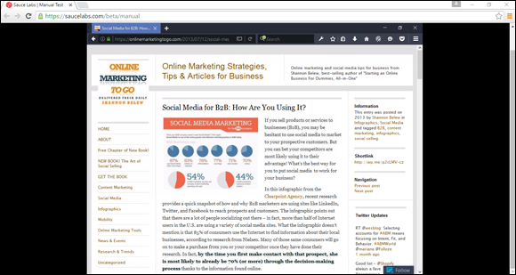
FIGURE 6-1: Compare your site in more than one browser and device.

FIGURE 6-2: When testing for mobile compatibility, don’t forget to check both iPhone and Android displays.
 It’s critical that your website is designed to be compatible on mobile devices. That’s because in 2015, Google updated its search algorithm to focus on “mobile friendly” sites. Dubbed “mobilegeddon” within the search industry, Google made it clear that websites should be easily viewable on mobile devices, such as smartphones. Those who didn’t comply would see their website rankings drop if a site didn’t meet Google’s “mobile friendly” test. When your site is ready, make sure it complies with the mobile viewing standards. Take Google’s “mobile friendly” test at
 www.google.com/webmasters/tools/mobile-friendly.
Checking it out
How do you check for browser discrepancies? The obvious answer is to install every possible browser (or at least the mainstream ones) on your computer and run a trial version of your site on each one. Because you can download browsers for free, the only cost to you is your time. However, you could spend weeks manually checking hundreds of different browser editions. Instead, use a testing tool. For a small fee, tools such as GhostLabs (www.vanamco.com/ghostlab) test for browser compatibility and other functionality important to the overall user experience, such as links, downloads and forms. Free tools, such as Browserling (www.browserling.com), also quickly test for browser compatibility.
No matter which tool you use, look for glaring inconsistencies that make your information difficult to read, prevent images from loading, or omit information completely.
Another issue to test for is screen resolution, or how your site looks in different resolution settings. (Don’t confuse this term with the physical measurement of your monitor’s screen.) By resolution, we mean the number of pixels (or miniscule dots) that make up an image on the computer screen. The current most commonly used resolution settings are 1366 x 768 and 1920 x 1080, but there are many more that must be considered. Within each resolution is a designated amount of viewable space, which can affect how your website looks on a computer. Computer users can choose which resolution to use on their computers.
With the emphasis on mobile-friendly design and the need to meet viewer’s preferences no matter what type or size of device they use, many websites now use responsive design. This involves a type of code that allows the website to automatically “respond” to the type of device it’s being viewed in and essentially resize itself to fit the device. We discuss responsive design in more detail in Chapter 2 of this minibook.
Testing on Mac, Windows, or whatever
If checking for browser compatibility and screen resolution isn’t enough already, another major element is involved in testing your site. You have to test your site on different operating systems. For example, you might wonder what your site looks like using Macintosh OS X when you designed it on a PC using Windows 10. And we haven’t even mentioned Linux!
Keeping people in mind
Even if you know the basic information to test when you’re launching your site, you always have to consider a growing list of issues. For instance, your site should be accessible for viewers with disabilities, according to the World Wide Web Consortium (W3C) Web Content Accessibility Guidelines (WCAG) and other government regulations. Complying with these guidelines involves using slightly different coding, color contrasts, and text options for images, for instance.
 Web-based services, such as CynthiaSays (
www.cynthiasays.com) or WAVE (http://wave.webaim.org), can quickly scan your site to confirm accessibility. Both services check the code behind your design as well as the viewable areas to check for proper functionality according to WCAG standards.
Although you might not want to hear this advice right now, you should routinely test your site for these and other issues, long after you pass the initial launch stage. Keeping your site current and easy to use for the largest possible number of people is standard in the world of online business.
Taking a Trial Run
When a major company releases a software program, game, or website, it often has a limited distribution in a beta version. Beta means that the work is in test mode and is subject to change. A beta test, or a product in beta mode, is typically released to a large segment of the general public. As for your site, we suggest showing a beta version to a limited group of users in a trial run.
You can push your trial site live (make it available to the public) and not worry about lots of people finding it because it takes search engines a little bit of time to index the site. However, to be safe, you may prefer to keep the trial version a bit more private and difficult to find so that you can continue testing and making changes. Simply place all the HTML files for your site under a subfolder of your domain, such as www.mysitenamehere.com/testing/index.html. Google also provides some great tools and information on when and how to index your site and how to remove a URL from the search engine; check out Google Webmaster Tools, at www.google.com/webmasters. Or try Bing Webmaster Tools at www.bing.com/toolbox/webmaster.
These users include (ideally) friends, family members, and a few prospective customers who are willing to provide you with honest feedback. Upload the site and run a live trial version for a day or two. Everyone then has a chance to visit the site several times before you take it down again for final changes.
Your beta users should be on the lookout for common errors you might have missed, features or links that don’t work correctly, videos and graphics that load improperly — or not at all — and the general appearance and overall ease of use of the site. (For instance, the site should be intuitive to visitors, and the names of the page links and buttons must make sense to other people, not just to you.)
Three, Two, One — Take Off!
NASA used to launch its space shuttle missions at certain times of the day and under the most forgiving weather conditions. Although we guarantee that the weather outside isn’t a concern for your launch, certain times are better than others for sending your site out on the Net.
Particularly when you’re using a freelance website designer, you should have input about when your site launches. Because that person usually sends the files to the server on your behalf, request that your site be launched early in the week. That way, if a problem surfaces, you have plenty of time during the workweek to fix it. Frustration is quick to set in when you launch a site on Friday afternoon and shortly thereafter you discover a problem that you have to live with for the entire weekend.
When you use an outside developer, you’re asked to sign a waiver when the project is finished. The waiver says that your site is accurate and that all requested changes were made. You get a sense of finality when your site comes off a project-management list. Sign the waiver only when you’re completely satisfied. The web developer is then released from additional work after the site is launched. If your provider charges for maintenance (or changes) to the site, the signed waiver signals that the provider can switch you from the development stage to the web maintenance stage, which can cost you.
Avoid launching the day before a long holiday weekend, regardless of whether you or someone else designs your site. Of course, larger websites might find that launching a site over a holiday is advantageous. The slower period gives the company an extended shot at a trial run — and one more opportunity to correct errors. If a site has been well marketed, the opposite effect can occur: It can be a hit by a large amount of traffic because more people are home and spending time online. However, unless you spend a lot of money and effort investing in prelaunch publicity and advertising, high traffic flow shouldn’t be an issue for you at the beginning — holiday or not.
Nothing has to be forever on the web. If you discover a mistake after your website goes up, don’t panic. You can easily make a correction. The web is certainly not static, so updates are usually a snap.
Plenty of excitement should accompany your site’s sendoff to the web. This major accomplishment is the start of something potentially lucrative. Celebrate!