
Duotone and Tritone Effects
Duotone was a printing process that created rich monochromatic imagery using two colors or inks—with black being one of the colors. Each color was used to ink a separate plate. The plates were pressed in sequence in perfect register to create the printed monochromatic image on the paper.
As you probably imagine, tritone printing involves creating monochromatic imagery with black ink and two other colors. Why stop with three? It’s perfectly possible—although expensive and anachronistic—to create monochromatic imagery with four inked plates (called a quadtone). How about that? You can use four colors, and still end up with something that is “seen” as black and white. Note that—in the case of a quadtone—these are not process colors, they are spot colors. In other words, the four colors are not used in combination to create a complete spectrum of colors. The inks are used one at a time on four different plates.
Today, you won’t find much authentic duotone, tritone, or quadtone printing—except in a few specialized fine art print making ateliers. But you will find a mechanism for simulating this process from grayscale images in Photoshop.
Converting your RGB images to grayscale and then converting the grayscale images to duotone or tritone can be a way to produce rich monochromatic prints using a modern inkjet printer. However, making fine art prints is beyond the scope of this book. But I do use the Photoshop duotone functionality for another reason: to add an effect to my monochromatic imagery where it is appropriate. Using the duotone effect this way is essentially a digital simulation of the old printing process. Probably the effect that is closest to this is split toning (see pages 202–205).
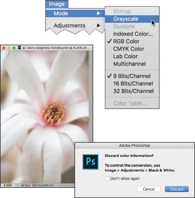
Step 1: Start by converting your photo to grayscale (if it is not already in grayscale mode) by choosing Image ![]() Mode
Mode ![]() Grayscale from the Photoshop menu. A Photoshop dialog may appear, asking whether you want to discard color information. This is okay because your monochromatic image should not have any color information, so click Discard.
Grayscale from the Photoshop menu. A Photoshop dialog may appear, asking whether you want to discard color information. This is okay because your monochromatic image should not have any color information, so click Discard.
If your image is in 16-bit mode, you will need to convert it to 8-bit mode by choosing Image ![]() Mode
Mode ![]() 8 Bits/Channel. Otherwise, the Duotone option on the Image
8 Bits/Channel. Otherwise, the Duotone option on the Image ![]() Mode menu will be grayed out and unavailable.
Mode menu will be grayed out and unavailable.

Step 2: Choose Image ![]() Mode
Mode ![]() Duotone. The Duotone Options dialog will open.
Duotone. The Duotone Options dialog will open.
The Duotone Options dialog appears deceptively simple, but it is actually a powerhouse that hides a wide range of creative options.
If you check out the Preset drop-down list, you’ll find a large list of possible duotone, tritone, and quadtone combinations that you can use as a starting place for your effect. Though, my preference is to create my own color combinations. A few preset combinations are shown below.
Note that once you come up with an “ink” combination that works for you it can be saved and retrieved as a custom preset.
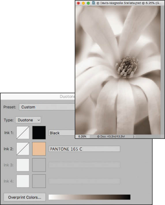
This is a duotone preset using black and tan inks.
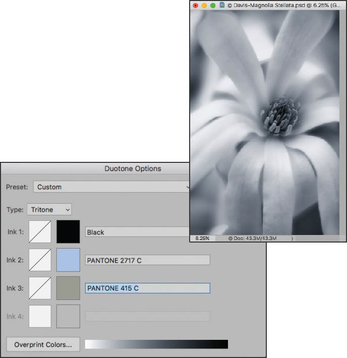
This is a tritone preset using black, blue, and sage inks.
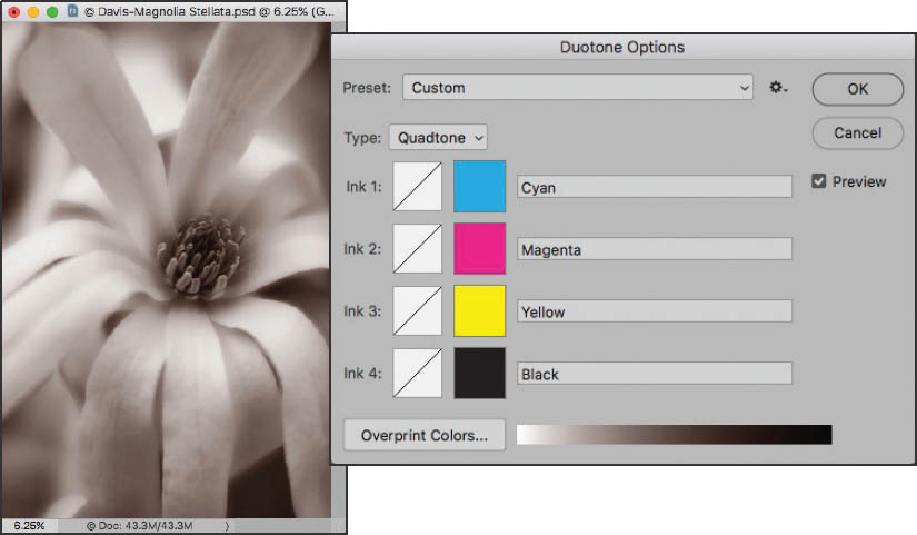
This is a quadtone preset using cyan, magenta, yellow, and black inks.
Don’t be confused by the CMYK inks. They are used here as spot colors, not as the process colors that make up the CMYK color space.

Step 3: For this example, create a tritone by selecting Tritone from the Type drop-down list. This will let you use three color inks for the effect.
The default setting in the Duotone Options dialog is Monotone with black as the ink choice. You can change this default color, if you wish, though of course your image will also change color.

Step 4: Leave the first ink choice as the default black. Notice that a color swatch of the black appears to the left of the color name.
Step 5: Click the color swatch for Ink 2 (which looks like a white square) to access the Color Libraries dialog.
There are many color libraries to choose from. It’s fun to look through the extensive list of colors available, but I’ll confess to a weakness for the Pantone metallic coated “book”—perhaps because I rarely get the chance to specify such an expensive option in “real life” on a duotone press.
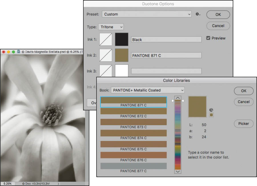
Step 6: The colors you pick should all be pretty different from one another for the most impact. For this example, choose Pantone 871 C from the Pantone metallic coated book. The ink is a metallic gold.

Step 7: Click OK to close the Color Libraries dialog and return to the Duotone Options dialog.
Step 8: Click the color swatch for Ink 3 to access the Color Libraries dialog.
Step 9: For the third ink in this example, choose Pantone 877 C from the Pantone metallic coated book. The ink is a metallic silver.
Now that the three inks have been selected, it’s time to control how the inks are applied by adjusting the curve setting for each ink.
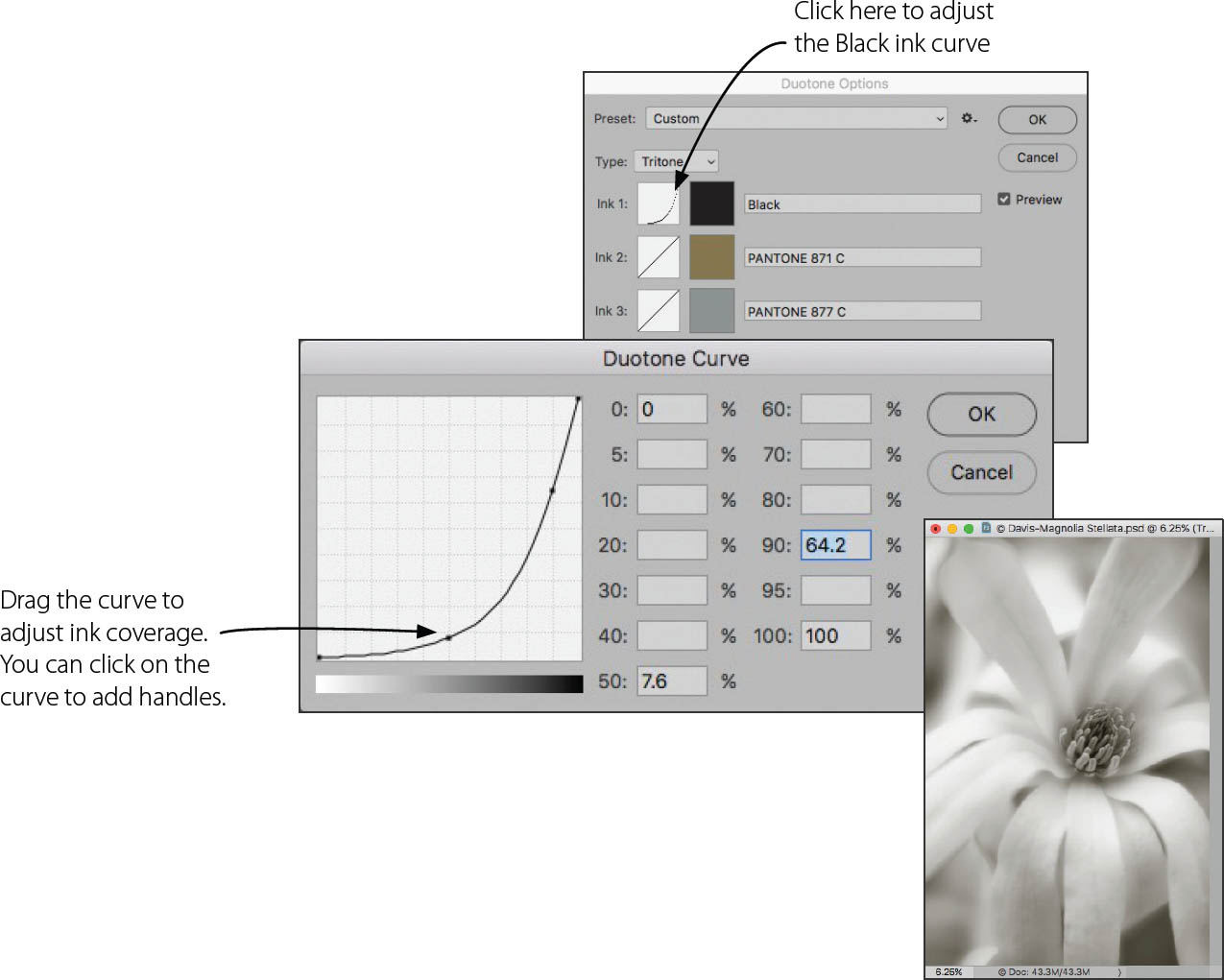
Step 10: To adjust the curve for the Black ink, click the curve box to the left of the Ink 1 color swatch. The Duotone Curve dialog opens.
Drag the curve line to adjust how the ink is used in the image. Moving the curve down and to the left decreases coverage of the ink in the tonal areas indicated by the bar at the bottom of the graph. Moving the curve up and right increases coverage.
There’s no substitute for experimenting, so play with the curve and see how it affects your image.
Step 11: Adjust the curves for Ink 2 and Ink 3 using the directions in Step 10.
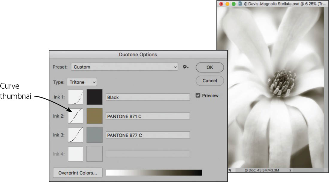
After you adjust the curve for each ink and close the Duotone Curve dialog, a thumbnail of the curve appears in the curve box associated with each ink.
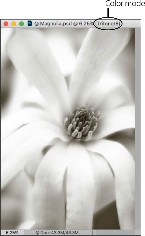
Step 12: When you are satisfied with the results, click OK to close the Duotone Options dialog. The color mode is shown in the title bar of the image.
Depending on what you plan to do with the photo, you may need to reconvert the image back to RGB or CMYK from the Duotone, Tritone, or Quadtone color mode. Once this reconversion has happened, the image can no longer be used for duotone printing with the “inks” you specified. Instead, the color model you select simulates the colors of the combined inks you specified for regular printing or display on the Web.

Star Magnolia—The Magnolia stellata, or star magnolia, is one of my favorite flowers and an ever popular magnolia variety. In this image of a magnolia blossom, I focused on the center of the flower with the idea of intentionally blurring the petals. Converting it to black and white, it seemed to me that it was a good candidate to experiment with multi-tone rendering.
Nikon D850, Lensbaby 85mm Velvet macro, 1/1000 of a second at f/1.8 and ISO 200, hand held; converted to monochrome with simulated tritone effect in Photoshop.