
Modern user interfaces allow people to interact with machines in a natural way within the context they are built upon. This is achieved through a wide variety of widgets (actors) designed with a specific purpose.
Having a well-cared interaction is also very important to immerse the user in your game experience.
Imagine the main menu for a shooter game with horror tinges where each and every detail counts: slightly lighted buttons with images, a nice gloomy font type for the main title, and a blunt gunshot sound when selecting the play option. The story doesn't end here because you must expand this environment to the settings screen where you might want to allow the user to change the volume through a custom-themed slider or set mutually-exclusive graphics options.
Libgdx provides you with a long list of customizable built-in widgets to save your valuable time, focusing your efforts on design. However, they are generic, so don't hesitate to implement your own version.
This recipe is mostly based on practical content. It is a good idea to take a look at the WidgetSample.java file from the samples-core project that comes with this book. You can import it through the Gradle plugin. If you need to do it from scratch, you can refer to Chapter 1, Diving into Libgdx. You will find the projects at [cookbook]/samples.
The Scene2D UI components extend the Actor class to acquire and expand its already explained functionality. You can easily frame them into two types:
Some of the components will require applying a user-defined style, which will vary according to the characteristics of the component. The style class will be contained within the widget class. So, you can access it using WidgetName.WidgetNameStyle.
Before creating any widgets, we need to set up Stage:
- The first step of this recipe is to initialize our
stage, which will serve as the parent of all components:Stage stage = new Stage(viewport, batch);
- In order for the
stageinstance to be able to capture events generated when interacting with the user, write the following:Gdx.input.setInputProcessor(stage);
In the next pages, you will find a complete tour through the built-in Libgdx UI components, their properties, and how to interact with them. These properties usually have self-explanatory names, but if you still have any queries, feel free to take a look at the Scene2D API at http://libgdx.badlogicgames.com/nightlies/docs/api/com/badlogic/gdx/scenes/scene2d/ui/package-summary.html.
You can also simply play around with them in code terms.
After your widgets are defined, do not forget to add them to the stage or a group of your choice that is already in the scene, as follows:
stage.addActor(image);
stage.addActor(label);
stage.addActor(button);
...
Label is the widget to use whenever you want to write any kind of text on the screen. You can set a style through the LabelStyle class where the font type must be specified while the font color and background image are optional. We can generate a label as follows:
- Define what font we are using:
BitmapFont font = new BitmapFont(Gdx.files.internal("data/font.fnt")); - Next, create the style instance:
Label.LabelStyle labelStyle = new Label.LabelStyle(font, Color.WHITE);
- Finally, call the
Labelconstructor and set a position within the screen (by default, items are placed at (0,0) local stage coordinates):label = new Label("This is a label", ls); label.setPosition(x,y);
Keep in mind that Libgdx will use a, by default, linear TextureFilter when changing font size (scaling).
As its name suggests, this widget will place a center-aligned image on the screen, by default. It can accept a Drawable, NinePatch, Texture, TextureRegion, or TextureRegionDrawable instance in the constructor. Only with the last one, Libgdx will keep the actor's properties (scale, rotation, and origin) when drawing.
Note
NinePatch permits drawing a texture in nine stretchable regions. In this way, they scale well for small sizes as well as big sizes. You can create your own NinePatch with the Android Draw 9-patch tool, which is available from http://developer.android.com/tools/help/draw9patch.html.
Drawable contains objects that know how to draw themselves at a certain rectangular size. Its bounds are stored along with its minimum size in order to determine the space it must take up in a specific scene.
TextureRegionDrawable is nothing more than a TextureRegion within a Drawable container.
The usage of this widget is easy:
- Instantiate the
Imageclass:Texture logo = new Texture(Gdx.files.internal("data/logo.png")); image = new Image(new TextureRegionDrawable( new TextureRegion(logo) )); - Place the image onto the screen with the
setPosition()method. This step will be omitted from now onwards because it's common for all classes extendingActor.
As you progress in this recipe, you will realize that you have multiple alternatives to choose from when including buttons in your game. This is the most general one.
It is a complex widget because it is internally implemented as a Table; an actor destined to organize elements on screen, which we will dive into later on. By its definition, you can infer that a button can contain other actors.
Button has no key properties, but you can specify a lot of optional details such as Textures or Drawables for checked, checkedOver, disabled, down, up, and over states through the ButtonStyle class, even the needed offset to press/release in both axes. In other words, you have a complete potpourri of options to contribute to the aforementioned game experience.
The resulting code for instancing a simple button can be as follows:
Texture actor = new Texture(Gdx.files.internal("data/button.png"));
Button.ButtonStyle buttonStyle = new Button.ButtonStyle();
buttonStyle.up = new TextureRegionDrawable(new TextureRegion(actor));
button = new Button( buttonStyle );
The following screenshot shows the example button:

The TextButton class extends Button, adding a text Label within its internal table. As a consequence, the style includes everything belonging to the LabelStyle and ButtonStyle properties:
- Start by defining the style, reusing the
BitmapFontinstance from theLabelexample:Texture actor = new Texture(Gdx.files.internal("data/button.png")); TextButton.TextButtonStyle tbs = new TextButton.TextButtonStyle(); tbs.font = font; tbs.up = new TextureRegionDrawable( new TextureRegion() ); - Finish by instancing the
TextButtonclass:textButton = new TextButton("TextButton", tbs);
The following screenshot shows the text button:

Changing a label for an image is the only difference between the ImageButton widget and the TextButton widget. This entails the inclusion of the ImageStyle and ButtonStyle properties within the ImageButtonStyle class.
It is a good idea to use this implementation when you want to place an icon over the button image.
The code is similar too. We can implement ImageButton as follows:
- Construct the
ImageButtonStyleproperty:Texture accept = new Texture(Gdx.files.internal("data/icon.png")); ImageButton.ImageButtonStyle ibs = new ImageButton.ImageButtonStyle(); // Background image ibs.up = new TextureRegionDrawable( new TextureRegion( actor) ); // Icon image ibs.imageUp = new TextureRegionDrawable( new TextureRegion(accept) ); - Instantiate the
ImageButtonclass:imageButton = new ImageButton(ibs);
The following screenshot shows the image button:

The fat brother in the Button family is a mixture of the previous two widgets preserving properties from both:
- As usual, define the style:
ImageTextButton.ImageTextButtonStyle itbs = new ImageTextButton.ImageTextButtonStyle();
itbs.font = font;
itbs.up = new TextureRegionDrawable( new TextureRegion( actor ) );
itbs.imageUp = new TextureRegionDrawable( new TextureRegion( accept ) );
- Create an object:
imageTextButton = new ImageTextButton("ImageTextButton", itbs);
The following screenshot shows the image-text button:

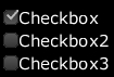
Multiple or mutually exclusive options (commonly known as radio buttons; refer to the There's more… section for more) can be achieved through the CheckBox class. It is internally implemented extending the TextButton class. In order to instantiate it, you must set a Drawable instance to the checkboxOff and checkBoxOn properties leaving checkboxOffDisabled, checkboxOnDisabled, and checkboxOver as optional.
The usage process would be as follows:
- Set the style properties:
checkBoxOn = new Texture( Gdx.files.internal("data/scene2d/checkBoxOn.png")); checkBoxOff = new Texture( Gdx.files.internal("data/scene2d/checkBoxOff.png")); CheckBox.CheckBoxStyle cbs = new CheckBox.CheckBoxStyle(); cbs.checkboxOn = new TextureRegionDrawable( new TextureRegion( checkBoxOn ) ); cbs.checkboxOff = new TextureRegionDrawable( new TextureRegion( checkBoxOff ) ); cbs.font = font; cbs.fontColor = Color.WHITE; - Create some new
Checkboxobjects through its constructor:checkbox = new CheckBox("Checkbox", cbs); checkbox = new CheckBox("Checkbox2", cbs);
The following screenshot shows the checkbox:
TextField is the widget to use whenever you need to get some input text from the user in a single line such as e-mail or password fields.
Selected text can be copied and pasted only under the desktop platform.
You must specify the font and fontColor properties, but it is a good idea to customize the background, cursor, disabledBackground, disabledFontColor, focusedBackground, focusedFontColor, messageFont, messageFontColor, and selection attributes to get a recognizable input appearance.
We can implement a password field as follows:
- Set the style:
TextField.TextFieldStyle tfs = new TextField.TextFieldStyle(); tfs.font = font; tfs.fontColor = Color.Black; tfSelection = new Texture(Gdx.files.internal("data/tfSelection.png")); tfBackground = new Texture(Gdx.files.internal("data/tfBackground.png")); tfCursor = new Texture(Gdx.files.internal("data/cursor.png")); // Blue background for selected text tfs.selection = new TextureRegionDrawable(new TextureRegion(tfSelection)); // White background for text input tfs.background = new TextureRegionDrawable(new TextureRegion(tfBackground)); // Cursor image tfs.cursor = new TextureRegionDrawable(new TextureRegion(tfCursor)); - Instantiate the component:
tf = new TextField("Enter password here"); - Set the input type:
tf.setPasswordMode(true); tf.setPasswordCharacter('*'), - Listen for the user input:
tf.setTextFieldListener( new TextFieldListener() {
  public void keyTyped (TextField textField, char key) {
    // Do whatever...
    // For example: Hide screen keyboard if visible
    if(key == '
')
      textField.getOnScreenKeyboard().show(false);
  }
});
The following screenshot shows TextField:
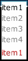
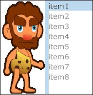
Commonly known as a listbox, this is a widget to display a sequence of strings, highlighting the selected one.
ListStyle needs font, fontColorSelected, fontColorUnselected, and selection to be defined while leaving it to the user whether or not to include a background. The usage process is as follows:
- Customize
ListStyle:List.ListStyle listS = new List.ListStyle(); listS.font = font; listS.fontColorSelected = Color.BLACK; listS.fontColorUnselected = Color.GRAY; listS.selection = new TextureRegionDrawable(new TextureRegion( tfBackground));
- Instantiate the component:
list = new List<String>(listS);
- Fill the container with the desired items:
Array<String> items = new Array<String>(); items.add("item1"); // One by one items.add("item2", "item3", "item4"); // Or once for all list.setItems(items); - Finally, as we have dynamically added content to the
Listwidget, we need to call thepack()method in order to size it and fit the text bounds:list.pack();
The following screenshot shows the List widget:

Whenever you have a static space but a dynamic number of items to show, consider using the ScrollPane widget where all internal properties are optional but interesting to define. We can implement ScrollPane as follows:
- In the same line as the rest, the first thing to do is customize the style:
ScrollPane.ScrollPaneStyle sps = new ScrollPane.ScrollPaneStyle();

Texture scroll_horizontal = new Texture( Gdx.files.internal( "data/scroll_horizontal.png" ));
Texture knob_scroll = new Texture( Gdx.files.internal(  "data/knob_scroll.png"));

// Background Image for each item
sps.background = new TextureRegionDrawable(new TextureRegion(tfBackground));
// Vertical Scroll container
sps.vScroll = new TextureRegionDrawable(new TextureRegion(scroll_horizontal));
// Vertical scroll current position knob
sps.vScrollKnob = new TextureRegionDrawable(new TextureRegion(knob_scroll));
- Select an
Actorto add the scrolling feature, for instance, aList, and instantiate the widget.Don't forget to call the
pack()method to adapt the size of thescrollPanewidget to its content:scrollPane = new ScrollPane(list2, sps); scrollPane.pack(); - Set the component's height/width in order to take advantage of scrolling:
scrollPane.setHeight((float) (scrollPane.getHeight()*0.4));
The following screenshot shows the ScrollPane widget:

The List widget needs a relatively decent space within the screen to display all items, even when combined with a ScrollPane widget. However, we will not always have such luxury. SelectBox works in the same way but it will only display the selected item, showing the rest on clicking/touching the item. I am pretty sure that you must have seen it before with the name of the drop-down list.
Its style class is a bit different because it contains two other styles inside apart from the typical properties. This peculiarity becomes mandatory to define as well as font, fontColor, and background.
The inner styles are the already used ListStyle along with ScrollPaneStyle. We can implement SelectBox as follows:
- The process starts by defining the style:
SelectBox.SelectBoxStyle sbs = new SelectBox.SelectBoxStyle(); sbs.listStyle = listS; sbs.scrollStyle = sps; sbs.background = new TextureRegionDrawable(new TextureRegion(new Texture(Gdx.files.internal("data/tfbackground.png")))); sbs.font = font; sbs.fontColor.set(Color.RED); - Fill
selectBoxwith the desired items:selectBox = new SelectBox<String>(sbs); selectBox.setItems(items);
- Size
selectBoxto bound the text:selectBox.pack();
The following screenshot shows the SelectBox widget:
Even though you already learned a way to implement this kind of UI component from scratch in Chapter 6, Font Rendering, Libgdx provides you with an out-of-the-box customizable progress bar.
It requires you to supply a background and a knob image. Nevertheless, you can also specify disabledBackground, disabledKnob, disabledKnobAfter, disabledKnobBefore, knobAfter, and knobBefore. Now, let's look at a practical example:
- Start by feeding
ProgressBarStyle:Texture progress_bar = new Texture(Gdx.files.internal("data/progress_bar.png")); Texture progress_bar_knob = new Texture(Gdx.files.internal("data/knob.png")); ProgressBar.ProgressBarStyle pbs = new ProgressBar.ProgressBarStyle(); pbs.background = new TextureRegionDrawable(new TextureRegion(progress_bar)); pbs.knob = new TextureRegionDrawable(new TextureRegion(progress_bar_knob)); - Then, instantiate the widget by passing the following to its constructor in the same order:
- Minimum and maximum value
- Size of each step in the progress
- Vertical (true) or horizontal (false) orientation
- Style
pb = new ProgressBar(0f, 100f, 1f, false, pbs);
- Whenever you know the current point in the progress, use the following:
pb.setValue(currentPoint);
The following screenshot shows the ProgressBar widget:
An example of a slider is a sound volume selector. It allows, for instance, the user to move a knob along a bar, focusing more on the audio output than on the actual minimum-maximum value of volume, in order to detect the desired point.
This component only has two attributes that you must specify: background and knob. Suspicious right? In fact, Slider is an extension of ProgressBar with all the consequences that it entails. In the following example, we will just focus on its exclusive properties:
- As usual, generate a slider style as follows:
slider_background = new Texture( Gdx.files.internal("data/scene2d/slider_background.png")); slider_knob = new Texture( Gdx.files.internal("data/scene2d/slider_knob.png")); Slider.SliderStyle ss = new Slider.SliderStyle(); ss.background = new TextureRegionDrawable(new TextureRegion(slider_background)); ss.knob = new TextureRegionDrawable(new TextureRegion(slider_knob)); - Instantiate the
Sliderwidget taking into account that its constructor is similar to the constructor of theProgressBarwidget.slider = new Slider(0f, 100f, 1f, false, ss);
The following screenshot shows the Slider widget:
There are some game genres, such as sports simulators, that usually do not fit gdx controllers as discussed in Chapter 4, Detecting User Input, so they must make use of a virtual touchpad.
Libgdx supports this widget with a circular movement area centered on its middle point. The background image must be specified, but it is recommended to define the knob image too.
Follow this process to create your own touchpad:
- Define the style:
Touchpad.TouchpadStyle ts = new Touchpad.TouchpadStyle();
ts.background = new TextureRegionDrawable(new TextureRegion(new Texture(Gdx.files.internal("data/touchpad_background.png"))));
ts.knob = new TextureRegionDrawable(new TextureRegion(new Texture(Gdx.files.internal("data/touchpad_knob.png"))));
- Instantiate the widget, specifying the dead zone radius where the knob position will not be changed:
touchpad = new Touchpad(10f, ts);
The following screenshot shows the example Touchpad:
The Stack widget is a container where widgets are placed on top of each other, sizing all of its content to its bounds. The following is an example implementation:
- Instantiate the class:
stack = new Stack();
- Add actors and set the desired size for the container:
//Add first actor
stack.add(button1);
stack.pack(); // Sizes stack to button1's bounds
//Add another actor
stack.addActorAfter(button1, label1);
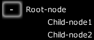
You can also organize your widgets hierarchically using the Scene2D Tree class, whose structure is composed of Tree.Node. Each of them has an icon and an actor, as well as zero or more children.
The mandatory properties of TreeStyle are the minus and plus images to expand or collapse the node. But it is also possible to decorate it with background, selection, and over images.
Next is an example implementation of its usage:
- Set properties for your custom style:
Tree.TreeStyle treeS = new Tree.TreeStyle(); treeS.plus = new TextureRegionDrawable(new TextureRegion(new Texture(Gdx.files.internal("data/plus.png")))); treeS.minus = new TextureRegionDrawable(new TextureRegion(new Texture(Gdx.files.internal("data/minus.png")))); - Instantiate the widget:
tree = new Tree(treeS);
- Create and add nodes:
Label rootNode = new Label("Root-node", ls); Label node1 = new Label("Child-node1", ls); Label node2 = new Label("Child-node2", ls); // parent tree.add(new Tree.Node(node1)); // children tree.getNodes().get(0).add(new Tree.Node(node1)); tree.getNodes().get(0).add(new Tree.Node(node2)); - Expand to make all nodes visible and update the widget's bounds:
tree.expandAll();
tree.pack();
The following screenshot shows the Tree widget:
This is a structural component to store two widgets distributed either horizontally or vertically and separated by a specified handler image. Our example will contain two images. We can implement
SplitPane as follows:
- Define
SplitPaneStyle:SplitPane.SplitPaneStyle splitPaneS = new SplitPane.SplitPaneStyle(); splitPaneS.handle = new TextureRegionDrawable(new TextureRegion(new Texture(Gdx.files.internal("data/divider.png")))); - Instantiate the widget, passing both the actors, the orientation (vertical true, horizontal false), and the style to its constructor:
splitPane = new SplitPane(caveman1, caveman2, false, splitPaneS);
The following screenshot shows the SplitPane widget:
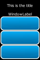
Sometimes you will want to have your own customized windows within your app. Scene2D provides you with a built-in solution internally implemented as an extension of the Table class that will attract the attention of one of the subsequent recipes.
You must define what font you are using for the title of the Window widget and, subject to the programmer's preference, specify background, stageBackground, and titleFontColor.
The process to create a very simple Window widget is as follows:
- Generate a new style:
Window.WindowStyle ws = new Window.WindowStyle();
ws.titleFont = font;
ws.titleFontColor = Color.WHITE;
- Instantiate the
Windowclass:window = new Window("This is the title", ws); - Add some extra padding at the top to make some space for the title:
window.padTop(50f);
- Add actors, for instance, a label and three random buttons. Every
rowcall will place subsequent actors into a new row whilecolspan(1)calls indicate that it will have one column:window.row().colspan(1); // 1 column row window.add(label); window.row().colspan(1); window.add(firstButton); window.row().colspan(1); window.add(secondButton); window.row().colspan(1); window.add(thirdButton);
- Use the
pack()method to fit the content inside the bounds:window.pack();
The following screenshot shows an example Window widget:
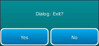
The Dialog widget is a specific kind of Window due to the extended relationship that connects them. You can add any widget to it. The dialog will close if an inner button is clicked. Two Table instances organize the content of a Dialog widget. The first one is the content table, which is intended for storing labels. The second one is the button table whose obvious mission is to contain buttons.
Dialog makes use of WindowStyle to receive any style:
- Create
WindowStyle:Window.WindowStyle ws2 = new Window.WindowStyle(); ws2.titleFont = font; ws2.titleFontColor = Color.WHITE;
- Instantiate
Dialog:Dialog dialog = new Dialog("Title", ws2); - We will disable clicks/touch on any other window/dialog apart from this by setting its modal property to
true. Moreover, it will have a background image:Texture dialog_background = new Texture(Gdx.files.internal("data/dialog_background.png")) dialog.setModal(true); //User can only interact with this window dialog.setBackground(new TextureRegionDrawable(new TextureRegion(dialog_background))); - Add a label so that the dialog shows a message:
dialog.getContentTable().row().colspan(1).center(); // 1 row with 1 centered column
dialog.getContentTable().add(message);
- Add two buttons created by you, for instance,
buttonYesandbuttonNo:dialog().row().colspan(2); // 1 row, 2 columns dialog.button(buttonYes); dialog.button(buttonNo);
- Pack the content as follows:
dialog.pack();
The following screenshot shows an example Dialog widget:
If you have run the example code for this recipe, you must have realized that you can interact with each widget on the screen in one way or another. This happens because every actor can add EventListeners to its functionality and set its behavior. The available Scene2D listeners are:
ActorGestureListener: This is fired when an actor is the subject of tap, long press, fling, pan, zoom, and pinch gestures.ChangeListener: This is a generic event that is fired whenever an actor receives some form of interaction.ClickListener: This is fired when the user clicks on the actor.DragListener: This is fired when mouse/finger dragging on an actor is detected.DragScrollListener: This is the same as the previous listener but will scroll through a scroll pane if needed.FocusListener: This is fired when losing or gaining focus.InputListener: This is a listener for touch, mouse, keyboard, and scroll inputs.TextField.TextFieldClickListener: This is a specificInputListenerfor text input. It can be useful to detect events such as typing or passing the cursor overTextField.TextArea.TextAreaListener: This is an extension of the previous listener.
A key method here from the Actor API is hit(), which returns the deepest touchable and visible actor where the interaction has occurred. Note that you can override it and decide when a hit is performed on your app.
Individual behavior is explained along with this recipe, but you can still add some cohesion between several actors. This is the case of the ButtonGroup class, which allows you to group buttons in order to get the radio button's functionality. Refer to the following sample code:
ButtonGroup bg = new ButtonGroup();
bg.add(checkbox, checkbox2, checkbox3);
bg.setMaxCheckCount(1);
bg.setMinCheckCount(0);