
It has been a long journey since you learned the basics of Scene2D, so you are now prepared for the fun part consisting of extending the library and generating your own content for personal projects or even for the community itself. With proper usage of the Skin class, you can perform a complete overhaul of your UI just by changing image assets. As you will know, software reuse becomes a booster in development companies so that you will not have to reinvent the wheel.
In this direction, you can easily create new widgets composed of simpler ones. Usually, the easiest way of approaching this is by extending a Table class and organizing inner widgets within it, but do not discard extending from WidgetGroup and using composition as a reliable alternative.
The possibilities for creating a new complex UI component are endless, but this recipe will cover a very simple and flexible level selector. The goal is being able to have a widget with a custom background, a level title, a descriptive image for the current level, left and right buttons to flow through the component, and a button to launch the game screen.
Do not forget to take a look at the sample projects from the [cookbook]/samples folder. You will need to import them correctly to your Eclipse workspace. Feel free to re-read Chapter 1, Diving into Libgdx, where the process is explained step by step.
The CustomWidgetSample.java and LevelSelector.java files contain all the source code that illustrates this recipe, so I highly recommend that you play around with them after your reading is done.
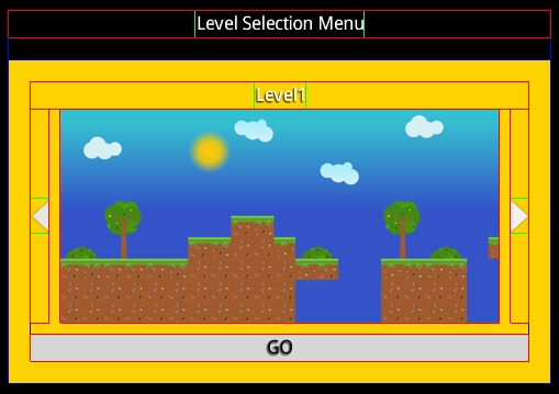
For you to have an idea of what you will have created at the end of this recipe, please take a look at the following screenshot:
To accomplish the goal of implementing our own widget, its creation and usage is explained step by step in the upcoming sections.
Make sure to start by following these instructions:
- Define your
LevelSelectorclass by extending theTableclass:public class LevelSelector extends Table { … } - Make sure to declare, if needed, an associated style, inner components, data containers, and auxiliary properties:
// Associated style
private LevelSelectorStyle style;
// Inner components
private Image buttonLeft, buttonRight;
private TextButton buttonGo;
// Data containers
private Array<Level> levels;
// Auxiliary properties
private int currentLevelIndex = 0; // current shown level
public float imageWidth = 400;// Normalized size for images
public float imageHeight = 195;
- Before getting your hands dirty with the real deal, you need to know the attributes for our custom style:
static public class LevelSelectorStyle { /* Optional */ public Drawable background; /* Must be defined */ public Drawable leftArrow, rightArrow; public TextButtonStyle textButtonStyle; … } - Another inner class will be contained within
LevelSelectorin order to store information (title and image) about each level:public static class Level { private Label title; private Image image; … }The trivial matter is to implement constructors, getters, and setters for the
Levelclass. Some ideas for the constructors are as follows:public Level(CharSequence level_name, Skin skin) public Level(CharSequence level_name, LabelStyle labelStyle) public Level(CharSequence level_name, Image image, Skin skin) public Level(CharSequence level_name, Image image, LabelStyle labelStyle)
Check the source code that comes along with this book if you have any doubts.
- It is a good idea to provide a wide selection of constructors for your
LevelSelectorwidget so that the user can determine which one fits their needs. Within our context, you can get the style through a skin, the raw style type, or even the separated properties that compose it. Another nonexclusive option is filling the container where we will store the levels in the constructor itself. Some of them are as follows:// Initialize data content and extract style from skin public LevelSelector(Array<Level> array, Skin skin) { super(skin); setStyle(skin.get(LevelSelectorStyle.class)); initialize(); setSize(getPrefWidth(), getPrefHeight()); this.levels = new Array<Level>(array); } // Empty content and defined style via a skin public LevelSelector(Skin skin, String styleName) { super(skin); setStyle(skin.get(styleName, LevelSelectorStyle.class)); initialize(); setSize(getPrefWidth(), getPrefHeight()); } // Empty content and defined style via a style object public LevelSelector(LevelSelectorStyle style){ setStyle(style); initialize(); setSize(getPrefWidth(), getPrefHeight()); } // Empty content and defined style via separated properties public LevelSelector(Drawable leftArrow, Drawable rightArrow, TextButtonStyle textButtonStyle) { this(new LevelSelector.LevelSelectorStyle(leftArrow, rightArrow, textButtonStyle)); } - Unexplained functions have been called while defining those constructors. The first one is
setStyle(), which is responsible for applying the received style to theLevelSelectorwidget:public void setStyle(LevelSelectorStyle style) { if (style == null) throw new IllegalArgumentException("style cannot be null."); this.style = style; this.buttonLeft = new Image(style.leftArrow); this.buttonRight = new Image(style.rightArrow); this.buttonGo = new TextButton("GO", style.textButtonStyle); setBackground(style.background); //Set table background invalidateHierarchy(); // Must be called whenever parent layout may change } - The next method is
initialize(), which is in charge of making the widget touchable, initializing the empty content data structure, and setting up the listeners for the arrows:private void initialize() { setTouchable(Touchable.enabled); levels = new Array<Level>(); buttonLeft.addListener(new ClickListener() { public void clicked (InputEvent event, float x, float y) { showPreviousLevel(); // Explained below } }); buttonRight.addListener(new ClickListener() { public void clicked (InputEvent event, float x, float y) { showNextLevel();// Explained below } }); } - To complete the constructors, set the preferred width and height for the background as given by the
getPrefWidth()andgetPrefHeight()functions:setSize(getPrefWidth(), getPrefHeight());
- As it is a widget with a dynamic nature, you should also provide some methods to add new level(s). The
updatecall will be explained in step 11:// addLevel(level1); public void addLevel(Level level) { if(level != null && !levels.contains(level,false)) levels.add(level); update(); } // addLevels(arrayLevels); public void addLevels (Array<Level> array) { for(Level l : array) levels.add(l); update(); } // addLevels(level1, level2, level3); public void addLevels(Level...levelsvar) { for(Level level : levelsvar) { if(level != null && !levels.contains(level,false)) levels.add(level); } update(); } - A key method needs to be called whenever the shown level changes. It will just rebuild the whole table with the new content. Do not hesitate to consult the first screenshot of this recipe in order to understand the next code snippet better:
private void update() { if(levels.size != 0) { clearChildren(); Level currentLevel = levels.get(currentLevelIndex); row(); add(currentLevel.getTitle()).colspan(3); row(); add(buttonLeft).colspan(1).padRight(10f); add(currentLevel.getImage()).colspan(1).size(imageWidth, imageHeight); add(buttonRight).colspan(1).padLeft(10f); row(); add(buttonGo).colspan(3).padTop(10f).fillX(); row(); pad(20f); pack(); } } - To move forward/backward across the selector, implement these methods:
private void showPreviousLevel() { if(currentLevelIndex > 0) { currentLevelIndex--; update(); } } private void showNextLevel() { if(currentLevelIndex+1 < levels.size) { currentLevelIndex++; update(); } } - Finally, draw the widget:
public void draw(Batch batch, float parentAlpha) {
  validate(); //Ensures the actor has been laid out
  super.draw(batch, parentAlpha);
}
You can have a really cool widget, but users need to know how to use it. Next is a brief description for the LevelSelector class:
- Making your widget come to life is pretty straightforward. Start by creating your title label and then generate the levels' content:
Label level_menu = new Label("Level Selection Menu", skin); Array<LevelSelector.Level> levels = new Array<LevelSelector.Level>(); LevelSelector.Level level1 = new LevelSelector.Level("Level1", skin); Texture jungleTex = new Texture(Gdx.files.internal("data/jungle-level.png")); Texture mountainsTex = new Texture(Gdx.files.internal("data/blur/mountains.png")); level1.setImage(new Image(new TextureRegionDrawable(new TextureRegion(jungleTex))) ); //... Repeat it for the rest of levels levels.addAll(level1, level2, level3); - Instantiate your component, populate the container, update the view, and add it to the main table:
final LevelSelector ls = new LevelSelector(skin);
ls.addLevels(levels);
table.add(ls);
- You can start loading the selected level when the user clicks on the GO button:
ls.getButton().addListener( new ClickListener() { @Override public void clicked(InputEvent event, float x, float y) { Gdx.app.log(TAG, "LOADING LEVEL " + ls.getCurrentLevel()); }; }); - Remember to dispose the textures:
jungleTex.dispose();
mountainsTex.dispose();
There is a bit missed out in the How to do it… section that consists of the JSON part. The skin can be generated quickly by packing your UI images into an atlas and setting the properties in the .json file. The properties for the LevelSelector class are as follows:
com.mygdx.game.LevelSelector$LevelSelectorStyle: {
  default: {
    leftArrow:left_arrow,rightArrow:right_arrow,background:goldDraw,textButtonStyle:default}
}
If you still don't really get on with this standard, please read the following paragraph.
It might be difficult to determine what is what within the JSON structure for the first time, so leftArrow is the property name in the code snippet while left_arrow is the filename, without the extension, of the image before being packed into the atlas.
In the code example, it is being used as a little trick to get background colors easily. As you read earlier, goldDraw is the selected resource. It is defined as follows:
com.badlogic.gdx.scenes.scene2d.ui.Skin$TintedDrawable: {
  goldDraw: { name: white, color: { r: 1, g: 0.84, b: 0, a: 1 } },
  …
}
The highlighted word white is a white one-pixel image file included in the atlas, so you just tint it and color any surface uniformly.
In order to keep a good grade of simplicity, a lot of details have been omitted, so you can improve this LevelSelector class in multiple ways.
Some quick ideas are hiding the arrow buttons when first or last levels are reached, populating the widget with a levels describer JSON file, allowing disabled levels, performance optimizations, adding the score for already played levels, and so on.
After the titan effort of learning the full Scene2D API, a question may fly around your head: can I develop a whole game using Scene2D? The answer is yes. However, you must have in mind an important consideration. Scene2D mixes models and views, and therefore, it makes it way harder to snapshot the game's state.
Developing a game with Scene2D might be worth it when you have a lot of UI or when it requires a bunch of actors to perform the same actions, such as card games.
Of course, you can implement only your UI with Scene2D and keep the rest without it.