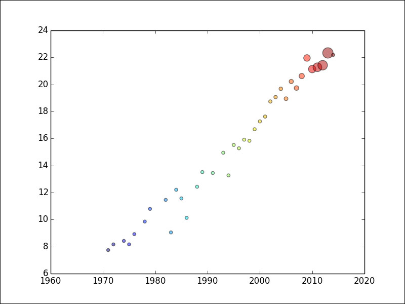
A scatter plot shows the relationship between two variables in a Cartesian coordinate system. The position of each data point is determined by the values of these two variables. The scatter plot can provide hints for any correlation between the variables under study. An upward trending pattern suggests positive correlation. A bubble chart is an extension of the scatter plot. In a bubble chart, the value of a third variable is relatively represented by the size of the bubble surrounding a data point, hence the name.
On http://en.wikipedia.org/wiki/Transistor_count#GPUs, there is also a table with transistor counts for Graphical Processor Units (GPUs).
GPUs are specialized circuits used to display graphics efficiently. Because of the way modern display hardware works, GPUs can process data with highly parallel operations. GPUs are a new development in computing. In the gpu_transcount.csv file in this book's code bundle, you will notice that we don't have many data points. Dealing with missing data is a recurring bubble chart issue. We will define a default bubble size for missing values. Again, we will load and average the data annually. Then, we will merge the transistor counts for the CPUs and GPUs DataFrame on the year indices with an outer join. The NaN values will be set to 0 (works for this example, but sometimes it's not a good idea to set NaN values to 0). All the functionality described in the preceding text was covered in Chapter 4, pandas Primer; therefore, please refer to that chapter if needed. The matplotlib API provides the scatter() function for scatter plots and bubble charts. We can view documentation for this function with the following commands:
$ ipython –pylab
In [1]: help(scatter)
In this example, we will specify the s parameter, which is related to the size of the bubble. The c parameter specifies colors. Unfortunately, you will not be able to see colors in this book, so you will have to run the examples yourself to see different colors. The alpha parameter determines how transparent the bubbles on the plot will be. This value varies between 0 (fully transparent) and 1 (opaque). Create a bubble chart as follows:
plt.scatter(years, cnt_log, c= 200 * years, s=20 + 200 * gpu_counts/gpu_counts.max(), alpha=0.5)
The following code for this example can also be found in the scatter_plot.py file in this book's code bundle:
import matplotlib.pyplot as plt
import numpy as np
import pandas as pd


df = pd.read_csv('transcount.csv')
df = df.groupby('year').aggregate(np.mean)

gpu = pd.read_csv('gpu_transcount.csv')
gpu = gpu.groupby('year').aggregate(np.mean)

df = pd.merge(df, gpu, how='outer', left_index=True, right_index=True)
df = df.replace(np.nan, 0)
print df
years = df.index.values
counts = df['trans_count'].values
gpu_counts = df['gpu_trans_count'].values
cnt_log = np.log(counts)
plt.scatter(years, cnt_log, c= 200 * years, s=20 + 200 * gpu_counts/gpu_counts.max(), alpha=0.5)
plt.show()
Refer to the following plot for the end result:

