
Two-dimensional plots are the bread and butter of data visualization. However, if you want to show off, nothing beats a good three-dimensional plot. I was in charge of a software package that could draw contour plots and three-dimensional plots. The software could even draw plots that when viewed with special glasses would pop right in front of you.
The matplotlib API has the Axes3D class for three-dimensional plots. By demonstrating how this class works, we will also show how the object-oriented matplotlib API works. The matplotlib Figure class is a top-level container for chart elements:
- Create a
Figureobject as follows:fig = plt.figure()
- Create an
Axes3Dobject from theFigureobject:ax = Axes3D(fig)
- The years and CPU transistor counts will be our x and y axes. It is required to create coordinate matrices from the years and CPU transistor counts arrays. Create the coordinate matrices with the NumPy
meshgrid()function:X, Y = np.meshgrid(X, Y)
- Plot the data with the
plot_surface()method of theAxes3Dclass:ax.plot_surface(X, Y, Z)
- The naming convention of the object-oriented API methods is to start with
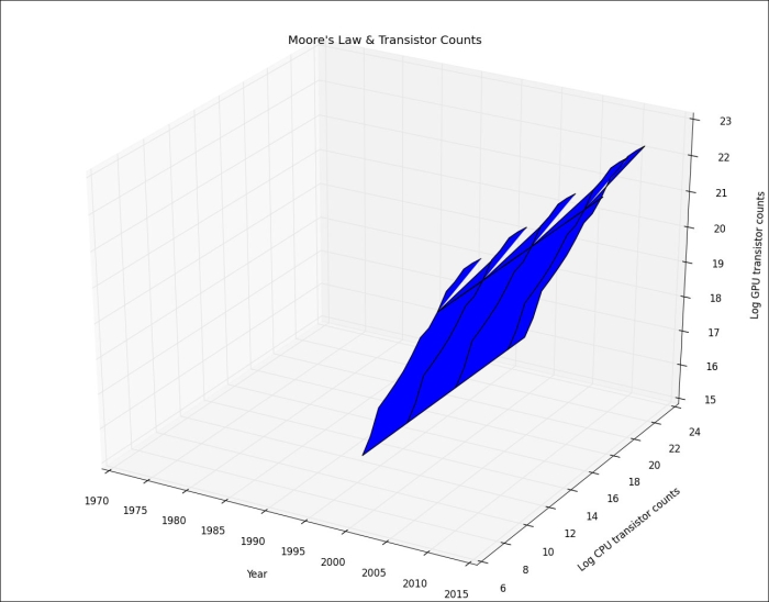
set_and end with the procedural counterpart function name, as shown in the following code snippet:ax.set_xlabel('Year') ax.set_ylabel('Log CPU transistor counts') ax.set_zlabel('Log GPU transistor counts') ax.set_title("Moore's Law & Transistor Counts")
You can also have a look at the following code in the three_dimensional.py file in this book's code bundle:
from mpl_toolkits.mplot3d.axes3d import Axes3D
import matplotlib.pyplot as plt
import numpy as np
import pandas as pd
df = pd.read_csv('transcount.csv')
df = df.groupby('year').aggregate(np.mean)
gpu = pd.read_csv('gpu_transcount.csv')
gpu = gpu.groupby('year').aggregate(np.mean)
df = pd.merge(df, gpu, how='outer', left_index=True, right_index=True)
df = df.replace(np.nan, 0)
fig = plt.figure()
ax = Axes3D(fig)
X = df.index.values
Y = np.log(df['trans_count'].values)
X, Y = np.meshgrid(X, Y)
Z = np.log(df['gpu_trans_count'].values)
ax.plot_surface(X, Y, Z)
ax.set_xlabel('Year')
ax.set_ylabel('Log CPU transistor counts')
ax.set_zlabel('Log GPU transistor counts')
ax.set_title("Moore's Law & Transistor Counts")
plt.show()Refer to the following plot for the end result:
..................Content has been hidden....................
You can't read the all page of ebook, please click here login for view all page.