Legends and annotations are effective tools to display information required to comprehend a plot in a glance. A typical plot will have the following additional information elements:
- A legend describing the various data series in the plot. This is provided by invoking the matplotlib
legend()function and supplying the labels for each data series. - Annotations for important points in the plot. The matplotlib
annotate()function can be used for this purpose. A matplotlib annotation consists of a label and an arrow. This function has many parameters describing the label and arrow style and position, so you may need to callhelp(annotate)for a detailed description. - Labels on the horizontal and vertical axes. These labels can be drawn by the
xlabel()andylabel()functions. We need to give these functions the text of the labels as a string and optional parameters such as the font size of the label. - A descriptive title for the graph with the matplotlib
title()function. Typically, we will only give this function a string representing the title. - A grid is also nice to have in order to localize points easily. The matplotlib
grid()function turns the plot grid on and off.
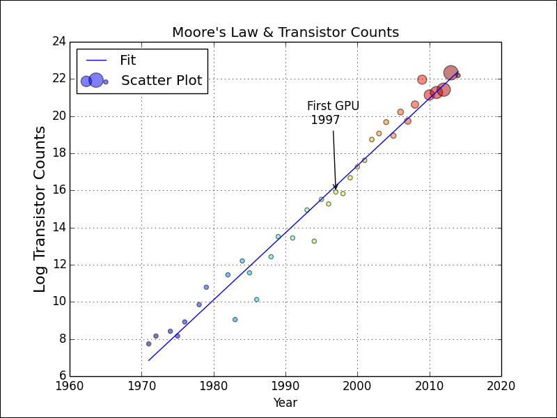
We will modify the bubble chart code from the previous example and add the straight line fit from the second example in this chapter. In this setup, add a label to the data series as follows:
plt.plot(years, np.polyval(poly, years), label='Fit')
plt.scatter(years, cnt_log, c= 200 * years, s=20 + 200 * gpu_counts/gpu_counts.max(), alpha=0.5, label="Scatter Plot")
Let's annotate the first GPU in our dataset. To do this, get a hold of the relevant point, define the label of the annotation, specify the style of the arrow (the arrowprops argument), and make sure that the annotation hovers above the point in question:
gpu_start = gpu.index.values.min()
y_ann = np.log(df.at[gpu_start, 'trans_count'])
ann_str = "First GPU
 %d" % gpu_start
plt.annotate(ann_str, xy=(gpu_start, y_ann), arrowprops=dict(arrowstyle="->"), xytext=(-30, +70), textcoords='offset points')
The complete code example is in the legend_annotations.py file in this book's code bundle:
import matplotlib.pyplot as plt
import numpy as np
import pandas as pd


df = pd.read_csv('transcount.csv')
df = df.groupby('year').aggregate(np.mean)
gpu = pd.read_csv('gpu_transcount.csv')
gpu = gpu.groupby('year').aggregate(np.mean)

df = pd.merge(df, gpu, how='outer', left_index=True, right_index=True)
df = df.replace(np.nan, 0)
years = df.index.values
counts = df['trans_count'].values
gpu_counts = df['gpu_trans_count'].values

poly = np.polyfit(years, np.log(counts), deg=1)
plt.plot(years, np.polyval(poly, years), label='Fit')

gpu_start = gpu.index.values.min()
y_ann = np.log(df.at[gpu_start, 'trans_count'])
ann_str = "First GPU
 %d" % gpu_start
plt.annotate(ann_str, xy=(gpu_start, y_ann), arrowprops=dict(arrowstyle="->"), xytext=(-30, +70), textcoords='offset points')

cnt_log = np.log(counts)
plt.scatter(years, cnt_log, c= 200 * years, s=20 + 200 * gpu_counts/gpu_counts.max(), alpha=0.5, label="Scatter Plot")
plt.legend(loc='upper left')
plt.grid()
plt.xlabel("Year")
plt.ylabel("Log Transistor Counts", fontsize=16)
plt.title("Moore's Law & Transistor Counts")
plt.show()
Refer to the following plot for the end result: