Logarithmic plots (or log plots) are plots that use a logarithmic scale. A logarithmic scale shows the value of a variable which uses intervals that match orders of magnitude, instead of a regular linear scale. There are two types of logarithmic plots. The log-log plot employs logarithmic scaling on both axes and is represented in matplotlib by the matplotlib.pyplot.loglog() function. The semi-log plots use linear scaling on one axis and logarithmic scaling on the other axis. These plots are represented in the matplotlib API by the semilogx() and semilogy() functions. On log-log plots, power laws appear as straight lines. On semi-log plots, straight lines represent exponential laws.
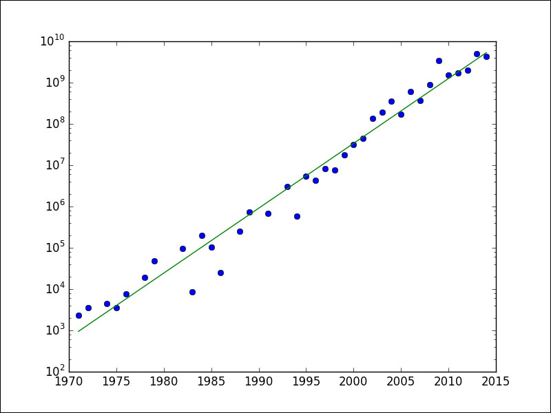
Moore's law is such a law. It's not a physical, but more of an empirical observation. Gordon Moore discovered a trend of the number of transistors in integrated circuits doubling every two years. On http://en.wikipedia.org/wiki/Transistor_count#Microprocessors, a table can be found with transistor counts for various microprocessors and the corresponding year of introduction.
From the table, I have prepared a CSV file, transcount.csv, containing only the transistor count and year. We still need to average the transistor counts for each year. Averaging and loading can be done with pandas. If you need to, refer to Chapter 4, pandas Primer, for tips. Once we have the average transistor count for each year in the table, we can try to fit a straight line to the log of the counts versus the years. The NumPy polyfit() function allows to fit data to a polynomial.
Refer to the log_plots.py file in this book's code bundle for the following code:
import matplotlib.pyplot as plt
import numpy as np
import pandas as pd


df = pd.read_csv('transcount.csv')
df = df.groupby('year').aggregate(np.mean)
years = df.index.values
counts = df['trans_count'].values
poly = np.polyfit(years, np.log(counts), deg=1)
print "Poly", poly
plt.semilogy(years, counts, 'o')
plt.semilogy(years, np.exp(np.polyval(poly, years)))
plt.show()
The following steps will explain the preceding code:
- Fit the data as follows:
poly = np.polyfit(years, np.log(counts), deg=1)
print "Poly", poly
- The result of the fit is a
Polynomialobject (see http://docs.scipy.org/doc/numpy/reference/generated/numpy.polynomial.polynomial.Polynomial.html#numpy.polynomial.polynomial.Polynomial). The string representation of this object gives the polynomial coefficients with a descending order of degrees, so the highest degree coefficient comes first. For our data, we obtain the following polynomial coefficients:Poly [ 3.61559210e-01 -7.05783195e+02] - The NumPy
polyval()function enables us to evaluate the polynomial we just obtained. Plot the data and fit with thesemilogy()function:plt.semilogy(years, counts, 'o') plt.semilogy(years, np.exp(np.polyval(poly, years)))
The trend line is drawn as a solid line and the data points as filled circles. Refer to the following plot for the end result: