Autocorrelation is correlation within a dataset and can indicate a trend.
For example, if we have a lag of one period, we can check if the previous value influences the current value. For that to be true, the autocorrelation value has to be pretty high.
In the previous chapter, Chapter 6, Data Visualization, we already used a pandas function that plots autocorrelation. In this example, we will use the NumPy correlate() function to calculate the actual autocorrelation values for the sunspots cycle. At the end, we need to normalize the values we receive. Apply the NumPy correlate() function as follows:
y = data - np.mean(data)
norm = np.sum(y ** 2)
correlated = np.correlate(y, y, mode='full')/norm
We are also interested in the indices corresponding to the highest correlations. These indices can be found with the NumPy argsort() function, which returns the indices that would sort an array:
print np.argsort(res)[-5:]
These are the indices found for the largest autocorrelations:
[ 9 11 10 1 0]
The largest autocorrelation is by definition for zero lag, that is, the correlation of a signal with itself. The next largest values are for a lag of one and ten years. Check the autocorrelation.py file in this book's code bundle:
import numpy as np
import pandas as pd
import statsmodels.api as sm
import matplotlib.pyplot as plt
from pandas.tools.plotting import autocorrelation_plot
data_loader = sm.datasets.sunspots.load_pandas()
data = data_loader.data["SUNACTIVITY"].values
y = data - np.mean(data)
norm = np.sum(y ** 2)
correlated = np.correlate(y, y, mode='full')/norm
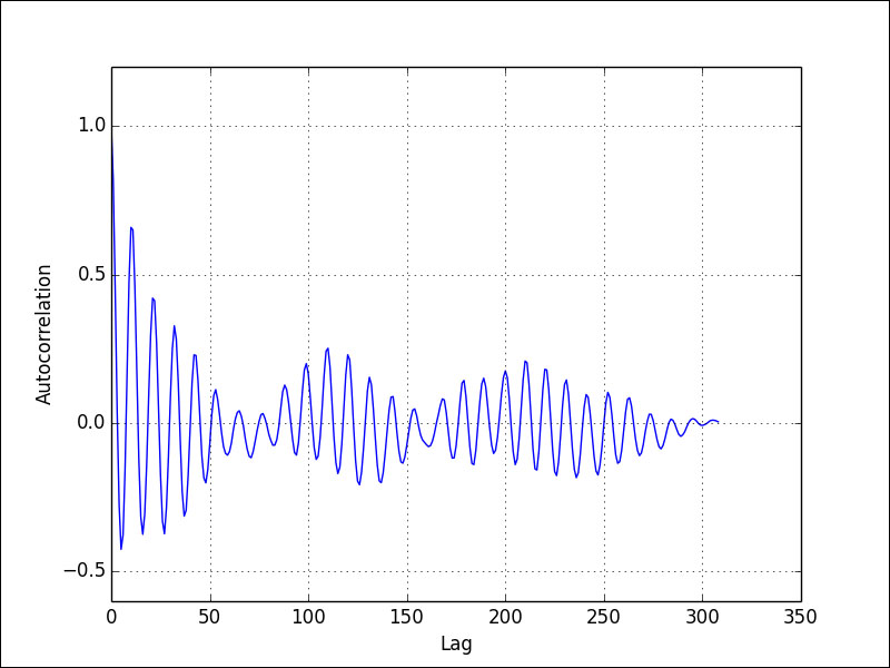
res = correlated[len(correlated)/2:]
print np.argsort(res)[-5:]
plt.plot(res)
plt.grid(True)
plt.xlabel("Lag")
plt.ylabel("Autocorrelation")
plt.show()
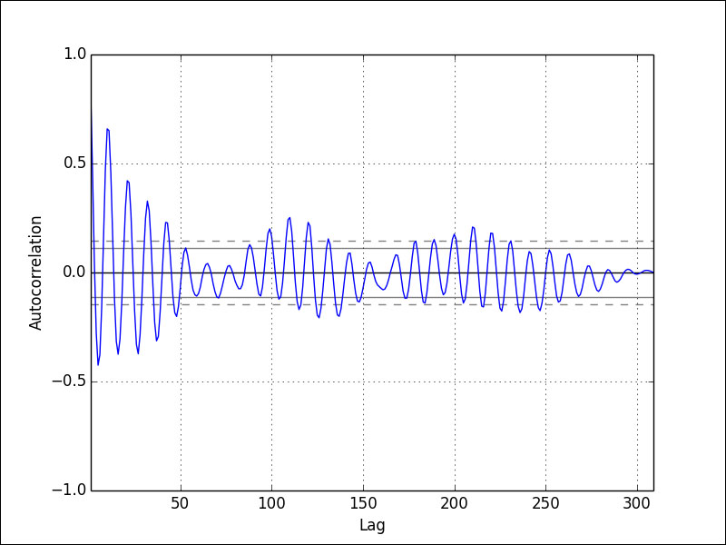
autocorrelation_plot(data)
plt.show()Refer to the following plot for the end result:
Compare the previous plot with the plot produced by pandas: