Plot.ly is a website currently in the beta stage, which provides online data visualization tools and a related Python library to be used on a user's machine. We can import and analyze data via the web interface or work entirely in a local environment and publish the end result on the Plot.ly website. Plots can be easily shared on the website within a team, allowing for collaboration, which is really the point of the website in the first place. In this section, we will give an example of how to plot a box plot with the Python API.
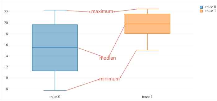
A box plot is a special way of visualizing a dataset using quartiles. If we split a sorted dataset into four equal parts, the first quartile will be the largest value of the part with the smallest numbers. The second quartile will be the value in the middle of the dataset, which is also called the median. The third quartile will be the value in the middle between the median and the highest value. The bottom and the top of the box plot are formed by the first and third quartiles. The line through the box is the median. The whiskers on both ends of the box are usually the minimum and maximum of the dataset. At the end of this section, we will see an annotated box plot, which will clarify matters. Install the Plot.ly API with the following commands:
$ sudo pip install plotly
$ pip freeze|grep plotly
plotly==1.0.26
After installing the API, sign up to get an API key. The following code snippet signs you in after supplying a valid key:
api_key = getpass()

# Change the user to your own username
py.sign_in('username', api_key)
Create the box plots with the Plot.ly API as follows:
data = Data([Box(y=counts), Box(y=gpu_counts)])
plot_url = py.plot(data, filename='moore-law-scatter')
Please refer to the following code from the plot_ly.py file in this book's code bundle:
import plotly.plotly as py
from plotly.graph_objs import *
from getpass import getpass
import numpy as np
import pandas as pd

df = pd.read_csv('transcount.csv')
df = df.groupby('year').aggregate(np.mean)

gpu = pd.read_csv('gpu_transcount.csv')
gpu = gpu.groupby('year').aggregate(np.mean)
df = pd.merge(df, gpu, how='outer', left_index=True, right_index=True)
df = df.replace(np.nan, 0)

api_key = getpass()

# Change the user to your own username
py.sign_in('username', api_key)

counts = np.log(df['trans_count'].values)
gpu_counts = np.log(df['gpu_trans_count'].values)

data = Data([Box(y=counts), Box(y=gpu_counts)])
plot_url = py.plot(data, filename='moore-law-scatter')
print plot_url
Also, refer to the following plot for the end result: