
Autocorrelation plots graph autocorrelations of time series data for different lags. Autocorrelation is the correlation of a time series with the same time series lagged. The autocorrelation_plot() pandas function in pandas.tools.plotting can draw an autocorrelation plot.
The following is the code from the autocorr_plot.py file in this book's code bundle:
import matplotlib.pyplot as plt
import numpy as np
import pandas as pd
from pandas.tools.plotting import autocorrelation_plot


df = pd.read_csv('transcount.csv')
df = df.groupby('year').aggregate(np.mean)

gpu = pd.read_csv('gpu_transcount.csv')
gpu = gpu.groupby('year').aggregate(np.mean)

df = pd.merge(df, gpu, how='outer', left_index=True, right_index=True)
df = df.replace(np.nan, 0)
autocorrelation_plot(np.log(df['trans_count']))
plt.show()
Draw an autocorrelation plot for the CPU transistor counts as follows:
autocorrelation_plot(np.log(df['trans_count']))
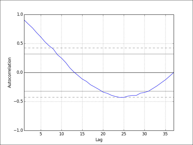
Refer to the following plot for the end result. As we can see in the following plot, more recent values (smaller lags) are stronger correlated with the current value than older values (larger lags), and at extremely large lags, the correlation decays to 0:
..................Content has been hidden....................
You can't read the all page of ebook, please click here login for view all page.