
First of all, let's generate some data. Let's assume that the following are the scores obtained by students in three different subjects:
scorePhysics = [34,35,35,35,35,35,36,36,37,37,37,37,37,38,38,38,39,39,40,40,40,40,40,41,42,42,42,42,42,42,42,42,43,43,43,43,44,44,44,44,44,44,45,45,45,45,45,46,46,46,46,46,46,47,47,47,47,47,47,48,48,48,48,48,49,49,49,49,49,49,49,49,52,52,52,53,53,53,53,53,53,53,53,54,54,54,54,54,54,54,55,55,55,55,55,56,56,56,56,56,56,57,57,57,58,58,59,59,59,59,59,59,59,60,60,60,60,60,60,60,61,61,61,61,61,62,62,63,63,63,63,63,64,64,64,64,64,64,64,65,65,65,66,66,67,67,68,68,68,68,68,68,68,69,70,71,71,71,72,72,72,72,73,73,74,75,76,76,76,76,77,77,78,79,79,80,80,81,84,84,85,85,87,87,88]

scoreLiterature = [49,49,50,51,51,52,52,52,52,53,54,54,55,55,55,55,56,56,56,56,56,57,57,57,58,58,58,59,59,59,60,60,60,60,60,60,60,61,61,61,62,62,62,62,63,63,67,67,68,68,68,68,68,68,69,69,69,69,69,69,70,71,71,71,71,72,72,72,72,73,73,73,73,74,74,74,74,74,75,75,75,76,76,76,77,77,78,78,78,79,79,79,80,80,82,83,85,88]

scoreComputer = [56,57,58,58,58,60,60,61,61,61,61,61,61,62,62,62,62,63,63,63,63,63,64,64,64,64,65,65,66,66,67,67,67,67,67,67,67,68,68,68,69,69,70,70,70,71,71,71,73,73,74,75,75,76,76,77,77,77,78,78,81,82,84,89,90]
Now, if we want to plot the box plot for a single subject, we can do that using the plt.boxplot() function:
plt.boxplot(scoreComputer, showmeans=True, whis = 99)
Let's print the box plot for scores from the computer subject:
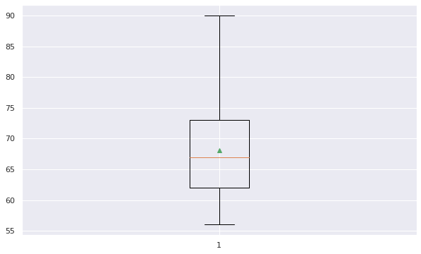
The preceding diagram illustrates the fact that the box goes from the upper to the lower quartile (around 62 and 73), while the whiskers (the bars extending from the box) go to a minimum of 56 and a maximum of 90. The red line is the median (around 67), whereas the little triangle (green color) is the mean.
Now, let's add box plots to other subjects as well. We can do this easily by combining all the scores into a single variable:
scores=[scorePhysics, scoreLiterature, scoreComputer]
Next, we plot the box plot:
box = plt.boxplot(scores, showmeans=True, whis=99)

plt.setp(box['boxes'][0], color='blue')
plt.setp(box['caps'][0], color='blue')
plt.setp(box['caps'][1], color='blue')
plt.setp(box['whiskers'][0], color='blue')
plt.setp(box['whiskers'][1], color='blue')

plt.setp(box['boxes'][1], color='red')
plt.setp(box['caps'][2], color='red')
plt.setp(box['caps'][3], color='red')
plt.setp(box['whiskers'][2], color='red')
plt.setp(box['whiskers'][3], color='red')

plt.ylim([20, 95])
plt.grid(True, axis='y')
plt.title('Distribution of the scores in three subjects', fontsize=18)
plt.ylabel('Total score in that subject')
plt.xticks([1,2,3], ['Physics','Literature','Computer'])

plt.show()
The output of the preceding code is given here:
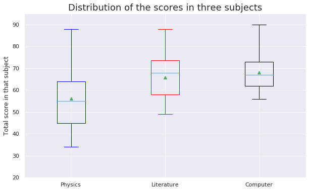
From the graph, it is clear that the minimum score obtained by the students was around 32, while the maximum score obtained was 90, which was in the computer science subject.