
In order to understand the time series dataset, let's randomly generate a normalized dataset:
- We can generate the dataset using the numpy library:
import os
import numpy as np
%matplotlib inline
from matplotlib import pyplot as plt
import seaborn as sns
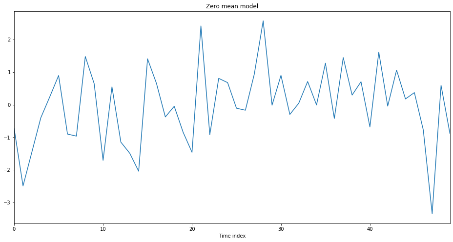
zero_mean_series = np.random.normal(loc=0.0, scale=1., size=50)
zero_mean_series
We have used the NumPy library to generate random datasets. So, the output given here will be different for you. The output of the preceding code is given here:
array([-0.73140395, -2.4944216 , -1.44929237, -0.40077112, 0.23713083, 0.89632516, -0.90228469, -0.96464949, 1.48135275, 0.64530002, -1.70897785, 0.54863901, -1.14941457, -1.49177657, -2.04298133, 1.40936481, 0.65621356, -0.37571958, -0.04877503, -0.84619236, -1.46231312, 2.42031845, -0.91949491, 0.80903063, 0.67885337, -0.1082256 , -0.16953567, 0.93628661, 2.57639376, -0.01489153, 0.9011697 , -0.29900988, 0.04519547, 0.71230853, -0.00626227, 1.27565662, -0.42432848, 1.44748288, 0.29585819, 0.70547011, -0.6838063 , 1.61502839, -0.04388889, 1.06261716, 0.17708138, 0.3723592 , -0.77185183, -3.3487284 , 0.59464475, -0.89005505])
- Next, we are going to use the seaborn library to plot the time series data. Check the code snippet given here:
plt.figure(figsize=(16, 8))
g = sns.lineplot(data=zero_mean_series)
g.set_title('Zero mean model')
g.set_xlabel('Time index')
plt.show()
We plotted the time series graph using the seaborn.lineplot() function which is a built-in method provided by the seaborn library. The output of the preceding code is given here:
- We can perform a cumulative sum over the list and then plot the data using a time series plot. The plot gives more interesting results. Check the following code snippet:
random_walk = np.cumsum(zero_mean_series)
random_walk
It generates an array of the cumulative sum as shown here:
array([ -0.73140395, -3.22582556, -4.67511792, -5.07588904,-4.83875821, -3.94243305, -4.84471774, -5.80936723,-4.32801448, -3.68271446, -5.39169231, -4.8430533 ,-5.99246787, -7.48424444, -9.52722576, -8.11786095,-7.46164739, -7.83736697, -7.886142 , -8.73233436, -10.19464748, -7.77432903, -8.69382394, -7.88479331,-7.20593994, -7.31416554, -7.4837012 , -6.5474146 ,-3.97102084, -3.98591237, -3.08474267, -3.38375255,-3.33855708, -2.62624855, -2.63251082, -1.35685419,-1.78118268, -0.3336998 , -0.03784161, 0.66762849,-0.01617781, 1.59885058, 1.55496169, 2.61757885, 2.79466023, 3.16701943, 2.3951676 , -0.9535608 ,-0.35891606, -1.2489711 ])
Note that for any particular value, the next value is the sum of previous values.
- Now, if we plot the list using the time series plot as shown here, we get an interesting graph that shows the change in values over time:
plt.figure(figsize=(16, 8))
g = sns.lineplot(data=random_walk)
g.set_title('Random Walk')
g.set_xlabel('Time index')
plt.show()
The output of the preceding code is given here:

Note the graph shown in the preceding diagram. It shows the change of values over time. Great – so far, we have generated different time series data and plotted it using the built-in seaborn.tsplot() method.