
Multivariate analysis is the analysis of three or more variables. This allows us to look at correlations (that is, how one variable changes with respect to another) and attempt to make predictions for future behavior more accurately than with bivariate analysis.
Initially, we explored the visualization of univariate analysis and bivariate analysis; likewise, let's visualize the concept of multivariate analysis.
One common way of plotting multivariate data is to make a matrix scatter plot, known as a pair plot. A matrix plot or pair plot shows each pair of variables plotted against each other. The pair plot allows us to see both the distribution of single variables and the relationships between two variables:
- We can use the scatter_matrix() function from the pandas.tools.plotting package or the seaborn.pairplot() function from the seaborn package to do this:
# pair plot with plot type regression
sns.pairplot(df,vars = ['normalized-losses', 'price','horsepower'], kind="reg")
plt.show()
This code will plot a 3 x 3 matrix of different plots for data in the normalized losses, price, and horsepower columns:
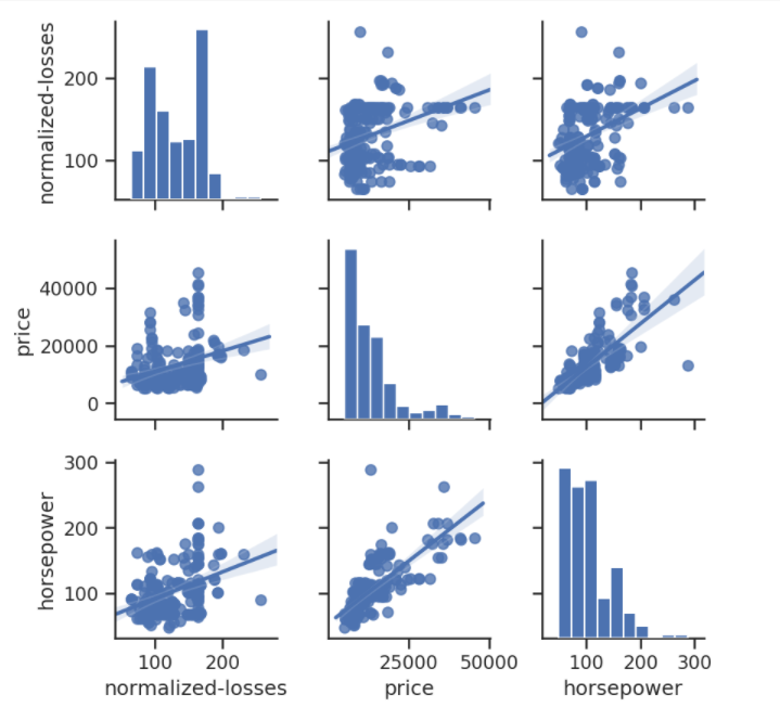
As shown in the preceding diagram, the histogram on the diagonal allows us to illustrate the distribution of a single variable. The regression plots on the upper and the lower triangles demonstrate the relationship between two variables. The middle plot in the first row shows the regression plot; this represents that there is no correlation between normalized losses and the price of cars. In comparison, the middle regression plot in the bottom row illustrates that there is a huge correlation between price and horsepower.
- Similarly, we can carry out multivariate analysis using a pair plot by specifying the colors, labels, plot type, diagonal plot type, and variables. So, let's make another pair plot:
#pair plot (matrix scatterplot) of few columns
sns.set(style="ticks", color_codes=True)
sns.pairplot(df,vars = ['symboling', 'normalized-losses','wheel-base'], hue="drive-wheels")
plt.show()
The output of this code is given as follows:
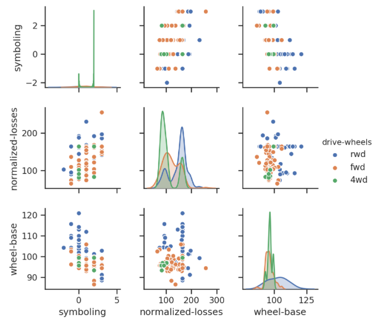
This is a pair plot of records of the symboling, normalized-losses, wheel-base, and drive-wheels columns.
The density plots on the diagonal allow us to see the distribution of a single variable, while the scatter plots on the upper and lower triangles show the relationship (or correlation) between two variables. The hue parameter is the column name used for the labels of the data points; in this diagram, the drive-wheels type is labeled by color. The left-most plot in the second row shows the scatter plot of normalized-losses versus wheel-base.
As discussed earlier, correlation analysis is an efficient technique for finding out whether any of the variables in a multivariate dataset are correlated. To calculate the linear (Pearson) correlation coefficient for a pair of variables, we can use the dataframe.corr(method ='pearson') function from the pandas package and the pearsonr() function from the scipy.stats package:
- For example, to calculate the correlation coefficient for the price and horsepower, use the following:
from scipy import stats
corr = stats.pearsonr(df["price"], df["horsepower"])
print("p-value:	", corr[1])
print("cor:		", corr[0])
The output is as follows:
p-value: 6.369057428260101e-48
cor: 0.8095745670036559
Here, the correlation between these two variables is 0.80957, which is close to +1. Therefore, we can make sure that both price and horsepower are highly positively correlated.
- Using the pandas corr( function, the correlation between the entire numerical record can be calculated as follows:
correlation = df.corr(method='pearson')
correlation
The output of this code is given as follows:

- Now, let's visualize this correlation analysis using a heatmap. A heatmap is the best technique to make this look beautiful and easier to interpret:
sns.heatmap(correlation,xticklabels=correlation.columns,
            yticklabels=correlation.columns)
The output of this code is given as follows:

A coefficient close to 1 means that there's a very strong positive correlation between the two variables. The diagonal line is the correlation of the variables to themselves – so they'll, of course, be 1.
This was a brief introduction to, along with a few practice examples of multivariate analysis. Now, let's practice them with the popular dataset, Titanic, which is frequently used for practicing data analysis and machine learning algorithms all around the world. The data source is mentioned in the Technical requirements section of this chapter.