
We can group the data by different time periods and present them in box plots:
- We can first group the data by months and then use the box plots to visualize the data:
fig, axes = plt.subplots(3, 1, figsize=(8, 7), sharex=True)
for name, ax in zip(['Consumption', 'Solar', 'Wind'], axes):
  sns.boxplot(data=df_power, x='Month', y=name, ax=ax)
  ax.set_ylabel('GWh')
  ax.set_title(name)
  if ax != axes[-1]:
    ax.set_xlabel('')
The output of the preceding code is given here:
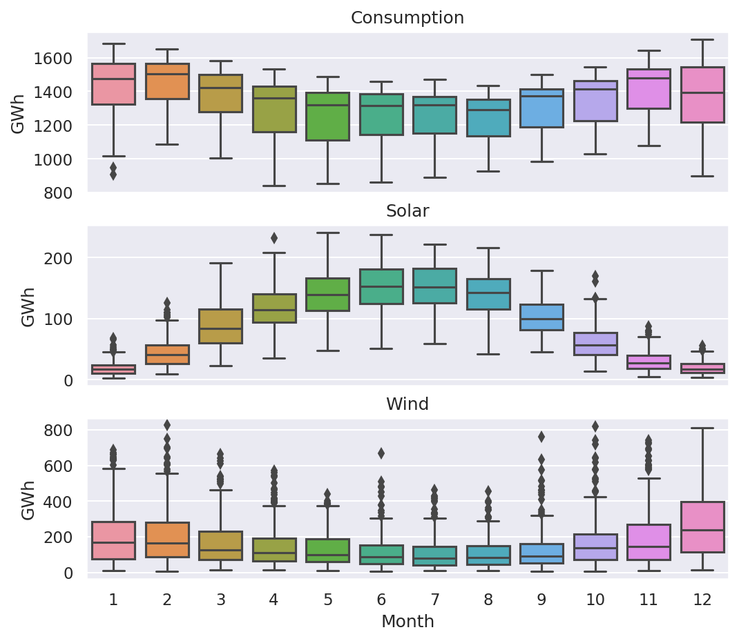
The preceding plot illustrates that electricity consumption is generally higher in the winter and lower in the summer. Wind production is higher during the summer. Moreover, there are many outliers associated with electricity consumption, wind production, and solar production.
- Next, we can group the consumption of electricity by the day of the week, and present it in a box plot:
sns.boxplot(data=df_power, x='Weekday Name', y='Consumption');
The output of the preceding code is given here:

The preceding screenshot shows that electricity consumption is higher on weekdays than on weekends. Interestingly, there are more outliers on the weekdays.