
A table chart combines a bar chart and a table. In order to understand the table chart, let's consider the following dataset. Consider standard LED bulbs that come in different wattages. The standard Philips LED bulb can be 4.5 Watts, 6 Watts, 7 Watts, 8.5 Watts, 9.5 Watts, 13.5 Watts, and 15 Watts. Let's assume there are two categorical variables, the year and the wattage, and a numeric variable, which is the number of units sold in a particular year.
Now, let's declare variables to hold the years and the available wattage data. It can be done as shown in the following snippet:
# Years under consideration
years = ["2010", "2011", "2012", "2013", "2014"]

# Available watt
columns = ['4.5W', '6.0W', '7.0W','8.5W','9.5W','13.5W','15W']
unitsSold = [
             [65, 141, 88, 111, 104, 71, 99],
             [85, 142, 89, 112, 103, 73, 98],
             [75, 143, 90, 113, 89, 75, 93],
             [65, 144, 91, 114, 90, 77, 92],
             [55, 145, 92, 115, 88, 79, 93],
            ]

# Define the range and scale for the y axis
values = np.arange(0, 600, 100)
We have now prepared the dataset. Let's now try to draw a table chart using the following code block:
colors = plt.cm.OrRd(np.linspace(0, 0.7, len(years)))
index = np.arange(len(columns)) + 0.3
bar_width = 0.7

y_offset = np.zeros(len(columns))
fig, ax = plt.subplots()

cell_text = []

n_rows = len(unitsSold)
for row in range(n_rows):
    plot = plt.bar(index, unitsSold[row], bar_width, bottom=y_offset,
                   color=colors[row])
    y_offset = y_offset + unitsSold[row]
    cell_text.append(['%1.1f' % (x) for x in y_offset])
    i=0
# Each iteration of this for loop, labels each bar with corresponding value for the given year
    for rect in plot:
        height = rect.get_height()
        ax.text(rect.get_x() + rect.get_width()/2, y_offset[i],'%d'
                % int(y_offset[i]),
                ha='center', va='bottom')
        i = i+1
Finally, let's add the table to the bottom of the chart:
# Add a table to the bottom of the axes
the_table = plt.table(cellText=cell_text, rowLabels=years,
                rowColours=colors, colLabels=columns, loc='bottom')
plt.ylabel("Units Sold")
plt.xticks([])
plt.title('Number of LED Bulb Sold/Year')
plt.show()
The preceding code snippets generate a nice table chart, as follows:
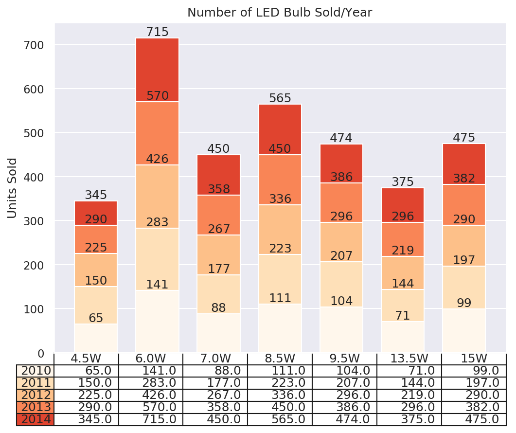
Look at the preceding table chart. Do you think it can be easily interpreted? It is pretty clear, right? You can see, for example, in the year 2014, 345 units of the 4.5-Watt bulb were sold. Similarly, the same information can be deduced from the preceding table plot.