
Let's answer the rest of the questions, taking a look at the average number of emails per day and per hour:
- To do so, we will create two functions, one that counts the total number of emails per day and one that plots the average number of emails per hour:
def plot_number_perday_per_year(df, ax, label=None, dt=0.3, **plot_kwargs):
    year = df[df['year'].notna()]['year'].values
    T = year.max() - year.min()
    bins = int(T / dt)
    weights = 1 / (np.ones_like(year) * dt * 365.25)
    ax.hist(year, bins=bins, weights=weights, label=label, **plot_kwargs);
    ax.grid(ls=':', color='k')
The preceding code creates a function that plots the average number of emails per day. Similarly, let's create a function that plots the average number of emails per hour:
def plot_number_perdhour_per_year(df, ax, label=None, dt=1, smooth=False,
                      weight_fun=None, **plot_kwargs):

    tod = df[df['timeofday'].notna()]['timeofday'].values
    year = df[df['year'].notna()]['year'].values
    Ty = year.max() - year.min()
    T = tod.max() - tod.min()
    bins = int(T / dt)
    if weight_fun is None:
        weights = 1 / (np.ones_like(tod) * Ty * 365.25 / dt)
    else:
        weights = weight_fun(df)
    if smooth:
        hst, xedges = np.histogram(tod, bins=bins, weights=weights);
        x = np.delete(xedges, -1) + 0.5*(xedges[1] - xedges[0])
        hst = ndimage.gaussian_filter(hst, sigma=0.75)
        f = interp1d(x, hst, kind='cubic')
        x = np.linspace(x.min(), x.max(), 10000)
        hst = f(x)
        ax.plot(x, hst, label=label, **plot_kwargs)
    else:
        ax.hist(tod, bins=bins, weights=weights, label=label, **plot_kwargs);


    ax.grid(ls=':', color='k')
    orientation = plot_kwargs.get('orientation')
    if orientation is None or orientation == 'vertical':
        ax.set_xlim(0, 24)
        ax.xaxis.set_major_locator(MaxNLocator(8))
        ax.set_xticklabels([datetime.datetime.strptime(str(int(np.mod(ts, 24))), "%H").strftime("%I %p")
                            for ts in ax.get_xticks()]);
    elif orientation == 'horizontal':
        ax.set_ylim(0, 24)
        ax.yaxis.set_major_locator(MaxNLocator(8))
        ax.set_yticklabels([datetime.datetime.strptime(str(int(np.mod(ts, 24))), "%H").strftime("%I %p")
                            for ts in ax.get_yticks()]);
Now, let's create a class that plots the time of the day versus year for all the emails within the given timeframe:
class TriplePlot:
  def __init__(self):
    gs = gridspec.GridSpec(6, 6)
    self.ax1 = plt.subplot(gs[2:6, :4])
    self.ax2 = plt.subplot(gs[2:6, 4:6], sharey=self.ax1)
    plt.setp(self.ax2.get_yticklabels(), visible=False);
    self.ax3 = plt.subplot(gs[:2, :4])
    plt.setp(self.ax3.get_xticklabels(), visible=False);

  def plot(self, df, color='darkblue', alpha=0.8, markersize=0.5, yr_bin=0.1, hr_bin=0.5):
    plot_todo_vs_year(df, self.ax1, color=color, s=markersize)
    plot_number_perdhour_per_year(df, self.ax2, dt=hr_bin, color=color, alpha=alpha, orientation='horizontal')
    self.ax2.set_xlabel('Average emails per hour')
    plot_number_perday_per_year(df, self.ax3, dt=yr_bin, color=color, alpha=alpha)
    self.ax3.set_ylabel('Average emails per day')
Now, finally, let's instantiate the class to plot the graph:
import matplotlib.gridspec as gridspec
import matplotlib.patches as mpatches

plt.figure(figsize=(12,12));
tpl = TriplePlot()

tpl.plot(received, color='C0', alpha=0.5)
tpl.plot(sent, color='C1', alpha=0.5)
p1 = mpatches.Patch(color='C0', label='Incoming', alpha=0.5)
p2 = mpatches.Patch(color='C1', label='Outgoing', alpha=0.5)
plt.legend(handles=[p1, p2], bbox_to_anchor=[1.45, 0.7], fontsize=14, shadow=True);
The output of the preceding code is as follows:
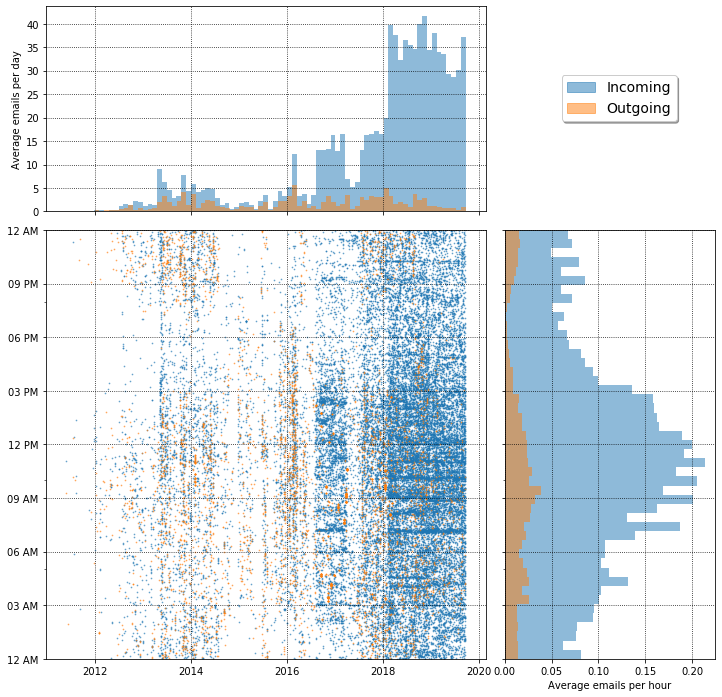
The average emails per hour and per graph is illustrated by the preceding graph. In my case, most email communication happened between 2018 and 2020.