
Do you remember what a continuous variable is and what a discrete variable is? If not, have a quick look at Chapter 1, Exploratory Data Analysis Fundamentals. Back to the main topic, a line chart is used to illustrate the relationship between two or more continuous variables.
We are going to use the matplotlib library and the stock price data to plot time series lines. First of all, let's understand the dataset. We have created a function using the faker Python library to generate the dataset. It is the simplest possible dataset you can imagine, with just two columns. The first column is Date and the second column is Price, indicating the stock price on that date.
Let's generate the dataset by calling the helper method. In addition to this, we have saved the CSV file. You can optionally load the CSV file using the pandas (read_csv) library and proceed with visualization.
My generateData function is defined here:
import datetime
import math
import pandas as pd
import random
import radar
from faker import Faker
fake = Faker()

def generateData(n):
  listdata = []
  start = datetime.datetime(2019, 8, 1)
  end = datetime.datetime(2019, 8, 30)
  delta = end - start
  for _ in range(n):
    date = radar.random_datetime(start='2019-08-1', stop='2019-08-30').strftime("%Y-%m-%d")
    price = round(random.uniform(900, 1000), 4)
    listdata.append([date, price])
  df = pd.DataFrame(listdata, columns = ['Date', 'Price'])
  df['Date'] = pd.to_datetime(df['Date'], format='%Y-%m-%d')
  df = df.groupby(by='Date').mean()

  return df
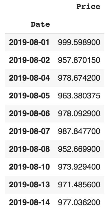
Having defined the method to generate data, let's get the data into a pandas dataframe and check the first 10 entries:
df = generateData(50)
df.head(10)
The output of the preceding code is shown in the following screenshot:
Let's create the line chart in the next section.