
On April 15, 1912, the largest passenger liner ever made at the time collided with an iceberg during her maiden voyage. When the Titanic sank, it killed 1,502 out of 2,224 passengers and crew. The titanic.csv (https://web.stanford.edu/class/archive/cs/cs109/cs109.1166/stuff/titanic.csv) file contains data for 887 real Titanic passengers. Each row represents one person. The columns describe different attributes about the person in the ship where the PassengerId column is a unique ID of the passenger, Survived is the number that survived (1) or died (0), Pclass is the passenger's class (that is, first, second, or third), Name is the passenger's name, Sex is the passenger's sex, Age is the passenger's age, Siblings/Spouses Aboard is the number of siblings/spouses aboard the Titanic, Parents/Children Aboard is the number of parents/children aboard the Titanic, Ticket is the ticket number, Fare is the fare for each ticket, Cabin is the cabin number, and Embarked is where the passenger got on the ship (for instance: C refers to Cherbourg, S refers to Southampton, and Q refers to Queenstown).
Let's analyze the Titanic dataset and identify those attributes that have maximum dependencies on the survival of the passengers:
- First load the dataset and the required libraries:
# load python libraries
import numpy as np
import pandas as pd
import seaborn as sns
import matplotlib.pyplot as plt
#load dataset
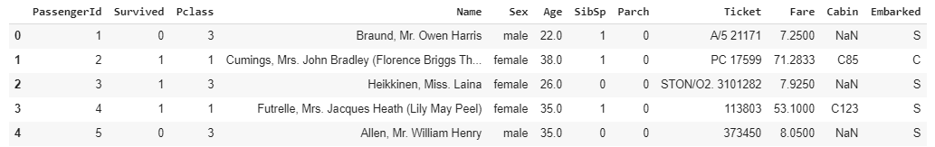
titanic=pd.read_csv("/content/titanic.csv")
titanic.head()
The output of this code is given as follows:
Let's take a look at the shape of the DataFrame in the code:
titanic.shape
The output is as follows:
(891, 12)
- Let's take a look at the number of records missing in the dataset:
total = titanic.isnull().sum().sort_values(ascending=False)
total
The output is as follows:
Cabin 687
Age 177
Embarked 2
Fare 0
Ticket 0
Parch 0
SibSp 0
Sex 0
Name 0
Pclass 0
Survived 0
PassengerId 0
dtype: int64
All the records appear to be fine except for Embarked, Age, and Cabin. The Cabin feature requires further investigation to fill up so many, but let's not use it in our analysis because 77% of it is missing. Additionally, it will be quite tricky to deal with the Age feature, which has 177 missing values. We cannot ignore the age factor because it might correlate with the survival rate. The Embarked feature has only two missing values, which can easily be filled.
Since the PassengerId, Ticket, and Name columns have unique values, they do not correlate with a high survival rate.
- First, let's find out the percentages of women and men who survived the disaster:
#percentage of women survived
women = titanic.loc[titanic.Sex == 'female']["Survived"]
rate_women = sum(women)/len(women)

#percentage of men survived
men = titanic.loc[titanic.Sex == 'male']["Survived"]
rate_men = sum(men)/len(men)

print(str(rate_women) +" % of women who survived." )
print(str(rate_men) + " % of men who survived." )
The output is as follows:
0.7420382165605095 % of women who survived.
0.18890814558058924 % of men who survived.
- Here, you can see the number of women who survived was high, so gender could be an attribute that contributes to analyzing the survival of any variable (person). Let's visualize this information using the survival numbers of males and females:
titanic['Survived'] = titanic['Survived'].map({0:"not_survived", 1:"survived"})

fig, ax = plt.subplots(1, 2, figsize = (10, 8))
titanic["Sex"].value_counts().plot.bar(color = "skyblue", ax = ax[0])
ax[0].set_title("Number Of Passengers By Sex")
ax[0].set_ylabel("Population")
sns.countplot("Sex", hue = "Survived", data = titanic, ax = ax[1])
ax[1].set_title("Sex: Survived vs Dead")
plt.show()
The output of this code is given as follows:

- Let's visualize the number of survivors and deaths from different Pclasses:
fig, ax = plt.subplots(1, 2, figsize = (10, 8))
titanic["Pclass"].value_counts().plot.bar(color = "skyblue", ax = ax[0])
ax[0].set_title("Number Of Passengers By Pclass")
ax[0].set_ylabel("Population")
sns.countplot("Pclass", hue = "Survived", data = titanic, ax = ax[1])
ax[1].set_title("Pclass: Survived vs Dead")
plt.show()
The output of this code is given as follows:

- Well, it looks like the number of passengers in Pclass 3 was high, and the majority of them could not survive. In Pclass 2, the number of deaths is high. And, Pclass 1 shows the maximum number of passengers who survived:
fig, ax = plt.subplots(1, 2, figsize = (10, 8))
titanic["Embarked"].value_counts().plot.bar(color = "skyblue", ax = ax[0])
ax[0].set_title("Number Of Passengers By Embarked")
ax[0].set_ylabel("Number")
sns.countplot("Embarked", hue = "Survived", data = titanic, ax = ax[1])
ax[1].set_title("Embarked: Survived vs Unsurvived")
plt.show()
The output of the code is given as follows:

Most passengers seemed to arrive on to the ship from S (Southampton) and nearly 450 of them did not survive.
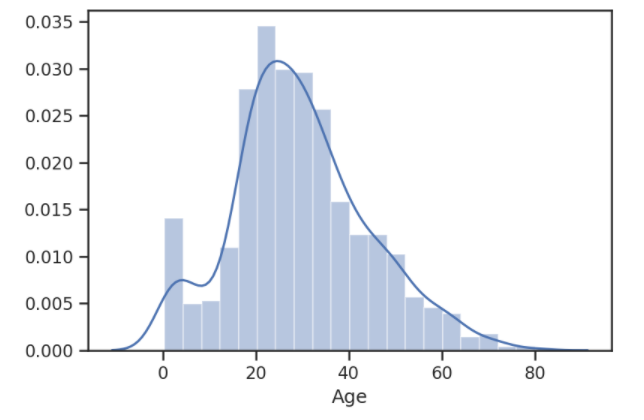
- To visualize the Age records, we will plot the distribution of data using the distplot() method. As we previously analyzed, there are 177 null values in the Age records, so we will drop them before plotting the data:
sns.distplot(titanic['Age'].dropna())
The output of this code is given as follows:
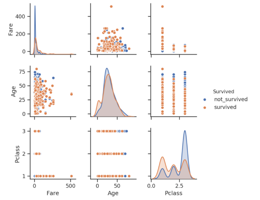
- Now, let's first carry out a multivariate analysis on the Titanic dataset using the Survived, Pclass, Fear, and Age variables:
sns.set(style="ticks", color_codes=True)
sns.pairplot(titanic,vars = [ 'Fare','Age','Pclass'], hue="Survived")
plt.show()
The output of this code is given as follows:
- Now, let's view the correlation table with a heatmap. Note that the first Embarked map records with integer values so that we can include Embarked in our correlation analysis too:
titanic['Embarked'] = titanic['Embarked'].map({"S":1, "C":2,"Q":2,"NaN":0})
Tcorrelation = titanic.corr(method='pearson')
Tcorrelation
The output of this code is given as follows:
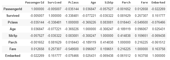
- The result is pretty straightforward. It shows the correlation between the individual columns. As you can see, in this table, PassengerId shows a weak positive relationship with the Fare and Age columns:
sns.heatmap(Tcorrelation,xticklabels=Tcorrelation.columns,
            yticklabels=Tcorrelation.columns)
The output of this code is given as follows:

You can get the same dataset in Kaggle if you want to practice more analysis and prediction algorithms.
So far, you have learned about correlation and types of data analysis. You have made different analyses over the dataset too. Now we need to closely consider the facts before making any conclusions on the analysis based on the output we get.