
Generally, we start with one-dimensional visualization and move to further dimensions. Having seen 2-D visualization earlier, let's add one more dimension and plot 3-D charts. We will use the matplotlib.pyplot method to do so:
- Let's start first by creating the axes:
fig = plt.figure(figsize=(16, 12))
ax = fig.add_subplot(111, projection='3d')
- Then, add the columns to the axes:
xscale = df_wines['residual sugar']
yscale = df_wines['free sulfur dioxide']
zscale = df_wines['total sulfur dioxide']
ax.scatter(xscale, yscale, zscale, s=50, alpha=0.6, edgecolors='w')
Here, we are interested in looking into the residual sugar, free sulfur dioxide, and total sulfur dioxide columns.
- Finally, let's add the labels to all of the axes:
ax.set_xlabel('Residual Sugar')
ax.set_ylabel('free sulfur dioxide')
ax.set_zlabel('Total sulfur dioxide')

plt.show()
The output of the preceding code is given as follows:
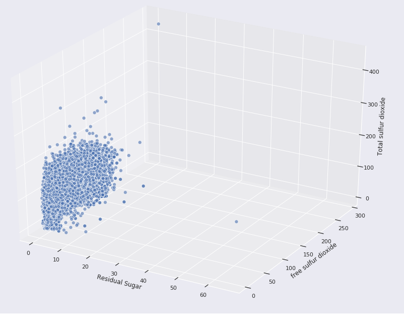
Figure 12.14 shows that three variables show a positive correlation with respect to one another. In the preceding example, we used the Matplotlib library. We can also use the seaborn library to plot three different variables. Check the code snippet given here:
fig = plt.figure(figsize=(16, 12))

plt.scatter(x = df_wines['fixed acidity'],
            y = df_wines['free sulfur dioxide'],
            s = df_wines['total sulfur dioxide'] * 2,
            alpha=0.4,
            edgecolors='w')

plt.xlabel('Fixed Acidity')
plt.ylabel('free sulfur dioxide')
plt.title('Wine free sulfur dioxide Content - Fixed Acidity - total sulfur dioxide', y=1.05)
Note that we have used the s parameter to denote the third variable (total sulfur dioxide). The output of the code is as follows:
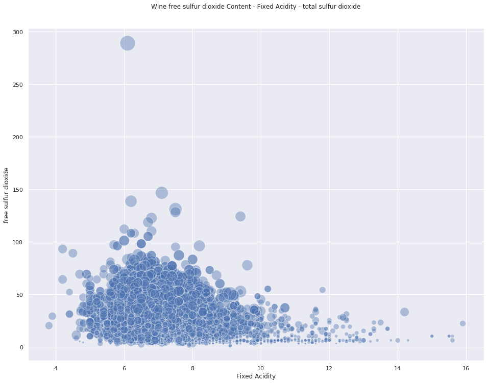
Note that in Figure 12.16, the size of the circles denotes the third variable. In this case, the larger the radius of the circle is, the higher the value of residual sugar. So, if you look carefully, you will notice most of the higher circles are located between the x axis with values of 4 and 10 and with the y axis with values between 25 and 150.
In the next section, we are going to develop different types of models and apply some classical Machine Learning (ML) algorithms and evaluate their performances.