
In this section, we will continue analyzing the red wine dataset. First, we will start by exploring the most correlated columns. Second, we will compare two different columns and observe their columns.
Let's first start with the quality column:
import seaborn as sns

sns.set(rc={'figure.figsize': (14, 8)})
sns.countplot(df_red['quality'])
The output of the preceding code is given here:
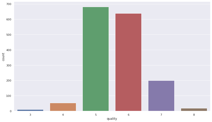
Figure 12.3 - The output indicates that the majority of wine is of medium quality
That was not difficult, was it? As I always argue, one of the most important aspects when you have a graph, is to be able to interpret the results. If you check Figure 12.3, you can see that the majority of the red wine belongs to the group with quality labels 3 and 4, followed by the labels 5 and 6, and some of the red wine belongs to the group with label 7, and so on.