
Let's visualize the time series dataset. We will continue using the same df_power dataframe:
- The first step is to import the seaborn and matplotlib libraries:
import matplotlib.pyplot as plt
import seaborn as sns
sns.set(rc={'figure.figsize':(11, 4)})
plt.rcParams['figure.figsize'] = (8,5)
plt.rcParams['figure.dpi'] = 150
- Next, let's generate a line plot of the full time series of Germany's daily electricity consumption:
df_power['Consumption'].plot(linewidth=0.5)
The output of the preceding code is given here:

As depicted in the preceding screenshot, the y-axis shows the electricity consumption and the x-axis shows the year. However, there are too many datasets to cover all the years.
- Let's use the dots to plot the data for all the other columns:
cols_to_plot = ['Consumption', 'Solar', 'Wind']
axes = df_power[cols_to_plot].plot(marker='.', alpha=0.5, linestyle='None',figsize=(14, 6), subplots=True)
for ax in axes:
    ax.set_ylabel('Daily Totals (GWh)')
The output of the preceding code is given here:

The output shows that electricity consumption can be broken down into two distinct patterns:
- One cluster roughly from 1,400 GWh and above
- Another cluster roughly below 1,400 GWh
Moreover, solar production is higher in summer and lower in winter. Over the years, there seems to have been a strong increasing trend in the output of wind power.
- We can further investigate a single year to have a closer look. Check the code given here:
ax = df_power.loc['2016', 'Consumption'].plot()
ax.set_ylabel('Daily Consumption (GWh)');
The output of the preceding code is given here:
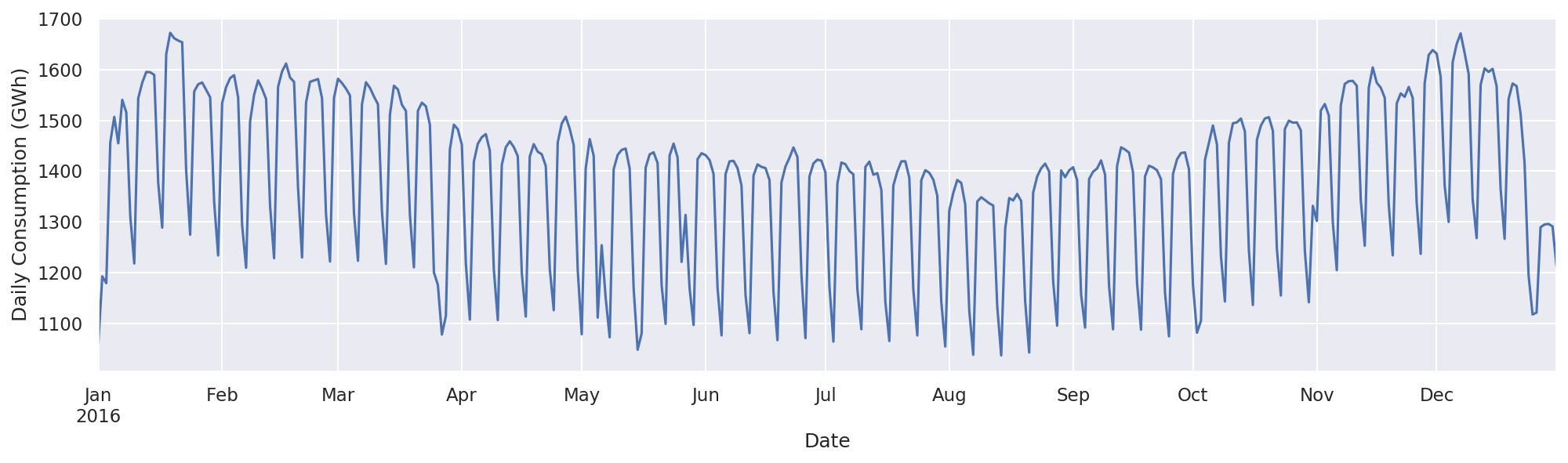
From the preceding screenshot, we can see clearly the consumption of electricity for 2016. The graph shows a drastic decrease in the consumption of electricity at the end of the year (December) and during August. We can look for further details in any particular month. Let's examine the month of December 2016 with the following code block:
ax = df_power.loc['2016-12', 'Consumption'].plot(marker='o', linestyle='-')
ax.set_ylabel('Daily Consumption (GWh)');
The output of the preceding code is given here:

As shown in the preceding graph, electricity consumption is higher on weekdays and lowest at the weekends. We can see the consumption for each day of the month. We can zoom in further to see how consumption plays out in the last week of December.
In order to indicate a particular week of December, we can supply a specific date range as shown here:
ax = df_power.loc['2016-12-23':'2016-12-30', 'Consumption'].plot(marker='o', linestyle='-')
ax.set_ylabel('Daily Consumption (GWh)');
As illustrated in the preceding code, we want to see the electricity consumption between 2016-12-23 and 2016-12-30. The output of the preceding code is given here:
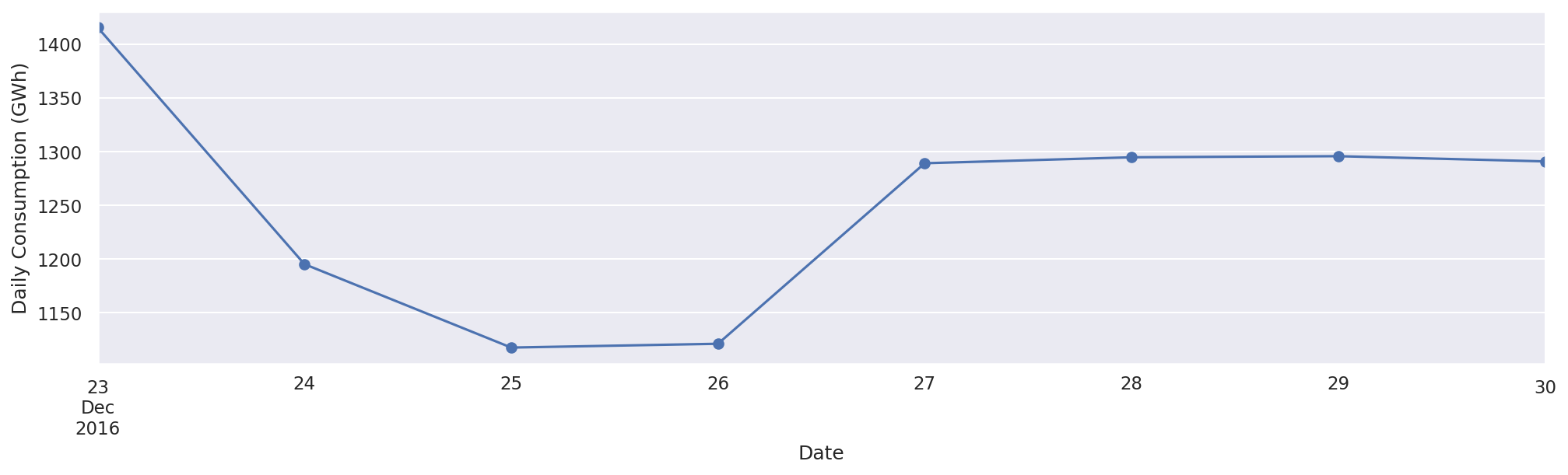
As illustrated in the preceding screenshot, electricity consumption was lowest on the day of Christmas, probably because people were busy partying. After Christmas, the consumption increased.