
Next, let's also see the correlation between the alcohol column and pH values. From Figure 12.5, we already know they are weakly positively correlated. Let's verify the results in this section:
- First, let's see the joint plot:
sns.jointplot(x='alcohol',y='pH',data=df_red, kind='reg')
The preceding code should not be new to you by now. We have already discussed the significance of these plots in Chapter 2, Visual Aids in EDA, and Chapter 7, Correlation. The graph produced by the preceding code is shown in the screenshot:
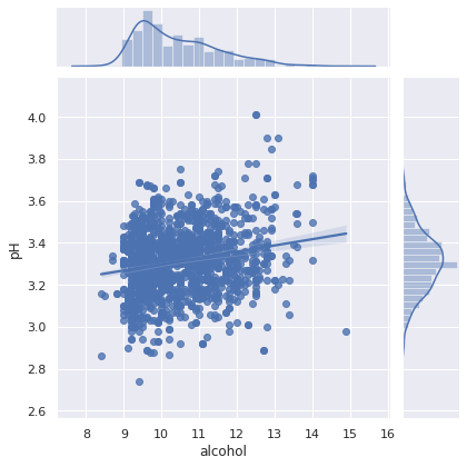
This screenshot shows that alcohol is weakly positively related to the pH values. Moreover, the regression line is depicted in the screenshot, illustrating the correlation between them.
- We can quantify the correlation using Pearson regression from scipy.stats, as shown here:
from scipy.stats import pearsonr

def get_correlation(column1, column2, df):
  pearson_corr, p_value = pearsonr(df[column1], df[column2])
  print("Correlation between {} and {} is {}".format(column1, column2, pearson_corr))
  print("P-value of this correlation is {}".format(p_value))
- And we can use the preceding method to see the correlation between any two columns. Let's see the correlation between alcohol and pH:
get_correlation('alcohol','pH', df_red)
The output of the preceding code is given as follows:
Correlation between alcohol and pH is 0.20563250850549825
P-value of this correlation is 9.96449774146556e-17
Note that, this is approximately the same value that is shown in Figure 12.5. Now you know different ways in which you can check how strongly or weakly two or more columns are related.
In the next section, we are going to analyze the white wine dataframe and compare it with the red wine.