
This is one of the most common types of visualization that almost everyone must have encountered. Bars can be drawn horizontally or vertically to represent categorical variables.
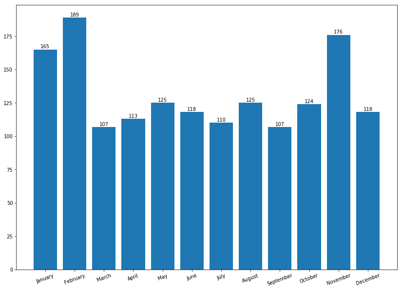
Bar charts are frequently used to distinguish objects between distinct collections in order to track variations over time. In most cases, bar charts are very convenient when the changes are large. In order to learn about bar charts, let's assume a pharmacy in Norway keeps track of the amount of Zoloft sold every month. Zoloft is a medicine prescribed to patients suffering from depression. We can use the calendar Python library to keep track of the months of the year (1 to 12) corresponding to January to December:
- Let's import the required libraries:
import numpy as np
import calendar
import matplotlib.pyplot as plt
- Set up the data. Remember, the range stopping parameter is exclusive, meaning if you generate range from (1, 13), the last item, 13, is not included:
months = list(range(1, 13))
sold_quantity = [round(random.uniform(100, 200)) for x in range(1, 13)]
- Specify the layout of the figure and allocate space:
figure, axis = plt.subplots()
- In the x axis, we would like to display the names of the months:
plt.xticks(months, calendar.month_name[1:13], rotation=20)
- Plot the graph:
plot = axis.bar(months, sold_quantity)
- This step is optional depending upon whether you are interested in displaying the data value on the head of the bar. It visually gives more meaning to show an actual number of sold items on the bar itself:
for rectangle in plot:
height = rectangle.get_height()
axis.text(rectangle.get_x() + rectangle.get_width() /2., 1.002 * height, '%d' % int(height), ha='center', va = 'bottom')
- Display the graph on the screen:
plt.show()
The bar chart is as follows:
Here are important observations from the preceding visualizations:
- months and sold_quantity are Python lists representing the amount of Zoloft sold every month.
- We are using the subplots() method in the preceding code. Why? Well, it provides a way to define the layout of the figure in terms of the number of graphs and provides ways to organize them. Still confused? Don't worry, we will be using subplots plenty of times in this chapter. Moreover, if you need a quick reference, Packt has several books explaining matplotlib. Some of the most interesting reads have been mentioned in the Further reading section of this chapter.
- In step 3, we use the plt.xticks() function, which allows us to change the x axis tickers from 1 to 12, whereas calender.months[1:13] changes this numerical format into corresponding months from the calendar Python library.
- Step 4 actually prints the bar with months and quantity sold.
- ax.text() within the for loop annotates each bar with its corresponding values. How it does this might be interesting. We plotted these values by getting the x and y coordinates and then adding bar_width/2 to the x coordinates with a height of 1.002, which is the y coordinate. Then, using the va and ha arguments, we align the text centrally over the bar.
- Step 6 actually displays the graph on the screen.
As mentioned in the introduction to this section, we said that bars can be either horizontal or vertical. Let's change to a horizontal format. All the code remains the same, except plt.xticks changes to plt.yticks() and plt.bar() changes to plt.barh(). We assume it is self-explanatory.
In addition to this, placing the exact data values is a bit tricky and requires a few iterations of trial and error to place them perfectly. But let's see them in action:
months = list(range(1, 13))
sold_quantity = [round(random.uniform(100, 200)) for x in range(1, 13)]

figure, axis = plt.subplots()

plt.yticks(months, calendar.month_name[1:13], rotation=20)

plot = axis.barh(months, sold_quantity)

for rectangle in plot:
  width = rectangle.get_width()
  axis.text(width + 2.5, rectangle.get_y() + 0.38, '%d' % int(width), ha='center', va = 'bottom')

plt.show()
And the graph it generates is as follows:

Well, that's all about the bar chart in this chapter. We are certainly going to use several other attributes in the subsequent chapters. Next, we are going to visualize data using a scatter plot.