
Scatter plots are also called scatter graphs, scatter charts, scattergrams, and scatter diagrams. They use a Cartesian coordinates system to display values of typically two variables for a set of data.
When should we use a scatter plot? Scatter plots can be constructed in the following two situations:
- When one continuous variable is dependent on another variable, which is under the control of the observer
- When both continuous variables are independent
There are two important concepts—independent variable and dependent variable. In statistical modeling or mathematical modeling, the values of dependent variables rely on the values of independent variables. The dependent variable is the outcome variable being studied. The independent variables are also referred to as regressors. The takeaway message here is that scatter plots are used when we need to show the relationship between two variables, and hence are sometimes referred to as correlation plots. We will dig into more details about correlation in Chapter 7, Correlation.
You are either an expert data scientist or a beginner computer science student, and no doubt you have encountered a form of scatter plot before. These plots are powerful tools for visualization, despite their simplicity. The main reasons are that they have a lot of options, representational powers, and design choices, and are flexible enough to represent a graph in attractive ways.
Some examples in which scatter plots are suitable are as follows:
- Research studies have successfully established that the number of hours of sleep required by a person depends on the age of the person.
- The average income for adults is based on the number of years of education.
Let's take the first case. The dataset can be found in the form of a CSV file in the GitHub repository:
headers_cols = ['age','min_recommended', 'max_recommended', 'may_be_appropriate_min', 'may_be_appropriate_max', 'min_not_recommended', 'max_not_recommended']

sleepDf = pd.read_csv('https://raw.githubusercontent.com/PacktPublishing/hands-on-exploratory-data-analysis-with-python/master/Chapter%202/sleep_vs_age.csv', columns=headers_cols)
sleepDf.head(10)
Having imported the dataset correctly, let's display a scatter plot. We start by importing the required libraries and then plotting the actual graph. Next, we display the x-label and the y-label. The code is given in the following code block:
import seaborn as sns
import matplotlib.pyplot as plt
sns.set()

# A regular scatter plot
plt.scatter(x=sleepDf["age"]/12., y=sleepDf["min_recommended"])
plt.scatter(x=sleepDf["age"]/12., y=sleepDf['max_recommended'])
plt.xlabel('Age of person in Years')
plt.ylabel('Total hours of sleep required')
plt.show()
The scatter plot generated by the preceding code is as follows:

That was not so difficult, was it? Let's see if we can interpret the graph. You can explicitly see that the total number of hours of sleep required by a person is high initially and gradually decreases as age increases. The resulting graph is interpretable, but due to the lack of a continuous line, the results are not self-explanatory. Let's fit a line to it and see if that explains the results in a more obvious way:
# Line plot
plt.plot(sleepDf['age']/12., sleepDf['min_recommended'], 'g--')
plt.plot(sleepDf['age']/12., sleepDf['max_recommended'], 'r--')
plt.xlabel('Age of person in Years')
plt.ylabel('Total hours of sleep required')
plt.show()
A line chart of the same data is as follows:
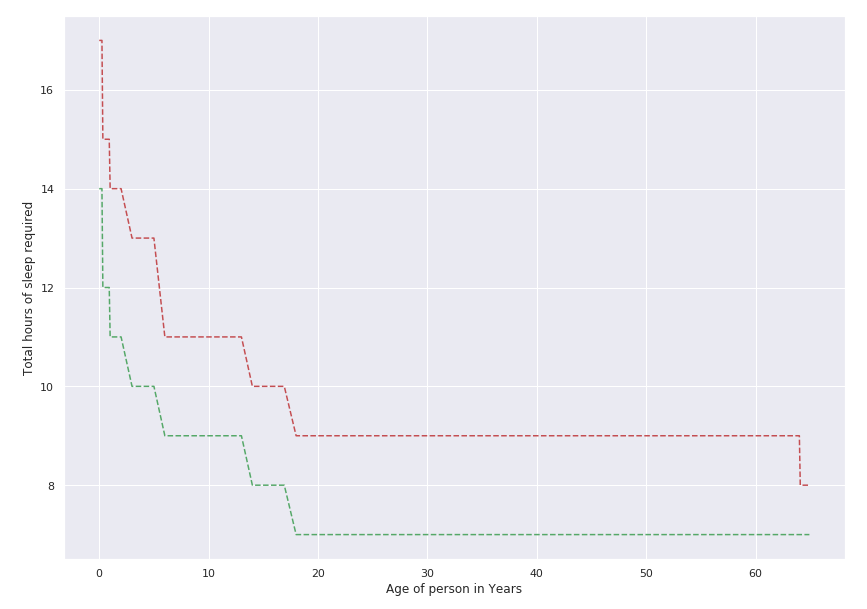
From the graph, it is clear that the two lines decline as the age increases. It shows that newborns between 0 and 3 months require at least 14-17 hours of sleep every day. Meanwhile, adults and the elderly require 7-9 hours of sleep every day. Is your sleeping pattern within this range?
Let's take another example of a scatter plot using the most popular dataset used in data science—the Iris dataset. The dataset was introduced by Ronald Fisher in 1936 and is widely adopted by bloggers, books, articles, and research papers to demonstrate various aspects of data science and data mining. The dataset holds 50 examples each of three different species of Iris, named setosa, virginica, and versicolor. Each example has four different attributes: petal_length, petal_width, sepal_length, and sepal_width. The dataset can be loaded in several ways.
Here, we are using seaborn to load the dataset:
- Import seaborn and set some default parameters of matplotlib:
import seaborn as sns
import matplotlib.pyplot as plt

plt.rcParams['figure.figsize'] = (8, 6)
plt.rcParams['figure.dpi'] = 150
- Use style from seaborn. Try to comment on the next line and see the difference in the graph:
sns.set()
- Load the Iris dataset:
df = sns.load_dataset('iris')

df['species'] = df['species'].map({'setosa': 0, "versicolor": 1, "virginica": 2})
- Create a regular scatter plot:
plt.scatter(x=df["sepal_length"], y=df["sepal_width"], c = df.species)
- Create the labels for the axes:
plt.xlabel('Septal Length')
plt.ylabel('Petal length')
- Display the plot on the screen:
plt.show()
The scatter plot generated by the preceding code is as follows:

Do you find this graph informative? We would assume that most of you agree that you can clearly see three different types of points and that there are three different clusters. However, it is not clear which color represents which species of Iris. Thus, we are going to learn how to create legends in the Scatter plot using seaborn section.