
This is one of the more interesting types of data visualization graphs. We say interesting not because it has a higher preference or higher illustrative capacity, but because it is one of the most argued-about types of visualization in research.
A paper by Ian Spence in 2005, No Humble Pie: The Origins and Usage of a Statistical Chart, argues that the pie chart fails to appeal to most experts. Despite similar studies, people have still chosen to use pie charts. There are several arguments given by communities for not adhering to the pie chart. One of the arguments is that human beings are naturally poor at distinguishing differences in slices of a circle at a glance. Another argument is that people tend to overestimate the size of obtuse angles. Similarly, people seem to underestimate the size of acute angles.
Having looked at the criticism, let's also have some positivity. One counterargument is this: if the pie chart is not communicative, why does it persist? The main reason is that people love circles. Moreover, the purpose of the pie chart is to communicate proportions and it is widely accepted. Enough said; let's use the Pokemon dataset to draw a pie chart. There are two ways in which you can load the data: first, directly from the GitHub URL; or you can download the dataset from the GitHub and reference it from your local machine by providing the correct path. In either case, you can use the read_csv method from the pandas library. Check out the following snippet:
# Create URL to JSON file (alternatively this can be a filepath)
url = 'https://raw.githubusercontent.com/hmcuesta/PDA_Book/master/Chapter3/pokemonByType.csv'
# Load the first sheet of the JSON file into a data frame
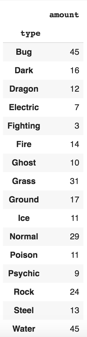
pokemon = pd.read_csv(url, index_col='type')
pokemon
The preceding code snippet should display the dataframe as follows:
Next, we attempt to plot the pie chart:
import matplotlib.pyplot as plt

plt.pie(pokemon['amount'], labels=pokemon.index, shadow=False, startangle=90, autopct='%1.1f%%',)
plt.axis('equal')
plt.show()
We should get the following pie chart from the preceding code:

Do you know you can directly use the pandas library to create a pie chart? Checkout the following one-liner:
pokemon.plot.pie(y="amount", figsize=(20, 10))
The pie chart generated is as follows:

We generated a nice pie chart with a legend using one line of code. This is why Python is said to be a comedian. Do you know why? Because it has a lot of one-liners. Pretty true, right?