
One of the most important deliverables of a monitoring solution is how you visualize the data and present it back to your customers and end users. With OpsMgr, there's a wide variety of options to choose from that enable you to create dashboards containing meaningful information. You can take advantage of pre-built dashboard layouts that can be populated with different visualization widgets to help display your monitoring data – or you can get inspiration from some of the free dashboard solutions that have been made available by the general OpsMgr community.
We will start this chapter with an introduction to all the built-in dashboard layouts and templates that OpsMgr has to offer before walking you through some of the most popular widgets that you can use to light up your displays and impress the boss!
Towards the end of the chapter we'll point you in the direction of some recommended community dashboard resources and we'll also give you some information on third-party vendor add-ons that you can use to really take those visualizations to the next level.
Here's what you'll learn by the end of the chapter:
- Dashboard layouts and templates
- Working with widgets
- Using Visio to create dashboard views
- Community dashboard resources
- Third-party vendor solutions
In the Working with Views section of Chapter 3, Exploring the Consoles, we introduced the Dashboard View and walked you through creating a new dashboard using the Grid Layout with four different widgets. Here, we'll take a look at each of the other dashboard layouts and templates that you can work with in OpsMgr and we'll also show you how to unlock a hidden Datacenter Dashboard template that contains some unique options for visualizing the health and performance of your monitored objects.
In Figure 9.1, you can see a list of all the available dashboard layouts and templates that you get with a default installation of OpsMgr. These options can be accessed when you create a new dashboard view in the Monitoring workspace.

Figure 9.1: Default dashboard layouts and templates
When configuring this layout, you can choose up to a maximum of five empty columns/cells to add to a dashboard. Each column can be populated with a different widget type and you can add extra cells by clicking the gear icon at the top right of the dashboard and selecting Add Cell.
Follow these steps to create an empty dashboard with a Column Layout (we'll revisit this dashboard later and populate the cells with some widgets):
- In the Monitoring workspace, right-click on the location that you wish to create the new dashboard, click on New, and then click on Dashboard View.
- Choose a dashboard layout style from the Select a Dashboard Layout or Widget Template dialog box, we'll choose the Column Layout here, and then click on Next to continue.
- In the Name field, type a name to identify the dashboard – we'll use 'Nimbus Corp Column Dashboard' as an example. Optionally, you can type a description of the view into the Description field, and then click on Next.
- At the Specify the Number of the Columns dialog box, select the number of columns that you wish to have in your dashboard (we'll pick two columns here but you can go up to a maximum of five), and then click on Next to move on.
- Click on Create to deploy the new dashboard layout and close the wizard.
This dashboard template is deployed by default with five widgets designed to show detailed information about a particular group or object.
Follow these steps to create an Object State Dashboard:
- From the Monitoring workspace, right-click on the location that you wish to create the new dashboard, click on New, and then click on Dashboard View.
- Now choose the Object State Dashboard option and click on Next to continue.
- Type a name for the dashboard – we'll use 'Nimbus Corp Object State Dashboard' as an example. Optionally, type a description of the view and click on Next to move on.
- At the Specify the Object dialog box, choose a group or monitored object (we've chosen one of our Hyper-V nodes) and then click on Next to move on.
- Select any criteria that you want to apply to this dashboard and then click on Next and hit Create to close the wizard.
- As each of the five widgets come already configured with this dashboard template, clicking on the dashboard will give you an instantly populated view similar to that in Figure 9.2.

Figure 9.2: Object State Dashboard
A favorite with senior management staff, this dashboard displays selected service level objectives that have been created in OpsMgr – we've covered this topic in detail in the Creating service level objectives section of Chapter 7, Configuring Service Models with Distributed Applications.
Here's what you need to do to configure a new Service Level Dashboard:
- From the Monitoring workspace, right-click on the location that you wish to create the new dashboard, click on New, and then click on Dashboard View.
- Now choose the Service Level Dashboard option and click on Next to continue.
- Type a name for the dashboard – we'll use 'Nimbus Corp Service Level Dashboard' as an example. Optionally, type a description of the view and click on Next to move on.
- At the Specify the Object dialog box, click on the Add button and then choose the service level objective(s) that you want to add to the dashboard. Choose a value for the Last section to determine how far back the SLA is measured.
- Click on Next to continue, and then hit Create to close the wizard.
- In Figure 9.3, you can see the different Service Levels that have been added to this dashboard and there's a nice visual in the bottom pane that clearly defines if the SLA has been met or not.
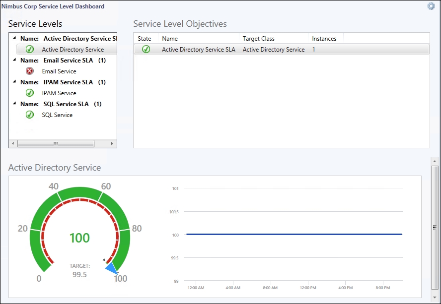
Figure 9.3: Service Level Dashboard
When you deploy this template, you get a four-cell dashboard that's pre-populated with the following widgets: Objects by Performance, Performance, State, and Alerts. None of the widgets in this dashboard have been scoped to monitored objects so that's something you need to do after you create it.
Follow these steps to create this dashboard:
- From the Monitoring workspace, right-click on the location that you wish to create the new dashboard, click on New, and then click on Dashboard View.
- Now choose the Summary Dashboard option and click on Next to continue.
- Type a name for the dashboard – we'll use 'Nimbus Corp Summary Dashboard' as an example. Optionally, type a description of the view and click on Next to move on.
- Click on Create to close the wizard and create the new dashboard.
- Using the gear icon beside each widget to help you populate the cells with data, you should end up with a dashboard similar to Figure 9.4.
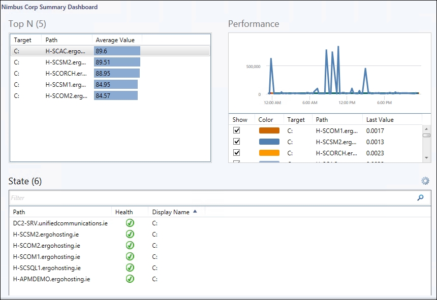
Figure 9.4: Populated Summary Dashboard