
An alternative method to build an investment strategy could be to separate good investment targets and check what is common between them. A good way to find similarities among stocks that performed well could be to create groups based on the TRS values and compare low- and high-performer clusters. The first step to this should be to analyze the following code:
library(stats)
library(matrixStats)
h_clust <- hclust(dist(d[,19]))
plot(h_clust, labels = F, xlab = "")
The following dendogram is the output for the preceding code:
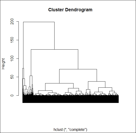
Based on the dendrogram, three clusters separate very well, but to cut the biggest of them into two subgroups, we may need to increase the number of clusters up until seven. To keep the overview, we should try to keep the number of cluster to the lowest possible, so first, we will try to create three clusters only using the k-means method:
k_clust <- kmeans(d[,19], 3)
K_means_results <- cbind(k_clust$centers, k_clust$size)
colnames(K_means_results) = c("Cluster center", "Cluster size")
K_means_results
Our results are pretty encouraging. Our three clusters have 1000 to 4000 elements, and we can very clearly identify the overperformers, underperformers, and, mid-range performers:
  Cluster center Cluster size
1       9.405869         3972
2      48.067540          962
3     -16.627188         2264
Next, we have to check whether there are significant differences regarding the average ratio values among these three groups. For this, we will use the Anova table. This statistical tool would compare the deviation across group averages and the standard deviation within the individual groups. Once the classification is valid, you would find huge differences among group averages but lesser differences when comparing firms within the same clusters:
for(i in c(3,4,6,10,12,14,16,17)) { print(colnames(d)[i]); print(summary(
aov(d[,i]~k_clust$cluster  , d))) }
Output:
[1] "Cash.Assets.Y.1"
                  Df  Sum Sq Mean Sq F value Pr(>F)
k_clust$cluster    1    7491    7491   41.94  1e-10 ***
Residuals       7195 1285207     179
---
Signif. codes:  0 '***' 0.001 '**' 0.01 '*' 0.05 '.' 0.1 ' ' 1
1 observation deleted due to missingness
[1] "Net.Fixed.Assets.to.Tot.Assets.Y.1"
                  Df  Sum Sq Mean Sq F value   Pr(>F)
k_clust$cluster    1   19994   19994   40.26 2.36e-10 ***
Residuals       7106 3529208     497
---
Signif. codes:  0 '***' 0.001 '**' 0.01 '*' 0.05 '.' 0.1 ' ' 1
90 observations deleted due to missingness
[1] "P.CF.5Yr.Avg.Y.1"
                  Df   Sum Sq Mean Sq F value Pr(>F)
k_clust$cluster    1    24236   24236     1.2  0.273
Residuals       4741 95772378   20201
2455 observations deleted due to missingness
[1] "Asset.Turnover.Y.1"
                  Df Sum Sq Mean Sq F value  Pr(>F)
k_clust$cluster    1      7   6.759   11.64 0.00065 ***
Residuals       7115   4133   0.581
---
Signif. codes:  0 '***' 0.001 '**' 0.01 '*' 0.05 '.' 0.1 ' ' 1
81 observations deleted due to missingness
[1] "OI...Net.Sales.Y.1"
                  Df  Sum Sq Mean Sq F value  Pr(>F)
k_clust$cluster    1    1461  1461.4   10.12 0.00147 **
Residuals       7196 1038800   144.4
---
Signif. codes:  0 '***' 0.001 '**' 0.01 '*' 0.05 '.' 0.1 ' ' 1
[1] "LTD.Capital.Y.1"
                  Df  Sum Sq Mean Sq F value Pr(>F)
k_clust$cluster    1    1575  1574.6   4.134 0.0421 *
Residuals       7196 2740845   380.9
---
Signif. codes:  0 '***' 0.001 '**' 0.01 '*' 0.05 '.' 0.1 ' ' 1
[1] "Market.Cap.Y.1"
                  Df    Sum Sq   Mean Sq F value Pr(>F)
k_clust$cluster    1 1.386e+08 138616578   2.543  0.111
Residuals       7196 3.922e+11  54501888
[1] "P.E.Y.1"
                  Df  Sum Sq Mean Sq F value  Pr(>F)
k_clust$cluster    1    1735  1735.3   8.665 0.00325 **
Residuals       7196 1441046   200.3
---
Signif. codes:  0 '***' 0.001 '**' 0.01 '*' 0.05 '.' 0.1 ' ' 1
In the output, R marks significance with an asterisk (*) after the F test probabilities (Pr). So, you learned from the previous table that six of the variables show significant differences across clusters. To see the average values per cluster, you need to type the following code:
f <- function(x) c(mean = mean(x, na.rm = T), N = length(x[!is.na(x)]), sd = sd(x, na.rm = T))
output <- aggregate(d[c(19,3,4,6,10,12,14,16,17)], list(k_clust$cluster), f)
rownames(output) = output[,1]; output[,1] <- NULL
output <- t(output)
output <- output[,order(output[1,])]
output <- cbind(output, as.vector(apply(d[c(19,3,4,6,10,12,14,16,17)], 2, f)))
colnames(output) <- c("Underperformers", "Midrange", "Overperformers", "Total")
options(scipen=999)
print(round(output,3))
Our output was as follows. As you see, each variable has three rows (mean, number of elements, and standard deviation). That is why, the table is so long.
|
Underperformers |
Midrange |
Overperformers |
Total | |
|---|---|---|---|---|
|
Total.Return.YTD..I..mean |
-16.627 |
9.406 |
48.068 |
6.385 |
|
Total.Return.YTD..I..N |
2264.000 |
3972.000 |
962.000 |
7198.000 |
|
Total.Return.YTD..I..sd |
12.588 |
8.499 |
17.154 |
23.083 |
|
Cash.Assets.Y.1.mean |
15.580 |
13.112 |
12.978 |
13.870 |
|
Cash.Assets.Y.1.N |
2263.000 |
3972.000 |
962.000 |
7197.000 |
|
Cash.Assets.Y.1.sd |
14.092 |
12.874 |
13.522 |
13.403 |
|
Net.Fixed.Assets.to.Tot.Assets.Y.1.mean |
26.932 |
29.756 |
31.971 |
29.160 |
|
Net.Fixed.Assets.to.Tot.Assets.Y.1.N |
2252.000 |
3899.000 |
957.000 |
7108.000 |
|
Net.Fixed.Assets.to.Tot.Assets.Y.1.sd |
21.561 |
22.469 |
23.204 |
22.347 |
|
P.CF.5Yr.Avg.Y.1.mean |
18.754 |
19.460 |
28.723 |
20.274 |
|
P.CF.5Yr.Avg.Y.1.N |
1366.000 |
2856.000 |
521.000 |
4743.000 |
|
P.CF.5Yr.Avg.Y.1.sd |
57.309 |
132.399 |
281.563 |
142.133 |
|
Asset.Turnover.Y.1.mean |
1.132 |
1.063 |
1.052 |
1.083 |
|
Asset.Turnover.Y.1.N |
2237.000 |
3941.000 |
939.000 |
7117.000 |
|
Asset.Turnover.Y.1.sd |
0.758 |
0.783 |
0.679 |
0.763 |
|
OI...Net.Sales.Y.1.mean |
13.774 |
14.704 |
15.018 |
14.453 |
|
OI...Net.Sales.Y.1.N |
2264.000 |
3972.000 |
962.000 |
7198.000 |
|
OI...Net.Sales.Y.1.sd |
11.385 |
12.211 |
12.626 |
12.023 |
|
LTD.Capital.Y.1.mean |
17.287 |
20.399 |
17.209 |
18.994 |
|
LTD.Capital.Y.1.N |
2264.000 |
3972.000 |
962.000 |
7198.000 |
|
LTD.Capital.Y.1.sd |
18.860 |
19.785 |
19.504 |
19.521 |
|
P.E.Y.1.mean |
20.806 |
19.793 |
19.455 |
20.067 |
|
P.E.Y.1.N |
2264.000 |
3972.000 |
962.000 |
7198.000 |
|
P.E.Y.1.sd |
14.646 |
13.702 |
14.782 |
14.159 |
As we have seen in our preceding Anova table, in the case of six out of eight financial ratios, we find significant differences among the three groups. This method helps to find even nonlinear connections (in contrast to correlation ratios). A good example of this is Cash.Assets; Overperformers and mid-range shows very similar values, but underperformers have a significantly higher amount of (probably unused) cash. This means that being below a certain level, cash/asset gives us the hint that the given share is not a good investment. We will find the same pattern with the asset turnover.
The 5-year average of Price/Cash flow (P/CF) is another good example of how we may discover connections that remain hidden when only checking correlations. This ratio shows the J form, that is, the lowest value is with the mid-range group, and the highest with the overperformers.
Based on these results, the best investment targets may have, at the same time, lower cash ratio and financial leverage (LT debt / capital) but higher fixed asset rate and P/CF ratio, while P/E and asset turnover are just average. In short, the best firms use their current capital efficiently; they average the asset turnover with not too much free cash. They have further room to increase their leverage and have a good cash flow growth outlook reflected by the higher P/CF rate. Before testing this selection method, we shall check whether we may refine this by either adding more exact rules to separate potential investment or by simplifying it by removing some of these criteria.