
Technical analysis (TA) can help you achieve better results if you do not overestimate its predictive power. Technical analysis is especially good at predicting short-term trends and at indicating market sentiment. Fundamental investors (and one of the writers of this chapter) use them to choose their buy-in and sell-out point: given their fundamentally backed view on the direction of the market technical analysis is a valuable help in choosing the short-term optimum. It can also eliminate such common trading flaws as badly chosen position size (indication on the strength of the trend), shaky hands (only sell when there is a sign) and inability to press the button (but when there is a sign, do sell).
Three golden rules to remember before we jump to technicalities:
- Each market has its own mix of tools that work: For example head-and-shoulders mostly appear on stock charts whereas support-resistance levels temper the trading on forex markets, and within the markets each asset can be specific. Therefore, as a rule of thumb, use tailor-made sets of indicators and neural networks specific to the actual asset you are looking at.
- No pain, no gain: Keep in mind that there is no holy grail, if one achieves to sustain winning on 60% of the trades then she has found a viable and well-rewarding trading strategy.
- Avoid impulsive trading: Maybe this is the most important above all. It might hurt that you lost on your last trade but do not let it influence your future decisions. Trade only when there is a sign. If you consider opening a live trade account read extensively on money management (handling risk and position size, leverage) and on psychology of trading (greed, fear, hope, regret).
Technical analysis abounds of tools but most of them can be categorized into four main groups. We advise you to use the old ones as these are more followed by professionals and are more likely to trigger price movements themselves (being self-fulfilling) besides being usually more user-friendly.
- Support-resistance and price channels: Price levels often influence trading: strategic levels may act either as support, keeping price levels from falling below, or as resistance, an obstacle to further rises. Parallel lines applied to the primary conditions of a trend (bottoms for an increasing trend, tops for a decreasing trend) define price channels - they are tools of the top-bottom analysis, just like the next category, the chart patterns. As these are usually harder to program we do not deal with them in detail.
- Chart patterns – Head-and-shoulders, saucers: sound familiar? Perhaps, due to their easily recognizable nature, chart patterns are the most widely known tools of technical analysis. They have three categories: trend makers (mast, flag), trend breakers (double tops) and decision point signals (triangles). These, too, are rather intuitive, hardly programmable, and thus fall out of the scope of this chapter.
- Candle patterns: As candlestick charts are the most widespread technicists started to spot signals on these and have given those names like morning star, three white soldiers or the famous key reversal. More than any other TA tool, they are significant only if combined with other signals, in most cases strategic price levels. They can be a combination of two-five candles.
- Indicators: This is the type we will deal with the most in the following pages. Easy to program, technical indicators serve as basis of high frequency trading (HFT), a strategy based on algorithmic decisions and rapid market orders. These indicators have four categories: momentum-based, trend follower, money flow (based on volume) and volatility-based.
In this chapter we are going to present a strategy that combines elements from types (3) and (4), we will be looking for potential trend changes by the help of indicators and signal key reversals there.
Although everyone should explore by her own the TA tools that best work on the respective markets some general observations can be formulated.
- Stocks usually form nice chart patterns and are sensitive to candle patterns and to strategic moving average crossings, too. Asymmetric information is an important issue, although less than in the case of commodities, for instance, and unpredictable spikes can alter the course of the prices at news releases.
- FX is traded continuously around the globe and is strongly decentralized which implies two things. First, no overall volume data is available, so one should have a general idea about the liquidity of the markets to weigh the importance of price changes – for example in summer liquidity is lower, therefore even a smaller buy-in can generate volatility. Second, different people trade at different times and each of them has different habits. In EURJPY, for instance, during the US and European trading hours the tens and round numbers tend to be psychological supports, whereas there is a switch to the 8s during the Asian trading (8 being a lucky number). From a TA toolkit perspective: no characteristic chart patterns besides triangles and masts, important support-resistance levels and price channels, zone-thinking, stuck-launch dynamics and Fibonacci proportions are mostly used.
Charting programs, if not provided by brokerages in the trading program, can get expensive and not always provide sophisticated TA tools. To circumvent this problem you can use R to trace your charts and can program all the indicators you like – if they are not yet built in.
Let's look at an example now: plotting charts for bitcoin. Bitcoin is a crypto currency that got popular in the summer of 2014 where its price was up to $1162 from below $1 and is traded on many freshly founded and therefore rudimentary exchanges. This posed a problem to many small investors: how to trace the chart? And, even if they were okay with BitStamp's uneasy platform, granular data was only available in spreadsheet format and is still today.
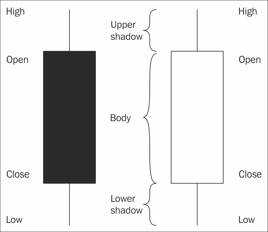
You can source data from http://bitcoincharts.com/. Herein we included a code that draws in live data and thus acts as if it was a live charting tool. With this useful trick you can avoid paying hundreds of dollars for a professional software. We plot candlestick charts (also called OHLC), the commonly used type. Before we start here is a graphic that explains how they work.
Here we provide the program code of the live data fetcher that draws OHLC chart.
We will use the RCurl package to get data from the Internet. First let's have a look at the following function:
library(RCurl)
get_price <- function(){
First we use the getURL function from the RCurl package to read the whole website as a string:
a <- getURL("https://www.bitcoinwisdom.com/markets/bitstamp/btcusd", ssl.verifypeer=0L, followlocation=1L)
If we have a look at the HTML code we can easily find the bitcoin price we are looking for. The function returns it as a numeric value.
  n <- as.numeric(regexpr("id=market_bitstampbtcusd>", a))
  a <- substr(a, n, n + 100)
  n <- as.numeric(regexpr(">", a))
  m <- as.numeric(regexpr("</span>", a))
  a <- substr(a, n + 1, m - 1)
  as.numeric(a)
}
Or we can grab the exact same information with the help of the XML package, which was created to parse HTML and XML files and to extract information:
library(XML)
as.numeric(xpathApply(htmlTreeParse(a, useInternalNodes = TRUE), '//span[@id="market_bitstampbtcusd"]', xmlValue)[[1]])
This practice of getting price data is of course only for demonstration purposes. Live price data should be provided by our broker (for which we can still use R). Now let's see, how to draw a live candle chart:
DrawChart <- function(time_frame_in_minutes,
  number_of_candles = 25, l = 315.5, u = 316.5) {

  OHLC <- matrix(NA, 4, number_of_candles)
  OHLC[, number_of_candles] <- get_price()
  dev.new(width = 30, height = 15)
  par(bg = rgb(.9, .9, .9))
  plot(x = NULL, y = NULL, xlim = c(1, number_of_candles + 1),
    ylim = c(l, u), xlab = "", ylab = "", xaxt = "n", yaxt = "n")
  abline(h = axTicks(2), v = axTicks(1), col = rgb(.5, .5, .5), lty = 3)
  axis(1, at = axTicks(1), las = 1, cex.axis = 0.6,
    labels = Sys.time() - (5:0) * time_frame_in_minutes)
  axis(2, at = axTicks(2), las = 1, cex.axis = 0.6)
  box()
  allpars = par(no.readonly = TRUE)
  while(TRUE) {
    start_ <- Sys.time()
    while(as.numeric(difftime(Sys.time(), start_, units = "mins")) <
      time_frame_in_minutes) {
      OHLC[4,number_of_candles] <- get_price()
      OHLC[2,number_of_candles] <- max(OHLC[2,number_of_candles], OHLC[4,number_of_candles])
OHLC[3,number_of_candles] <- min(OHLC[3,number_of_candles], OHLC[4,number_of_candles])
      frame()
      par(allpars)
      abline(h = axTicks(2), v=axTicks(1), col = rgb(.5,.5,.5), lty = 3)
      axis(1, at = axTicks(1), las = 1, cex.axis = 0.6, labels = Sys.time()-(5:0)*time_frame_in_minutes)
      axis(2, at = axTicks(2), las = 1, cex.axis = 0.6)
      box()
      for(i in 1:number_of_candles) {
        polygon(c(i, i + 1, i + 1, i),
          c(OHLC[1, i], OHLC[1, i], OHLC[4, i], OHLC[4, i]), col = ifelse(OHLC[1,i] <= OHLC[4,i], rgb(0,0.8,0), rgb(0.8,0,0)))
        lines(c(i+1/2, i+1/2), c(OHLC[2,i], max(OHLC[1,i], OHLC[4,i])))
        lines(c(i+1/2, i+1/2), c(OHLC[3,i], min(OHLC[1,i], OHLC[4,i])))
       }
       abline(h = OHLC[4, number_of_candles], col = "green", lty = "dashed")
     }
     OHLC <- OHLC[, 2:number_of_candles]
     OHLC <- cbind(OHLC, NA)
     OHLC[1,number_of_candles] <- OHLC[4,number_of_candles-1]
  }
}
To fully understand this code some time and some programming experience is probably needed. To summarize the algorithm does the following: in an infinite loop, reads price data and stores it in a matrix with four rows as OHLC. Every time the last column of this matrix is recalculated to assure that H is the highest and L is the lowest price observed in that time interval. When the time determined by the time_frame_in_minutes variable is reached matrix columns roll, the oldest observations (first column) are dropped, and each column is replaced by the next one. The first column is then filled with NAs except the O (open) price, which is considered as the close price of the previous column, so the chart is continuous.
The remaining code is only for drawing the candles with the "polygon" method. (We can do it with built-in functions as well, as we will see later.)
Let's call this function and see what happens:
DrawChart(30,50)
See more on data manipulation in Chapter 4, Big Data – Advanced Analytics.
R has many built-in indicators, such as the simple moving average (SMA), the exponential moving average (EMA), the relative strength indicator (RSI), and the famous MACD. These constitute an integral part of technical analysis, their main goal is to visualize a relative benchmark so that you could get an idea whether your asset is overbought, relatively well-performing or at a strategic level compared to some reference period. Here you find a brief explanation to what each of them does, and how you can put them on your chart.
Moving averages are the simplest among all indicators: they show the average price level for you on a rolling basis. For example, if you trace the 15-candle SMA, it will give you the average price level of the 15 preceding candles. Obviously, if your current candle's time is up and a new candle starts, the SMA will calculate a new average leaving out the previously first candle and taking in the newest one instead. The difference between SMA and EMA is that SMA weighs all candles equally whereas EMA gives exponential weights – hence the name: it overweighs current candles to previous ones. This is a good approach if you want a benchmark that is more tied to current price levels and that reacts more quickly where there are shifts in price levels. These are overlay indicators that are directly plotted on the chart.
The relative strength index is a band-indicator: its value can vary between 0 and 100 with three bands within this range. With an RSI between 0 to 30 the asset is oversold, between 70 to 100 it is overbought. RSI endeavors to judge upon price variations' intensity by using the relative strength ratio: average price of up closes divided by the average price of down closes (aka green candles' average close per red candles' average close). The average's summing period may vary, 70 is the most used.
As the formula suggests this indicator often gives signals, mostly in strong trends. As prices might remain at overbought or oversold levels use this indicator carefully, always in combination with some other type of indicator, or chart pattern like a trend breaker, also called failure swing. You might also consider diminishing your position size or looking for warning signs if, for instance, it shows that the asset you are long on is overbought.
Here you can see how to trace this indicator and a moving average:
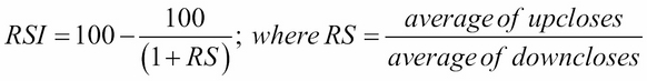
library(quantmod)
bitcoin <- read.table("Bitcoin.csv", header = T, sep = ";", row.names = 1)
bitcoin <- tail(bitcoin, 150)
bitcoin <- as.xts(bitcoin)
dev.new(width = 20, height = 10)
chartSeries(bitcoin, dn.col = "red", TA="addRSI(10);addEMA(10)")
By looking at the above chart we can conclude that during this period the market became rather oversold as the RSI tended to remain at low territories and it has hit the extreme levels several times.
MACD (Mac Dee) stands for Moving Average Convergence-Divergence. It is a combination of a slow (26-candles) and a quick (12 candles) exponential moving average, a trend follower indicator: it gives signals rarely, but these tend to be more accurate. MACD gives signals when the quick EMA crosses the slow one. This is a buy if the quick crosses from below and a sell if it crosses from above (the 12-canlde average price being lower than the 26-candle, long-term average). The position of the EMA(12) marks the general direction of the trend – for example if it is above the EMA(26) the market is bullish. Important restriction: MACD gives false alarms in ranges, use only in strong trends. Some use the direction of the changes of the distance between the two lines, too, plotted in red or green histograms: once there are four bars in the same color, the strength of the trend is confirmed.
For technical analysis, you can use different R-packages: quantmod, ftrading, TTR, and so on. We mostly rely on quantmod. Here you can see how to trace the MACD on a previously saved dataset, named Bitcoin.csv:
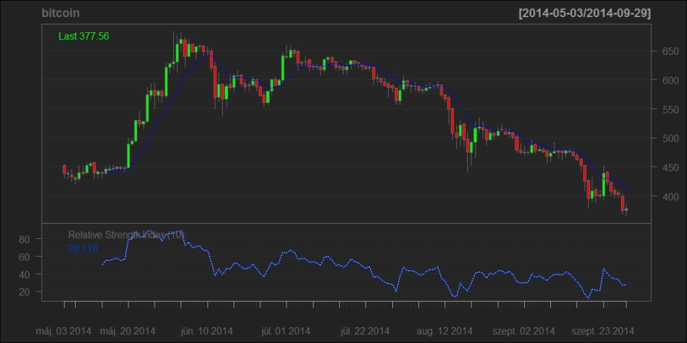
library(quantmod)
bitcoin <- read.table("Bitcoin.csv", header = T, sep = ";", row.names = 1)
bitcoin <- tail(bitcoin, 150)
bitcoin <- as.xts(bitcoin)
dev.new(width = 20, height = 10)
chartSeries(bitcoin, dn.col = "red", TA="addMACD();addSMA(10)")
You can see the MACD under the chart, in the strong downwards trend it gives valid signals.
Now that you got a general grasp of R's TA features let us program a rather easy strategy. The following script recognizes key reversals, a candlestick pattern, at strategic price levels.
To do this, we applied the following dual rationale: first, we gave a discretional definition to what a strategic price level is. For instance, we recognized as mature increasing trend the price movement whose bottoms are monotonously increasing (bottom being the candle body's lowest point) and whose current MA(25) level is higher than the MA(25) measured 25 candles before. We underline here that this does not constitute part of the standard TA tools and that its parameters have been chosen to best fit the actual chart we deal with, that of bitcoin. If you would like to apply it to other assets we advise you to adjust it to provide the best fit. This is not a trend recognition algorithm on itself: it only serves as part of our signal system.
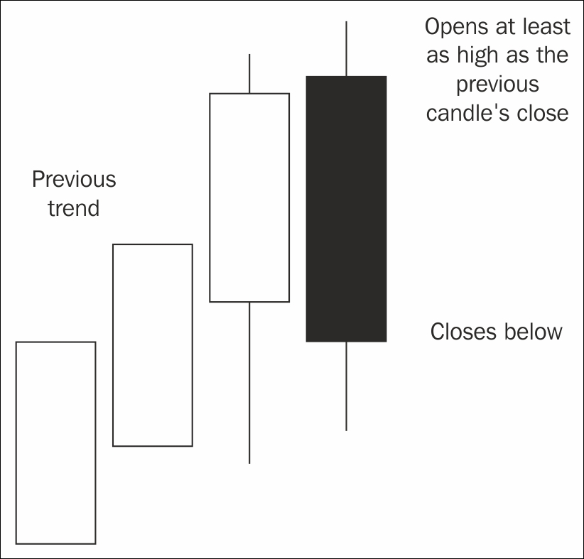
If this algorithm recognized a strategic price level in a mature trend that would be likely to break down if a candle pattern appeared, we started to look for key reversals. The key reversal is a trend breaker candlestick pattern, it occurs when the previous trend's last candle that points to the same direction as the trend itself (it is green for a rising trend, red for a falling one), but suddenly prices turn and the next candle points in the opposite direction of the trend with a bigger candle body than the previous one. The trend breaker candle should start at least as high as the previous one, or, if the quotes are not continuous, a bit above the close for a rising trend, and a bit below for a falling one. See our graphic below for a key reversal in a rising trend:
Here you find the code of the function that recognizes this pattern.
Earlier in the bitcoin section we used the polygon method to create candle charts manually. Here we are using the quantmod package and the chartSeries function to do the same more easily wrapped in the OHLC function to make it more flexible.
library(quantmod)
OHLC <- function(d) {
  windows(20,10)
  chartSeries(d, dn.col = "red")
}
The following function takes the time series and two indices (i and j) as arguments, and decides, weather it is an increasing trend from i to j or not:
is.trend <- function(ohlc,i,j){
First: if the MA(25) is not increasing then it is not an increasing trend so we return FALSE.
avg1 = mean(ohlc[(i-25):i,4])
avg2 = mean(ohlc[(j-25):j,4])
if(avg1 >= avg2) return(FALSE)
In this simple algorithm a candle is called a valley, if the bottom of the candle body is lower than the previous one and the next one. If the valleys make a monotonous non-decreasing series we have an increasing trend.
ohlc <- ohlc[i:j, ]
  n <- nrow(ohlc)
  candle_l <- pmin(ohlc[, 1], ohlc[, 4])
  valley <- rep(FALSE, n)
  for (k in 2:(n - 1))
    valley[k] <- ((candle_l[k-1] >= candle_l[k]) & (candle_l[k+1] >= candle_l[k]))
  z <- candle_l[valley]
  if (all(z == cummax(z))) return(TRUE)
  FALSE
}
This was the trend recognition. Let's see the trend reversal. First we use the previous function to check the conditions of the increasing trend. Then we check the last two candles for the reversal pattern. That's it.
is.trend.rev <- function(ohlc, i, j) {
  if (is.trend(ohlc, i, j) == FALSE) return(FALSE)
  last_candle <- ohlc[j + 1, ]

  reverse_candle <- ohlc[j + 2, ]
  ohlc <- ohlc[i:j, ]
  if (last_candle[4] < last_candle[1]) return(FALSE)
  if (last_candle[4] < max(ohlc[,c(1,4)])) return(FALSE)
  if (reverse_candle[1] < last_candle[4] |
      reverse_candle[4] >= last_candle[1]) return(FALSE)
  TRUE
}
We are out of the woods. Now we can use this in real data. We simply read the bitcoin data and run the trend reversal recognition on it. If there is a reversed trend with at least 10 candles we plot it.
bitcoin <- read.table("Bitcoin.csv", header = T, sep = ";", row.names = 1)
n <- nrow(bitcoin)
result <- c(0,0)
for (a in 26:726) {
  for (b in (a + 3):min(n - 3, a + 100)) {
    if (is.trend.rev(bitcoin, a,b) & b - a > 10 )
      result <- rbind(result, c(a,b))
    if (b == n)
      break
  }
}

z <- aggregate(result, by = list(result[, 2]), FUN = min)[-1, 2:3]
for (h in 1:nrow(z)) {
  OHLC(bitcoin[z[h, 1]:z[h, 2] + 2,])
  title(main = z[h, ])
}
Our code successfully recognizes four key reversals, including the historical turning point in the bitcoin price giving us a nice short selling signal. We can conclude that the signaling was successful, the only thing left to do is to use them wisely.
Aware of the fundamentals of bitcoin (its acceptance as money undermined, ousting from such previously core markets as China), one could have made a nice profit whilst following the signal (the last candle on the chart) which is as follows:
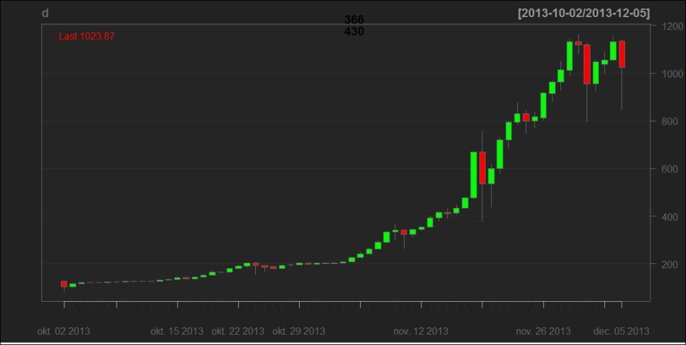
TA is useful while setting take profits and stop losses, in other words managing your position. If you chose to sell at the signal, you could have set these as follows.
The system signals that you might want to sell at $1023,9 on December 5, 2013, in the last candle of the above chart, highlighted with an arrow on the next chart. You decide to proceed and open a position. Since bitcoin prices fluctuate quite much, especially after an exponentially increasing previous trend, you decide to put your stop loss to the historical high, to 1163, because you don't want false spikes to close you out of the position.
On the next chart, here below, you can see that this approach is justified, after the fall in prices volatility increases significantly and shadows grow.
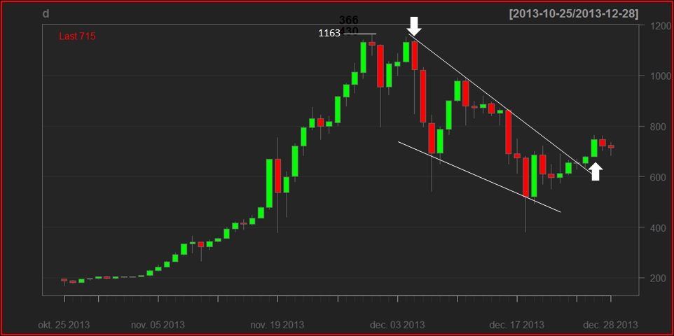
By the end of 2013 a supposed trend line can be traced if you connect the tops of the candles bodies (in white, drawn manually). This seems to hold and a lower trendline forms on the bottoms, with a lower slope, giving a triangle. We say that a triangle is valid on a chart if the price leaves it before it reaches 3/4 of its length.
This is what happens: on December 26, 2013 the daily chart breaks the line upwards with a big green candle (pointed at by an arrow). The MACD crosses, giving a strong bullish signal, and we close the position on the top of the body, at 747.0 – if not before. So, we earned $276.9, or a 27% return on the trade.
Let's look at the risk profile of this trade to show how technical analysis can be used to manage your exposure. The best way to do so is to calculate your risk-reward ratio, given by the below formula:
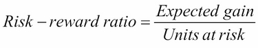
The denominator is easy to define, this is the possible loss on the position, (1163.0-1023.9) = $139.1 in the case of the activation of the stop loss. The numerator, the possible gain can be approximated by a Fibonacci retracement, a tool that uses the golden section to predict possible price reversions, particularly useful in this exponential trend. You can see it below on a graph from https://bitcoinwisdom.com/:
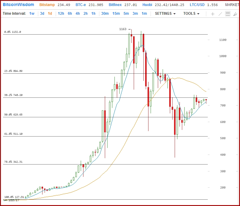
If you take the height of the trend as 100%, you can expect prices to touch Fibonacci levels when the trend breaks. Since a key reversal is a strong sign, let's take the 38.2%, which equals $747.13, so we expect prices to go down there. So the numerator of the risk-reward ratio is (1023.9-747.1) = $276.8, giving a final result of 276.8 /139.1 = 1.99, meaning that there is an ex-ante profit potential of $1.99 per one dollar at risk. This is a just fine potential, the trade should be approved.
Whenever you consider entering into a position, calculate how much you risk compared to how much you expect to gain. If it is below 3/2, the position is not the best, if below 1, you should forget the trade altogether. The possible ways to improve your risk/reward ratio are a tighter stop loss or the choice of a stronger sign. Technical analysis provides you with useful risk management tactics if you wish to be successful at trading, do not forget about them.
Technical analysis, and particularly the presented chartist approach, is a highly intuitive, graphical way of analyzing financial assets. It uses support-resistance levels, chart- and candle patterns and indicators to predict future price movements. R enabled us to fetch live data for free and plot it as an OHLC chart, plot indicators on it and receive automated signs for key reversals, a candlestick pattern. We used one of these to show how a real position could have been managed manually and have shown that the appeal of TA is that it not only tells you when to open a position but also when to close it and calculate the strength of the signal by using risk management practices.