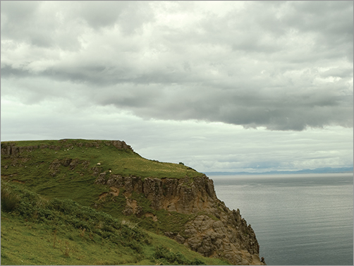
For your first matte painting, you’ll paint over a photo I took of a hill in Scotland. Because it’s the photographic source for your matte painting, it’s referred to as a plate. You can consider this matte painting your training-wheels project, because you don’t need to create the background. This image will be used as the basis for learning about perspective, delineating light and dark sides, and applying textures to achieve a photorealistic effect. Concentrate on coming up with a visually compelling concept that you’ll use to complete the next several chapters.
Let’s first take a closer look at the plate you’ll be painting over (see Figure 3-1). This scene is relatively neutral, so you’ll be able to set different moods through the application of color overlays or color corrections.
Figure 3-1: Plate
Understanding 16-bit Color
There is something special about this plate. Open CastlePlate16Bit.psd (included in the Chapter 3 materials on the DVD) in Photoshop, and take a moment to examine it before you proceed.
Most photos taken with an inexpensive camera, or those pulled off the Internet, are in 8-bit color. An 8-bit image is 2 to the eighth power, or 256 levels of information for each channel. An 8-bit RGB (red, green, and blue) image in Photoshop uses numbers from 0 to 255 to represent each constituent color, or channel, in the image. Thus 0 is the absence of a color, and 255 is the maximum amount possible of that color. (Photoshop shows the top level as 255 because it begins counting with 0 instead of 1.)
Digital pictures are made up of combinations of red, green, and blue pixels, so in an 8-bit RGB image, the maximum possible red is listed as (255, 0, 0), whereas the maximum possible green is listed as (0, 255, 0). An 8-bit plate has 16.8 million (256 × 256 × 256) possible colors.
That may sound like a lot; but for feature film work, everything is done with 16-bit color, which has vastly more color information. A16-bit image is 2 to the sixteenth power, or 65,536 levels of information for each channel. Multiplying the three channels (65,536 × 65,536 × 65,536) gives you an astounding 281 trillion possible colors with which to work. Because of the additional precision it offers, most of what you do as a matte artist will be in 16-bit color.
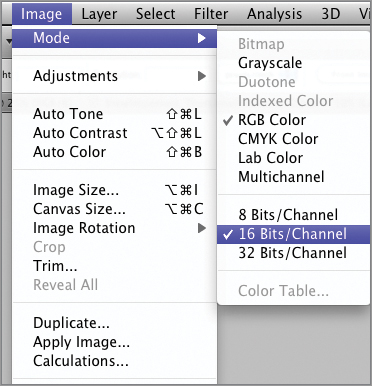
You can find out the bit depth of an image by going to Photoshop’s top menu and choosing Image Mode 8, 16, or 32 Bits/Channel. A checkmark appears next to the bit depth of the current image (see Figure 3-2).
Figure 3-2: Finding the bit depth of your document
You need to know the bit depth in this case because many of the filters are turned off in Photoshop when you work in 16-bit color. Return to the top menu and choose Filter (see Figure 3-3).
Figure 3-3: Filters turned off in 16-bit color
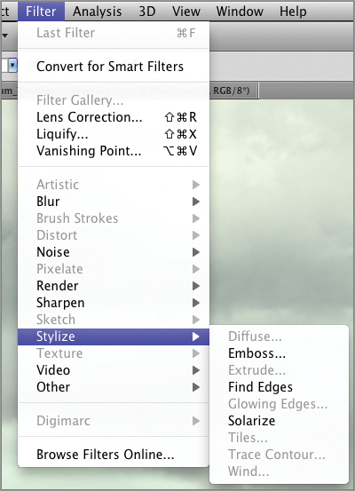
Notice how many of the filters are grayed out and unavailable for use, such as Distort, Pixelate, and Sketch. With each new release of Photoshop, Adobe rewrites more of the filters to work in 16-bit. The filters available in version CS5 are the most useful ones, like Blur, Noise, and Sharpen.
You need to keep in mind two things about 16-bit plates:
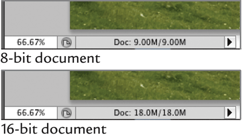
- A 16-bit plate is twice as large as an 8-bit plate. Therefore, if your 8-bit plate is 9 MB, and you change it to 16-bit, the document size will be 18 MB. The current document size is listed after Doc in the lower-left corner of your document window (see Figure 3-4).
- When you change a 16-bit plate to an 8-bit plate and save it, you permanently lose half of the plate’s information. This can come as a nasty surprise if you planned to use all the data in the 16-bit plate. There are, however, practical reasons for switching between the depths. During the concept phase, when you want to capture your ideas quickly, you’ll find that your brushwork is faster in 8-bit. When you switch back to 16-bit, I recommend you cut the painted elements in the 8-bit plate and paste them into the original 16-bit plate. This trick allows you to make the transfer from one bit depth to another without a loss of data. For this reason, when you get a 16-bit plate from a client, make sure you save a copy!
Figure 3-4: 8-bit vs. 16-bit document size
Rules of Composition
As you begin work on your concept sketch, you need to follow some basic rules of composition. Here are five compositional rules that I use in my work: four are common-sense rules any artist should know, and one is an advanced compositional ratio used by artists for hundreds of years:
- Avoid symmetry.
- Don’t paint objects flat-on to the viewer.
- Follow the principle of balance.
- Obey the rule of thirds.
- Understand the golden mean.
Avoid Symmetry
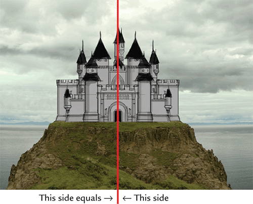
When composing your matte shot, you should generally avoid setting up a symmetrical composition. Symmetry means the right and left sides of your shot are roughly the same. Why avoid symmetry? To put it bluntly, symmetrical compositions are boring.
In the hands of a master, symmetrical shots can be powerful. Film director Stanley Kubrick used symmetrical shots at the climax of his films because of their iconic power. Symmetry can be used to excellent advantage in certain situations: to achieve a sense of dominance, majesty, or conformity. However, when a beginner uses symmetry, it’s a sign they lack knowledge of composition. For this castle painting, don’t set up your shot symmetrically (see Figure 3-5).
Figure 3-5: Symmetrical composition
Don’t Paint Objects Flat-on to the Viewer
As a matte painter, you should avoid painting objects, especially buildings, flat-on to the camera. The flat view of a building tends to be the most uninteresting. Setting it at an angle gives you a better silhouette and view of the subject (see Figure 3-6).
Figure 3-6: Object at an angle

The Principle of Balance
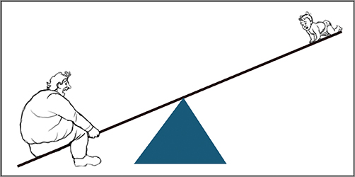
This principle, also known as the fulcrum-lever rule, is a quick and easy way to balance multiple objects in your composition. Think of your composition as a heavy-set man on a teeter-totter with a baby. If the heavy man is too far out on the teeter-totter, the baby can’t balance him (see Figure 3-7).
Figure 3-7: Out of balance
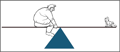
In order to correct the imbalance, the man needs to move nearer to the middle—the fulcrum—of the teeter-totter. This same principle works with objects in a composition. A larger object situated near the center of the composition can be balanced by a smaller object on the outside edge. Returning to the teeter-totter scene, if the heavy-set man moves toward the fulcrum, he can balance the baby (see Figure 3-8).
Figure 3-8: In balance
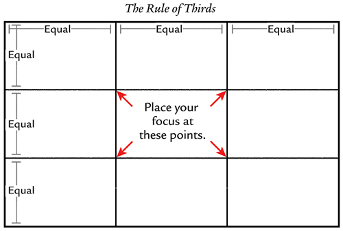
The Rule of Thirds
The rule of thirds states that, whenever possible, you should place the focus of your picture one-third of the way from the edge of your frame. This discourages you from placing your subject smack in the middle of the picture or from having your horizon divide your picture in half (see Figure 3-9).
Figure 3-9 The rule of thirds
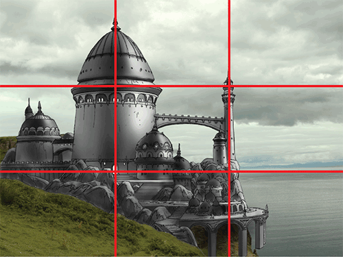
For vertical elements in your composition, you can use the division lines making up the rule of thirds as alignment guides. Note how the doorway to the castle has been placed in the lower-left focus point (see Figure 3-10).
Figure 3-10: Using the division lines as guides
The Golden Mean
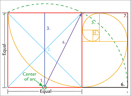
The golden mean, also known as the golden measure and the divine proportion, is a uniquely pleasing spatial division that has been used by artists as far back as the Renaissance. It involves a mathematical relationship between the long and short sides of a rectangle, where the length of the long side equals 1.61803… times the length of the short side. Like pi, the number is irrational and never resolves itself, though mathematicians have factored it out to a million places. Don’t be afraid if, like me, math isn’t your forté. I’m about to show you how easy it is to set up a rectangle with the golden mean without any math.
Here are the steps to draw the golden mean:
1. Start a new file in Photoshop measuring 1,500 pixels wide by 1,000 pixels high. On the left side of the picture, draw a square with all 4 sides of equal length, as shown in red in Figure 3-11. You can constrain the Rectangular Marquee tool to a square by holding down the Shift key.
2. Draw an X from corner to corner, as shown in the figure in light blue. If you’re using the custom brush set included in Chapter 2, the Hard Round Solid 5 brush works great for drawing straight lines if you click, hold down the Shift key, and click again.
3. Draw a vertical line through the center of the X to find the middle of the bottom side, as shown in dark blue.
4. Draw a line from the center of the bottom of the square to the top-right corner, as shown by the purple line with the arrowhead.
5. Using the base of the pointed purple line as the center point, draw an arc, as shown by the dashed green line.
6. Draw a line extending from the bottom-right corner of the original red square, as indicated by the black line. Where it meets the arc is the far edge of the golden rectangle.
7. Draw a line up from where the arc meets the extended bottom line and from the top-right corner of the original red square to close the rectangle shown in dark red.
You can now construct another golden rectangle inside of the part of the rectangle you just created. If you continue to do this for several iterations, you get a series of nested golden mean shapes. Using these shapes as guides, you can draw a spiral as shown in gold (see Figure 3-11). You now have your own golden mean template in a file, so you can easily cut it out and paste it into a new project to use as reference while composing.
Figure 3-11: Constructing the golden mean
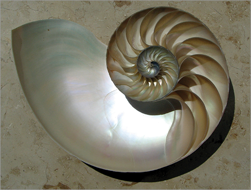
Amazingly enough, this complex mathematical ratio describes a phenomenon in the natural world: the perfect spiral. One of the finest examples is the nautilus shell (see Figure 3-12).
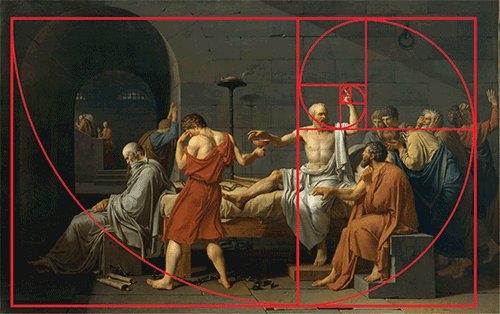
When you become familiar with the golden mean, you’ll recognize its use in countless works of art. Artists as diverse as Leonardo Da Vinci, Maxfield Parrish, Piet Mondrian, and Georges Seurat have used the golden mean as the basis of their artwork. One of my favorites is Jacques Louis David’s The Death of Socrates, which is displayed in the Metropolitan Museum of Art. With apologies to David for defacing his masterpiece, I have overlaid the golden mean on his painting to demonstrate how closely he adhered to it (see Figure 3-13).