

Job:12-84823 Title:RP-Graphic Design That Works (LDW)
(163)AC4680 175# Dtp:120/163 Page:186
Text (DS)
xfera
CLIENT:
Xfera is a mobile communications
company that offers a new gener-
ation of services and solutions.
FIRM:
Summa
ART DIRECTOR:
Wladimir Marnich
DESIGNER:
Griselda Marti
PHOTOGRAPHER:
Various stock
COPYWRITER:
Conrado Llorens
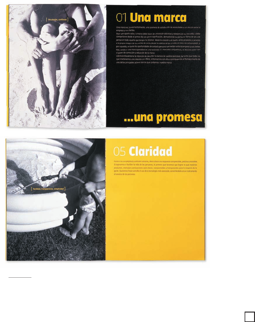
ABOVE: Because Xfera means “sphere,”
the design firm created a unique mark
incorporating the spherical letterform as
a play on words. The embossed logo sits
predominantly on the vibrant yellow
cover. The specially designed font, called
Xfera Taz, distinguishes the company’s
new identity.
A Step Above the Rest
Xfera was in the midst of developing an identity for their
company. “This was a brand book created for the official
launch of their new mark and name,” says art director
Wladimir Marnich. Designed as an internal communications
device, the brochure was used to inspire and inform employees
about Xfera’s new identity and key messaging. “We did a lot
of research to help understand the market, develop the brand,
and position the company,” recalls Marnich. “We traveled
throughout Europe—looking at the latest in mobile telephones.
We realized that there was a lack of real quality amongst
their competition.” Xfera was a fairly new company entering
a very competitive market, so they could not survive or com-
pete on price alone. “Because Xfera was coming out with the
latest in technology, we focused on quality, simplicity, and
humanizing the whole business instead,” adds Marnich.
Inside the brochure, words and images work together to
clearly communicate the company’s new brand. The images,
mostly lifestyle in nature, reinforce the key values and give a
human quality to the overall identity. “We spent a lot of time
researching photos,” notes Marnich. “We not only had to get
the concept to go with each one of the values, but we also
had to choose images with a similar quality. It was very difficult.”
Because of budget constraints, the design team had to use stock
photography. The brochure concludes with the presentation of
the company’s new mark and overall visual look.
Graphic Design That Works
186
180-193_C34680 29/12/05 12:24 PM Page 186
Job:12-84823 Title:RP-Graphic Design That Works (LDW)
175# Dtp:120/163 Page:187
Text (DS)
W)
86
What Works
The simplicity in layout and text helped to clearly
communicate the company’s new brand and identity to
Xfera employees. “People were quite pleased and really
tuned into what we were trying to say,” details Marnich.
LEFT: Throughout the
brochure, each spread uses
key words and lifestyle imagery
to clearly communicate the
company’s nine core values.
The entire brochure plays off
the corporate color scheme—
yellow, black, and gray. Gloss
varnish is applied to the
headline type to make it
stand out.
187
180-193 84823 12/12/05 8:02 AM Page 187
..................Content has been hidden....................
You can't read the all page of ebook, please click here login for view all page.