

Job:12-84823 Title:RP-Graphic Design That Works (LDW)
175# Dtp:120/163 Page:226
Text (DS)
One Step Beyond
In design, the use of color is not dictated by current trends, like in fashion or textiles,
but by the communication that needs to be delivered. Color is used to call attention
to certain focal points and to add support to the overall mood and message of a
piece. According to Josef Albers, “Color is the most relative medium in art.” And he’s
right. You can drastically change the overall communications of a piece by merely
varying the intensity, temperature, value, or placement of color. When making decisions
about color, it is important that you have the proper working environment. Neutral
surroundings and color corrective lights can aid greatly when making subtle color
distinctions.
When choosing a color scheme, try to vary the values—the lights and darks—instead
of the hues. You will get a lot more impact that way. Having too many different
colors in a piece is similar to trying to capture attention by shouting at a noisy
concert. By limiting the palette, you can better control the communication that is
being delivered. There has been a lot of study into the symbolic and psychological
aspects of color. It is said that certain colors, by their nature, evoke certain emotions,
while others have developed a symbolic or inherent meaning over time. But,
because color is relative to how one uses it within a layout, these theories do not
always apply for every situation. Furthermore, when picking colors, designers don’t
have to stick exclusively to PMS or process colors. “You can special-match things. As
designers, we have to be a bit more inventive and studious in order to get our clients
noticed,” adds art director David Salanitro. “You can be a designer that specs things
out of a catalog or you can create.”
Because most inks are transparent, the color, texture, and surface of the paper you
use can alter the colors you choose. “Paper has an effect on the way you will deliver
a message,” says art director Michael Barile. “Coated paper offers the most range of
information—retaining sharpness in color and detail while uncoated paper can be a
lot less controllable.” Because we see color that is reflected off the surface of a
paper, anything that changes the surface will affect the color that is perceived.
“When experimenting with paper and color, the best thing to do is to get in touch
with the paper manufacturer and request samples that show the use of various tech-
niques on a particular sheet,” notes art director Randy Smith. “A printer can also act
as a great resource of information.” When used effectively, color can add impact and
interest to any communications device.
Effectively Using Color
Graphic Design That Works
226
216-229 84823 12/12/05 8:19 AM Page 226

Job:12-84823 Title:RP-Graphic Design That Works (LDW)
175# Dtp:120/163 Page:227
Text (DS)
W)
26
C
LIENT:
Wausau Papers is promoting its
Astrobrights fluorescent paper line.
FIRM:
SVP Partners
ART DIRECTOR:
Randy Smith
DESIGNERS:
Randy Smith, Bob Vitale, and Jean
Page
PHOTOGRAPHER:
Various stock
COPYWRITER:
Randy Smith
ABOVE: The storytelling
brochure details the life of
the shy guy who, after using
Astrobrights, is no longer shy.
The colorful piece helps to
promote the fluorescent paper
line called Astrobrights to the
graphic design community. It
was handed out at shows and
mailed in a striking fluorescent
pink envelope.
RIGHT: Each spread shows the
versatility of the fluorescent
line of papers through the
application of a variety of inks
and production techniques.
Opaque whites are used under
the duotones to decrease the
intensity of the paper color and
make the lights pop. Foil
stamping, thermography, and
silver ink are also used
throughout. A fold-over binding
adheres several Japanese-folded
pages—giving the piece weight
and breath.
227
216-229 84823 12/12/05 8:19 AM Page 227

Job:12-84823 Title:RP-Graphic Design That Works (LDW)
175# Dtp:120/163 Page:228
Text (DS)
CLIENT:
Robertson-Ceco Corporation makes
prefabricated metal buildings.
FIRM:
Reservoir
ART DIRECTORS/DESIGNERS:
David Salanitro and Ted Bluey
PHOTOGRAPHER:
Reservoir
COPYWRITER:
Reservoir
ABOVE RIGHT: The annual report,
boldly entitled
Build with Metal,
serves as a resource for builders
and architects, an educational
tool for investors and the finan-
cial community, and a manifesto
for building with metal. A special
match silver and an opaque
black were both double-hit to
create a smooth and solid coat.
The silver was also dull varnished
to give the appearance of metal.
RIGHT: Because the piece was
very technical in nature, the
design team tried to keep the
reader interested by making
each page different and exciting
to look at. Each chapter empha-
sizes an advantage of working
with metal—like strength, speed,
value, flexibility, and imagination.
A bold and architectural feel in
the layout, type, and use of color
is carried throughout.
228
216-229 84823 12/12/05 8:19 AM Page 228
Job:12-84823 Title:RP-Graphic Design That Works (LDW)
175# Dtp:120/163 Page:229
Text (DS)
W)
28
One Step Beyond
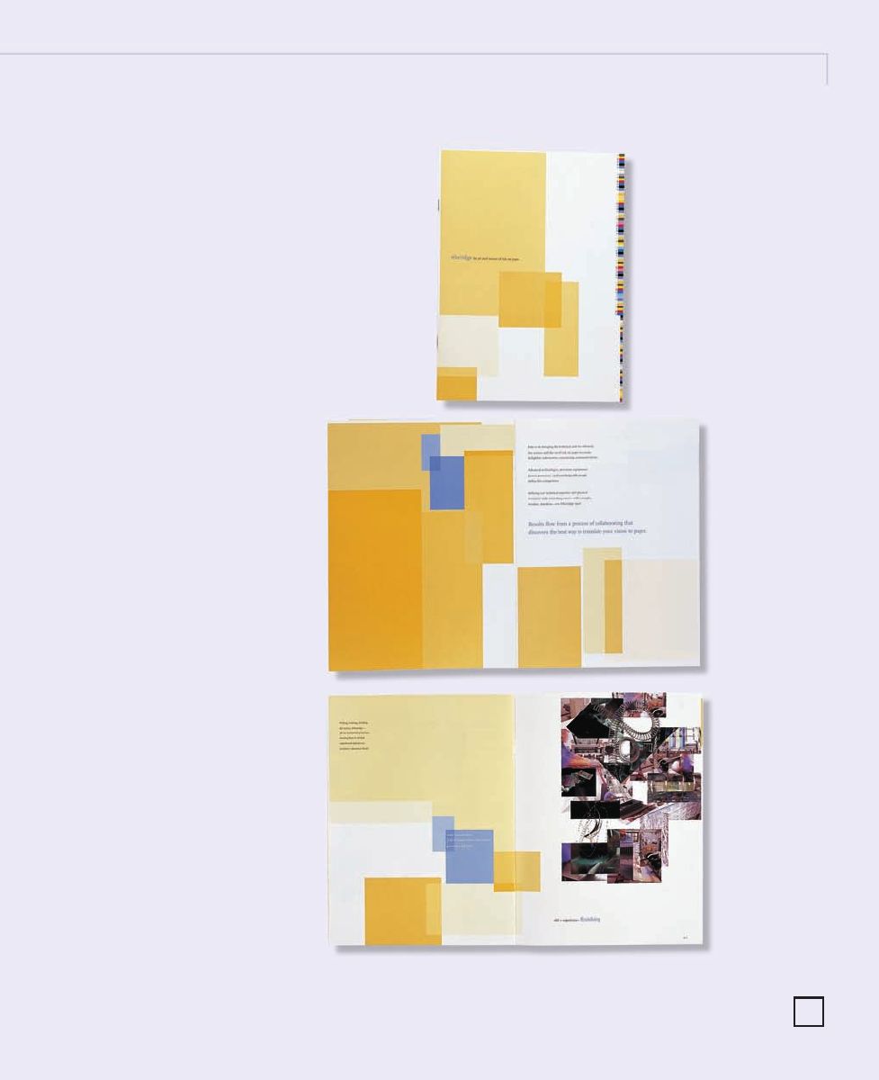
CLIENT:
Etheridge is a high-end printer who
works primarily with design firms
and corporate in-house design and
print managers.
FIRM:
BBK Studio
ART DIRECTOR:
Michael Barile
DESIGNERS:
Kelly Schwartz and Michael Barile
ILLUSTRATORS:
Allen McKinney and Michael Barile
PHOTOGRAPHERS:
Susan Carr and Gary Cialdella
COPYWRITER:
Randall Braaksma
RIGHT: This capabilities brochure
is the first in a series that helps
to explain, in depth, the printing
process to designers. Throughout
the brochure, squares of color
interact with montage imagery
and poetic haiku—adding a flair of
artistry to the science of printing.
The brochure is printed in eight
colors—four-color process plus four
PMS match colors on Consolidated
Reflections Silk coated text and
cover stock. In this particular
piece, color is used to show the
subtle blending and building of
color available with stochastic
printing.
229
216-229 84823 12/12/05 8:19 AM Page 229
..................Content has been hidden....................
You can't read the all page of ebook, please click here login for view all page.