
The information age has altered the way people read. There’s so much information that people, by necessity, have to
tune out in order not to be overloaded. They also have come to expect content to be fast, lively, and interactive, even
in two-dimensional print media.
Nobody relates to this more than the businessperson, especially the founders and executives of fast-track startups
who work 17-hour days and have hundreds of magazines and Web sites clamoring for their attention.
To bring this audience the longer-form analyses and profiles they need to run their business,
Business 2.0
keeps its
approach simple. The magazine puts articles center stage and offers visual tools to help readers apply what they
learn in an enjoyable, hassle-free way.
WHY IT WORKS:
Business 2.0
is dedicated to making articles as user-friendly as possible. Infographics, callouts, type treatment, and
simple layouts work together to build a pleasant, easy, and familiar read.
Business 2.0
New Business Rules for a New Economy
Job:12-84823 Title:RP-Graphic Design That Works (LDW)
175# Dtp:120/163 Page:174
Text (DS)
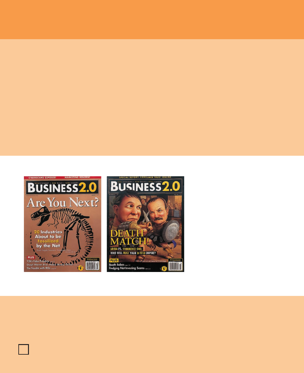
far left Covers must grab the attention of fast-moving
readers, so they’re clever without being complex. For the
March 1999 issue, a dinosaur skeleton is a humorous
poke at the Internet’s effect on old-school industries.
left Illustrator Thomas Reis came up with this par-
ody of business-to-business competitors when the
movie
Gladiator
was released. The illustration is an
instantly recognizable concept that inspires a laugh
and a second look, another newsstand grab for hur-
ried passersby.
Graphic Design That Works
174
174-178 84823 12/12/05 7:42 AM Page 174

Job:12-84823 Title:RP-Graphic Design That Works (LDW)
175# Dtp:120/163 Page:175
Text (DS)
W)
74
The business magazine’s concept grew out of a social
conversation between Chris Anderson, CEO of pub-
lishing company Imagine Media, and several friends,
including Amazon.com head Jeff Bezos. The title
launched as a monthly in late 1997 and hit the news-
stands half a year later.
Many new economy business titles also were emerging
around that time, so
Business 2.0
had to carve its
niche. “We weren’t going to be a news magazine,” says
art director Laura Morris, who helped found the maga-
zine with editor in chief James Daly. “We offered big-
ger package stories. Instead of making it newsy, we
made it a how-to magazine, explaining how to make it
in the new economy.”
Unlike business magazines of the past, new titles had
to be more “mass consumerish,” Morris says. Suddenly,
everybody wanted a piece of the action. Therefore,
though content was aimed at upper management and
CEOs, design had to appeal to a broader audience. “I
made it a little more fun and creative than other
books, something that a non-businessperson would
find dynamic visually,” Morris says.
The model was so successful that, in June 2000,
Busi-
ness 2.0
went biweekly. Currently boasting an all-paid
circulation of 350,000, the magazine packs its pages
with business tutorials and short pieces on new prod-
ucts and market trends as well as long, thoughtful
pieces on the smartest paths to steer.
left and below The
magazine’s restrained
design is occasionally
tweaked. Here, a gigantic
rose overpowers the
founders of a digital
scent company and flow-
ery script is used for by-
lines and the drop cap.
The theme recurs
throughout the article.
Fun with Business
175
174-178 84823 12/12/05 7:42 AM Page 175

Job:12-84823 Title:RP-Graphic Design That Works (LDW)
175# Dtp:120/163 Page:176
Text (DS)
One reason for
Business 2.0’s
success is the simplicity
of its presentation. Morris and her team make ease of
reading and navigation a top priority. “A businessper-
son who’s very busy doesn’t need design that over-
shadows text,” she says. “We needed to design a
magazine that wasn’t too complex.”
Morris points out a prime example of this commitment
to navigability: The table of contents resides just inside
the magazine’s front cover. A gatefold page opens up to
a spread ad, but the contents pages are the first read-
ers see—a rarity in magazine publishing, where the
contents usually are buried between layers of ads.
To keep readers aware of where they are and what
they’re looking at while flipping through the magazine,
designers color-code sections of the magazine. Red
tabs head pages in the front of the book, black ones
run across the well of in-depth articles, and blue tabs
mark the back of the book.
Morris admits that while she doesn’t necessarily feel
she’s been influenced by Web design in her creation of
the magazine—“It’s a totally different thing,” she
says—she borrowed the color-coding navigation idea
from online media.
That’s not the only Web element
Business 2.0
uses, in
fact. Elements that are immediately recognizable in
the Web platform, such as the pointy hand cursor and
linked underlined words, take their places in
Business
2.0’s
design. Every time an article refers to a Web site,
a small gray tab preceded by pointing hand icon juts
into the text to call out the related URL. When interest-
ing facts or definitions relate to a term addressed in
the paragraph, the term is underlined and colored red,
and a nearby box contains the data.
Designers also like to stick information in boxes, espe-
cially as sidebars or resource lists, to make it more ac-
cessible. “We like to provide as many entry points, as
many different places to pull the reader in, as possi-
ble,” Morris says.
right The colorful table
of contents is always lo-
cated inside the front
cover, with a gatefold ad
underneath. This is an-
other technique aimed
at helping busy execu-
tives easily navigate the
magazine.
Borrowing from the Web
left Color-coded header
tags separate depart-
ments from features; the
front-of-the-book sections
are tagged in power-tie
red. The words in head-
lines run together in alter-
nating gray and black.
far left Writing out Web
site URLs in body text
consumes space and
wrecks alignment, so the
magazine inserts callout
tabs next to Web com-
pany references. The tabs
borrow the pointy hand
icon familiar even to
Web amateurs.
176
174-178 84823 12/12/05 7:42 AM Page 176

W)
76
Job:12-84823 Title:RP-Graphic Design That Works (LDW)
175# Dtp:120/163 Page:177
Text (DS)
Morris doesn’t like to overdesign the magazine; pages
are generally white with black type, with colored sub-
heads, pull quotes, single images, and the occasional
icon or illustration to break up text. Type rarely strays
from the classic, matter-of-fact Garamond and Futura
families. Pages occasionally dip into a palette of violet,
rust brown, pink, and pale green but often stick close to
the primary navigational colors for accents. Gray-beige
and mustard gold are often used for backgrounds.
One technique
Business 2.0
has employed to enliven
its pages, however, has become an important part of its
brand. Early on, the magazine hired a company called
XPlane to make a diagram of a business concept to il-
lustrate a story. What emerged were elaborate info-
graphics abuzz with what Morris calls “little ant
people”—stick figures with funny facial expressions
racing from one section of the diagram to another.
The infographics help
Business 2.0
explain concepts in
an easy-to-use format, but the illustrations have also
become a large part of the magazine’s personality. The
stick people now make cameos on the front cover and
in other products, including conference literature and
the Web site.
right Horizontal striping is a common motif through-
out
Business 2.0
. Note the combination of solemn gray
with loud primary and secondary colors and steady
portraits with tilted graphs and silly illustrations.
far right Sometimes designers pull out all their am-
munition at once—at least in the color department.
The magazine’s entire palette is represented in this
listing of the top 25 Web sites.
left The magazine first
hired Xplane to portray
workflows and diagrams,
such as this e-commerce
engine map. The ant
people that characterized
Xplane’s illustrations
eventually became an
integral part of
Business
2.0’s
brand.
Simple Touches That Make the Brand
177
174-178 84823 12/12/05 7:42 AM Page 177

Job:12-84823 Title:RP-Graphic Design That Works (LDW)
175# Dtp:120/163 Page:178
Text (DS)
The XPlane graphics make up only a small part of the
illustrations in
Business 2.0
. These people-focused
pastels and collages generally add life to layouts with-
out being heavy-handed. They’re friendly, vaguely lit-
eral depictions of concepts and scenarios.
Covers are a little different in this regard. Though
some are all text, they are always bright and demand-
ing. A big part of the readership buys individual issues
at airport magazine shops, Morris says, so the front
has to scream at hurried consumers racing to catch a
flight. So while not complex, covers are, at times,
high-concept.
For example, for a cover story called “VC Scorecard,”
Morris got the idea to put players’ faces (in this case,
venture capitalists on the move) on baseball cards. On
another cover, a dinosaur skeleton served as the per-
fect icon for a story about industries becoming extinct
in the face of e-business.
Designers try to be similarly creative with photogra-
phy, which is usually reserved for portraits. “These
people aren’t comfortable in front of the camera,” Mor-
ris says. “We try to do enjoyable things, get people out
of their offices.” The point of the pictures is to show
how much fun the subjects are having in their jobs,
she says. Ironically, photographers often need to sepa-
rate them from their work in order to depict that.
By establishing a laid-back atmosphere in its design,
Business 2.0
can proceed with establishing an authori-
tative but casual voice—a tone to which people in
today’s fast-paced business world are receptive. Design
works like a twinkle in the eye, quietly and playfully
supporting the magazine’s new ideas.
Personality Through Illustration
left Upbeat illustrations and collages accompany
stories that don’t warrant photography. Even in this
bad-news feature, retro images of smiling models glow
opposite the report that e-tailers are struggling to sell
clothing online.
below Illustrations can take a cliché and add a more
realistic perspective. Here, Jeff Bezos, the perpetually
happy CEO of Amazon.com, appears as a perspiring
wretch to illustrate a story about his close call with
bankruptcy. Designers reflected the background pat-
tern and colors in the drop cap and headline.
178
174-178 84823 12/12/05 7:42 AM Page 178
..................Content has been hidden....................
You can't read the all page of ebook, please click here login for view all page.