

Publishing gender-specific fashion titles is a tough business. Some magazines aim to be so general that they water
down topics to appeal to as many people as possible. Others wink and nudge with inside jokes that a few people
get and other readers dream about someday understanding.
Code
strives to change all that. The Los Angeles-based fashion magazine for African American men hit the news-
stands in July 1999 and, after a year of tweaking, emerged with a smart, refreshing attitude reflected in its stylish
photography and accessible layout.
WHY IT WORKS:
Handsome, atmospheric photography and a luxurious color palette combine for a sophisticated, masculine tone.
Clean layout, consistent type usage, and realistic subjects in photographs appeal to readers’ style and self-image.
Code
The Style Magazine for Men of Color
Job:12-84823 Title:RP-Graphic Design That Works (LDW)
175# Dtp:120/163 Page:100
Text (DS)
far left
Code
’s designers present photographic sub-
jects—even international celebrities—at the reader’s
level. Here, a black-and-white photo of pop star Prince
makes an unimposing, alluring cover. The orange logo
is a bold foil to the sensual portrait.
left Decked to the nines, Cuba Gooding Jr. strikes a
pose on the October 1999 cover, an image of color and
movement meant to draw eyes at the newsstand.
Graphic Design That Works
100
100-105 84823 10/12/05 2:38 PM Page 100

DW)
e:100
Job:12-84823 Title:RP-Graphic Design That Works (LDW)
175# Dtp:120/163 Page:101
Text (DS)
Editor in chief Eugene Robinson says the magazine’s
founding staff strove to create a magazine for a new
generation of readers. “As a medium, magazines are
dealing with issues that never came up before,” Robin-
son says. “You’ve got the Web, e-books. It’s not the same
to do magazines like the ones we dug in our youth.”
Editors created a magazine that talked up to its read-
ers, but in a way that was franker and hipper than
competing titles. “We presume readers are as smart as
we are,” he says. “We wanted to make it smart, smart-
assed, and funny without resorting to fraternity guf-
faws or drawing-room chuckles.”
So far, the magazine has reached its target market; 90
percent of readers are African American males, while
the remaining 10 percent are Asian and Hispanic men,
Robinson says. The magazine is primarily about fash-
ion, though it also covers lifestyle and celebrities, so
editors and designers drew from a variety of magazine
types—giving nods to titles such as
Nylon, Gear, Inter-
view, Vibe, Elle,
and
Italian GQ
in its design.
Code
reaches out editorially to establish a voice with
which readers can identify. Realizing that readers ap-
preciate illustrations that mirror their lives, the maga-
zine’s designers likewise reach out. Instead of offering
traditional haute couture and lofty models,
Code
brings fashion back down to earth.
Smart and Real
above Hip, jazzy touches, such as these blue boxes
floating like musical notes across the top of an article
on musicians Wynton Marsalis and Joshua Redman,
stand out from the magazine’s clean layout.
left Often reserving
black-and-white photog-
raphy for serious pieces,
designers take a stab at it
in a fashion spread. Sepia
duotones portray vintage
New York as costars of a
Showtime drama stroll
the Big Apple.
101
100-105 84823 10/12/05 2:38 PM Page 101
Job:12-84823 Title:RP-Graphic Design That Works (LDW)
175# Dtp:120/163 Page:102
Text (DS)
Photography is obviously the magazine’s biggest con-
centration because of its emphasis on fashion.
Code
raised the bar as it progressed, committing itself to
photography at the level of top fashion magazines,
says creative director Charles Hess. Four to five photo
shoots a month with celebrities and models produce
strong, striking images that dominate the book. De-
signers place importance on working with talented,
well-known photographers and illustrators and try to
emphasize artists of color.
But recently, the nature of the photography has
changed. “The models are depicted as guys the audi-
ence can relate to,” says Hess. “When readers look at
the magazine, they see themselves.” This involves not
only using more natural light and realistic environ-
ments in shoots but also varying the types of models.
For example, a fashion spread in the December 2000
featured six “real working political men” sporting de-
signer suits and posing on the Mall in Washington,
D.C. “They were still good-looking, but they’re more
relatable than models,” Hess says.
The magazine also likes to feature celebrities—actors,
musicians, politicians, and designers—modeling cloth-
ing as well as providing interviews and profiles. On the
covers and inside the magazine, these stars have fun
with the shoots. They laugh, dance, and strike poses in
the gorgeous but practical fashions they model. Even
the most elusive or imposing public figures look like
friendly, ordinary guys—musician Prince shyly smiling
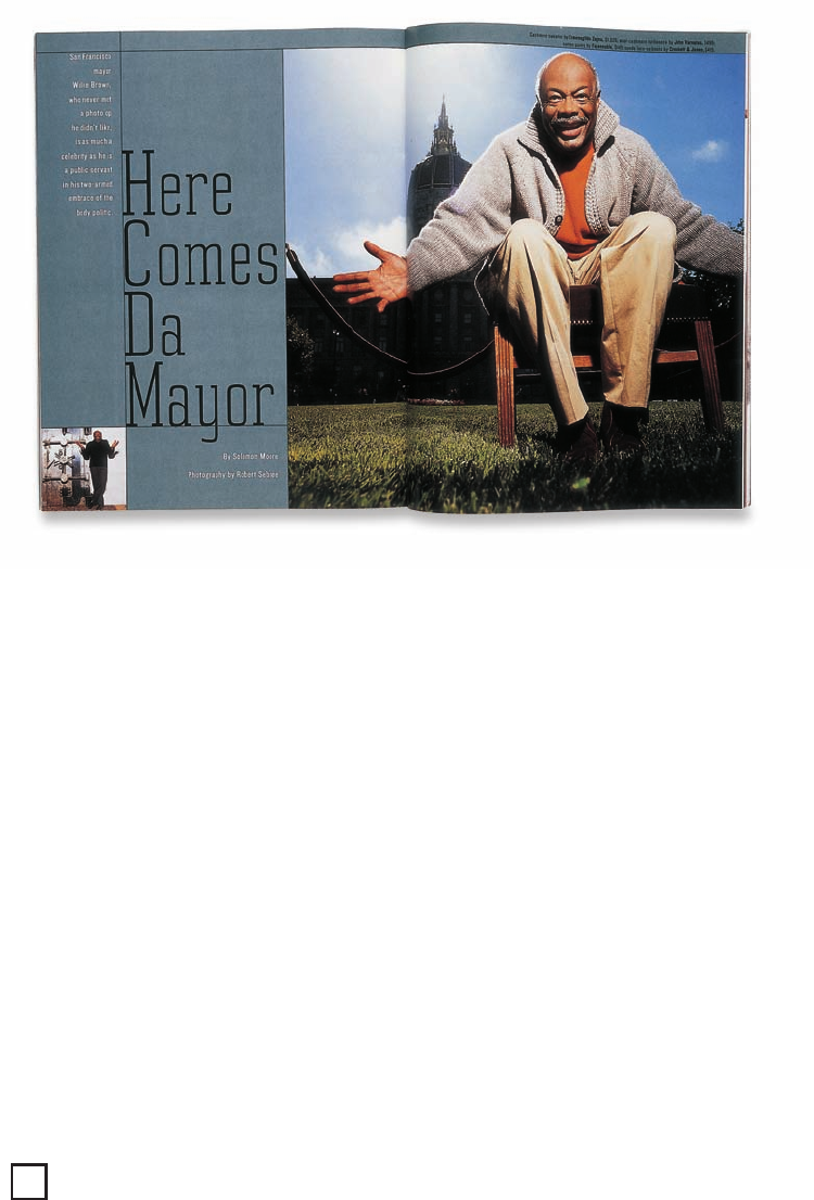
in a baby-soft turtleneck, San Francisco mayor Willie
Brown grinning with arms outstretched and wearing a
comfortable sweater.
Real Men, Realistic Photos
above Controversial
San Francisco mayor
Willie Brown is the
charismatic subject of
this bright and playful
fashion layout.
Graphic Design That Works
102
100-105 84823 10/12/05 2:38 PM Page 102

Job:12-84823 Title:RP-Graphic Design That Works (LDW)
175# Dtp:120/163 Page:103
Text (DS)
DW)
e:102
left To stand out from
the competition, design-
ers photographed up-
and-coming political
figures rather than mod-
els on the Mall in Wash-
ington, D.C. Midnight
blue page color suits the
nighttime atmosphere.
right Fashion shoots
take chances with exper-
imental staging. The
complexity of featured
plaid fabrics is replicated
in this photo, with
frosted panels creating
the same illusion of
overlapping layers.
100-105 84823 10/12/05 2:38 PM Page 103

Job:12-84823 Title:RP-Graphic Design That Works (LDW)
175# Dtp:120/163 Page:104
Text (DS)
An occasional excursion into black-and-white photo-
graphy gives the magazine a dramatic flair. Some-
times this is reserved for investigative, serious pieces;
other times it’s an artistic twist on the fashion shoot.
Black-and-white portraits even show up on
Code
’s
cover on occasion.
An expansive palette of fourteen to sixteen colors sets
the tone for the magazine no matter what shades the
artwork represents. “The palette is made up of the col-
ors of jewels—deep, rich, and masculine,” says Hess.
Burgundy red, pumpkin, midnight blue, and deep vio-
let may enhance photographs as beautiful, sophisti-
cated background colors for articles and sidebars.
Light touches of color help department headers stand
out in the front and back of the book and make pull
quotes diverge gently from the black-and-white for-
mula. But, for the most part, the magazine sticks to
simple black type on white pages, especially in depart-
ments. “We are trying to establish a recognizable, con-
sistent look with enough variation so that it’s not
boring,” Hess says.
above Front-of-the-book departments usually main-
tain a consistent format: one piece of artwork and two
columns of black type on a white background. How-
ever, varying the art placement, as with this lower-cor-
ner bleed, keeps readers guessing.
Code of Handsome Colors
above Though used
sparingly, color sets the
mood for certain fea-
tures. A rich pumpkin
yellow with burnt orange
accents—cheerful but
commanding colors—
opens an article about
the sophisticated comedy
of Chris Rock.
below In an unusually
colorful layout, several of
the colors from the mag-
azine’s palette team up
for a commentary on tel-
evision, specifically MTV.
Graphic Design That Works
104
100-105 84823 10/12/05 2:38 PM Page 104
..................Content has been hidden....................
You can't read the all page of ebook, please click here login for view all page.