

Trade magazines have always gotten a bad rap in the design department. Though they may easily make as much
money as their consumer counterparts, they historically do not place as much emphasis on glamour and style. One
reason is that they’re more utilitarian—meant to be read and used rather than flipped through passively. Another is
that, which the exception of a few, they don’t depend as much on the draw of their covers on the newsstand.
But when you’re a magazine for the design industry, your pages should look as good as the work you showcase.
That was the idea behind
HOW
magazine’s redesign in February 2000, which the design ideas magazine rolled out
with a chronicle of its redesign process.
WHY IT WORKS:
The new design combines creative uses of color and type with a simple, organized layout that is pleasant to read
and complements the artwork used to tell its stories.
HOW
Graphic Design Ideas at Work
Job:12-84823 Title:RP-Graphic Design That Works (LDW)
175# Dtp:120/163 Page:154
Text (DS)
above
HOW
’s cover art always reflects the theme of the
issue and recognizes skillful art and design at the same
time. Here, the cover introduces a personality—illustrator
Luba Lukova, who is profiled in that issue—while incor-
porating her vision for simple, colorful design patterns.
above Artistic depictions of well-designed objects
often whimsically illustrate concepts on the covers.
For the digital design theme issue, a simple electrical
plug takes on a motion, light, and mood of its own.
above “Hire Me!” pleads a quaint bumper sticker on
the bumper of an old car—the lines and shapes of
which create an eye-catching cover for
HOW’s
October
2000 issue.
Graphic Design That Works
154
154-165 84823 12/12/05 7:33 AM Page 154

Job:12-84823 Title:RP-Graphic Design That Works (LDW)
175# Dtp:120/163 Page:155
Text (DS)
W)
54
Actually,
HOW
is a newsstand magazine, though it
largely reaches toward a specific audience. Targeted
readers are design professionals, from the principals of
firms to the creative team members who populate them.
Designers, like all artists, are by nature influenced and
inspired by other designers’ work, and they learn from
each other in every aspect of their business.
HOW
col-
lects the ideas of successful firms and highlights what
they’re doing correctly so readers can learn from each
other. The magazine is as much about the people and
business practices of the graphic design world as it is
about the work designers do.
Each bimonthly issue has a theme—promotion, cre-
ativity, and so on. Like the other titles by publisher
F&W Publications—also known for
Writer’s Digest
and
several artists’ magazines—the issues are packed with
resources, ideas, and a host of takes surrounding each
theme. Articles are meant to get readers thinking, then
send them to the drawing board with the proper tools.
right To introduce a
feature on design contest
winners, this spread in-
tegrates the judges’
profiles into the pages’
design. Overlapping
boxes with rounded
edges converge to create
a Web-minded layout.
left
HOW
unleashes its
own creativity in the
“Thumbnails” depart-
ment, here featuring an
apocalyptic journal,
crude labels, and photos
of survival products in-
vented by graphic design
firms. The mixed-media
layout experiment takes
a humorous dig at para-
noid Y2K watchers.
Learning Experience
155
154-165 84823 12/12/05 7:33 AM Page 155
Job:12-84823 Title:RP-Graphic Design That Works (LDW)
175# Dtp:120/163 Page:156
Text (DS)
However, with all the tips and resource boxes that
went into putting articles together,
HOW’s
designers
noticed layouts were getting too boxy. During the re-
design, headed by outside designer Alexander Isley of
Isley Design in Redding, Connecticut, the magazine
went back to a smoother look to communicate con-
cepts more completely.
The magazine usually runs articles over six to eight
pages in the well, rarely divided by ads. “Nearly all
features open on a spread,” says editor in chief Bryn
Mooth. “Those opening spreads require a big idea, a
central concept that’s supported by both the opening
image and the headline and deck.”
The design employs a flexible six-column grid; depart-
ments and features alike stick to the grid, but art direc-
tor Amy Hawk may vary the number of text columns
she uses. For instance, departments usually have three
columns, but opening pages may include only one col-
umn, which may shift location but must still adhere to
the grid. “The idea was to create a grid that gives struc-
ture but doesn’t lock us into a cookie-cutter format,”
says Mooth.
Feature articles are typically long, around 1500 to 2500
words. A single article may include several case studies
or nuances related to a given topic. Colored text sub-
heads divide articles frequently, every few paragraphs
or so. By spreading articles over several pages, Hawk
also dodges the danger of their looking too heavy.
As part of the redesign,
HOW
also standardized the
types of sidebar it uses throughout the magazine. Lists
of tips or other sidebar articles occupy parts of
columns and are left open, without borders; instead,
they’re differentiated by a sans-serif font and a type-
face of a different color. A colored “Source Box” typi-
cally bleeds off the bottom of a page and contains
phone numbers and e-mail addresses for people
quoted in an article.
Grid for Structure and Variety
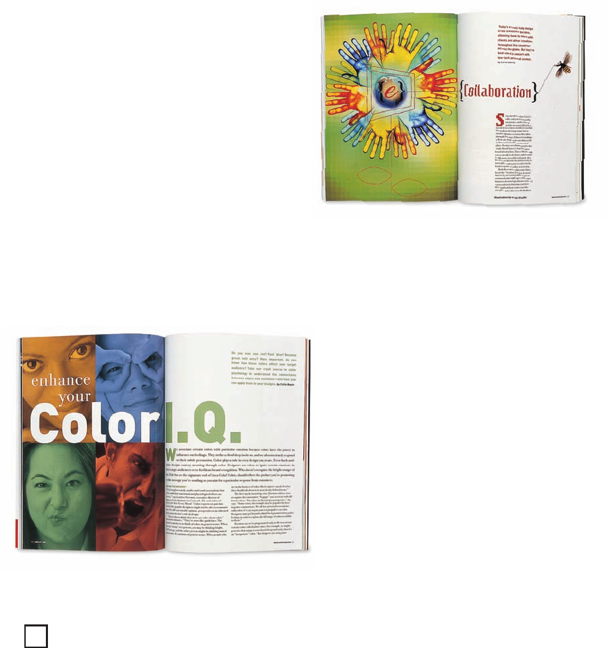
above
HOW’s
artist in-
terprets the grid and
uses type to create a
mood. Here, the pixilated
headline font suggests
computerization while
the illustrations express
organic nature—the
contrast between tech-
nology and human inter-
action explored in the
article itself.
left A checkerboard of
duotones—tinted accord-
ing to the magazine’s
palette—introduces an
article on the effect of
color on design.
Graphic Design That Works
156
154-165 84823 12/12/05 7:33 AM Page 156

W)
56
Job:12-84823 Title:RP-Graphic Design That Works (LDW)
175# Dtp:120/163 Page:157
Text (DS)
left Subheads, informa-
tion boxes, and pull
quotes are helpful in de-
termining the pages’
flow. Boxes frequently
bleed off the page, as
with this sidebar on
“Creativity Survival Tips.”
right This layout inte-
grates
HOW’s
own ideas
with other companies’
featured designs. A story
on building Web sites
utilizes Lego blocks sur-
rounded by colorful
screen shots. Individual
Legos act as keys for in-
formation boxes.
157
154-165 84823 12/12/05 7:33 AM Page 157

Job:12-84823 Title:RP-Graphic Design That Works (LDW)
175# Dtp:120/163 Page:158
Text (DS)
HOW’s
main objective was to avoid overshadowing the
work it featured by getting carried away with its own
design. Photographs are spread throughout the long
features to allow for white space and pay tribute to
featured art. “Prior to the redesign, features often were
jam-packed,” says Mooth.
Photos alternate between scenes of designers in their
workspace and the work itself—Web sites, brochures,
ads, and multimedia screenshots. The sophisticated,
stylish colors of many of the products often reflect
those of the walls with which designers surround
themselves for inspiration, so photographs naturally
tend to sprinkle diverse bits of color throughout the
white pages.
While restraining herself to let these photographs
carry much of the show, Hawk does use
HOW’s
own
palette to add personality and to complement the
shades that shine through in photography. Subtle but
snazzy red oranges, violet blues, grass greens, and rich
golds touch up text, specifically headlines, captions,
subheads, and sidebars.
Color in section headers also separates departments
from features. Front-of-the-book columns each are as-
signed their own color, and two-word headers run to-
gether, one word in vivid color, the other black.
However, colored bars—sometimes with textured
backgrounds that reflect the types of paper designers
love to use—run across the tops of pages in the fea-
ture well.
Restrained Design to Showcase Work
above Callout circles and
small photos dissect a
complex design piece that
won countless awards.
The soft background color,
gold type, and crowning
graphic touch atop the
headline set a refined
tone while illuminating
the white pages of the
featured brochure.
left “Design Stuff,” a
regular department in
the back of the book, is a
colorful but simple gath-
ering of short product
reviews. Note how the
magazine’s palette is
used to distinguish each
short write-up.
left
HOW
seeks good
design everywhere, even
in everyday objects. In
this “Thumbnails,” the
floral pattern of the per-
forated envelope and the
subtleties of retail re-
ceipts form a pleasant
backdrop for a feminine,
retro illustration.
Graphic Design That Works
158
154-165 84823 12/12/05 7:33 AM Page 158
..................Content has been hidden....................
You can't read the all page of ebook, please click here login for view all page.