
America has become hooked on yoga as a relaxation technique, but this centuries-old exercise is just as much about
control, balance, and energy as it is about winding down. True to its subject,
Yoga Journal
combines these funda-
mentals to create a soothing yet fluent design.
In fact, the magazine strives for a reading experience that mirrors the topic it covers. “We want to create the feeling
of walking into a yoga studio,” says art director Jonathan Wieder. “The look must be one of calm and serenity, but
we don’t want it to be soporific. There has to be a balance between calmness and energy.”
WHY IT WORKS:
Handsome, understated layouts and a palette of nature-inspired colors create a serene setting and build a strong,
continuous flow analogous to yoga positions themselves. The artists let photographs carry the design, clearly prov-
ing their understanding of the magazine’s most valuable design asset: the gorgeous human form.
Yoga Journal
Yoga Instruction for the Body and Spirit
Job:12-84823 Title:RP-Graphic Design That Works (MDW)
175# Dtp:163/120 Page:124
Text (DS)
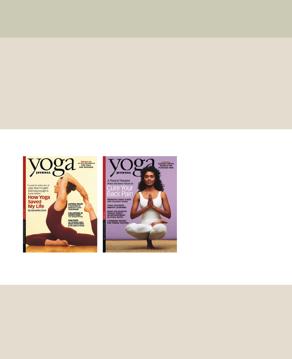
far left The human body forms elegant frames for
Yoga Journal’s
covers. Among fitness magazines prom-
ising perfect bodies with blaring colors and cover lines,
Yoga Journal
maintains the serenity of its subject.
left The font used for the word
yoga
in the maga-
zine’s flag resembles the graceful curves of the body in
a yoga position. The logo is a distinct part of the maga-
zine’s brand.
124-129 84823 10/12/05 3:25 PM Page 124

DW)
e:124
Job:12-84823 Title:RP-Graphic Design That Works (MDW)
175# Dtp:163/120 Page:125
Text (DS)
The magazine has had quite a history. First quite liter-
ally a journal for yoga teachers and school owners, it
quickly became a special-interest magazine for new-
age interests, covering everything from war and
poverty to life after death. Yoga itself was the main
focus when the magazine started in 1975, but few peo-
ple were practicing in the United States then, so it
moved quickly to the back burner.
With the practice’s resurgence in recent years,
Yoga
Journal
needed to reinvent itself, so it relaunched in
2000 as a yoga-only magazine and let the technique
regain center stage. Articles are instructional, dis-
cussing how to succeed at different poses, but also
cover benefits and related topics—health, spirituality,
and the like.
Who’s the reader? “She’s me,” says editor in chief
Kathryn Arnold. The magazine’s readership is 80 per-
cent female, Arnold says, and is, on average, 47 years
old. Readers generally have high income levels, travel
a lot, and are sophisticated, which means they have an
eye for fine design.
However, readers vary widely in their connection to
and familiarity with yoga. Readership is growing by
leaps and bounds and ranges from long-time yoga
practitioners who see it as a way of life to people who
have just started taking classes at the gym. Therefore,
the magazine’s redesign had to appeal to a broad audi-
ence, attracting them to the pages with a look that was
familiar, accessible, and attractive.
More people are turning to yoga as a physical exercise
rather than a spiritual or meditative one, too, now that
magazines and health professionals advocate it as
therapy for pain, back problems, and overall flexibility
and fitness. So layouts focus more on the physical act
of yoga—performing and improving poses—and ad-
dress their potential effects on specific physical prob-
lems. Illustrations of people in yoga poses are used in
more issues-oriented articles as well as instructional
ones, creating an ongoing challenge for artists to keep
each page looking new and interesting.
A Yoga-Focused Magazine
left Some departments
are framed with a softly
colored border, which sets
them apart from other
sections and gives them
their own personality.
left Yoga poses are not
always shown straight-
forwardly. Yoga-focused
features, such as this one
about yoga and health,
are accompanied by
artistic, emotional photo-
graphs that showcase the
beauty of positions.
125
124-129 84823 10/12/05 3:25 PM Page 125

Job:12-84823 Title:RP-Graphic Design That Works (MDW)
175# Dtp:163/120 Page:126
Text (DS)
Luckily, the subjects of the photographs themselves are
inherently diverse. The curves and angles of the body
in a yoga pose make for interesting negative space,
while pointing and leaning bodies give pages direction
and flow. Graceful, sensual poses are balanced with
ones that are more tense or strenuous, creating a natu-
ral ebb and flow. Designers let the provocative shapes
alone frame the magazine’s covers.
Inside, photography comes in two forms. Instructional
photos must be accurate, so readers imitating the
poses won’t hurt themselves, says Wieder. Editors and
yoga spotters usually attend these shoots, and photo-
graphs are appropriately straightforward, usually shot
at eye level with little background so the lines of the
subject are clear and obvious. For features articles, it’s
less important that the yoga is exact, so portraits tend
to be more atmospheric and evocative, shot with vari-
ous perspectives and lighting to illustrate the feel of
each article.
A technique that
Yoga Journal
originally adopted to
save money also helps the magazine’s overall feeling
of continuity. Because the publication relies so heavily
on original photography, it’s more affordable to shoot a
whole year’s worth of photos for certain departments,
Flow and Continuity
right The shapes of
yoga poses dictate the
flow of pages. Pho-
tographs of poses against
white backgrounds di-
vide the page into geo-
metric negative space, a
strong feature of the
magazine’s design.
left To ensure that
models in instructional
photos are positioned
correctly, a year’s worth
of photos are shot with a
yoga expert on hand.
Seeing the same model
repeatedly is comforting
to readers, designers say.
126
124-129 84823 10/12/05 3:25 PM Page 126

Job:12-84823 Title:RP-Graphic Design That Works (MDW)
175# Dtp:163/120 Page:127
Text (DS)
DW)
e:126
such as the “Asana” section for beginners, in one sit-
ting with a single model, says Wieder. Therefore, faces
are the same from issue to issue—as if a reader was
returning to a regular yoga class. Readers appreciate
the consistency, he says.
Shooting its own photographs also gives
Yoga Journal
some control over colors and patterns used in back-
grounds, so they often pick up shades of the maga-
zine’s palette. The wood floors or painted walls of a
setting often match or complement one of the 30 col-
ors used throughout the book—the muted maroons,
pale greens, chocolate browns, maize yellows, and soft
grays and beiges that the magazine uses for a unified
look. Illustrations also reflect the color choices.
The rich, subdued colors play a major role in creating a
sense of calm throughout the magazine, but they’re
also modern, a reflection of shades universally popu-
lar in interior design, fashion, advertising, and other
branches of the design world. Therefore, they’re famil-
iar and appealing to culturally aware readers.
right Photography illus-
trating noninstructional
features creates a sooth-
ing mood and conveys
the calm of a meditative
environment. This image
by Robert Olding uses a
short depth of field to
portray spiritual chanting
in yoga studios.
below Portraits of
celebrities and yoga no-
tables offer a departure
from routine instruction
without straying from the
magazine’s focus.
127
124-129 84823 10/12/05 3:25 PM Page 127

Job:12-84823 Title:RP-Graphic Design That Works (MDW)
175# Dtp:163/120 Page:128
Text (DS)
Besides color, matte paper stock adds to a feeling of
serenity. Chosen foremost as a more reader-friendly
paper that better represents photos, the matte finish
gives pages a subtle, poised feeling.
Type plays its own role in giving
Yoga Journal
its unas-
suming look. Designers chose sans-serif faces of vari-
ous weights for heads, department headers, cover
lines, and some sidebars, offering simplicity and read-
ability. Body text is a small serif font called Journal, a
light, elegant face with curves defined by straight lines.
The magazine’s logo is a perfect use of type, true to the
entire magazine’s nature and personality. Designers
decided the word yoga should be printed in lowercase
letters for a discreet and modern style. It dominates
Quiet Flow with Personal Touches
the word journal, which is printed below in all caps.
Yoga is portrayed in the font Village—which itself
carries the fluid lines and curves of a posing human
body. Displayed on top of
Yoga Journal’s
cover photo-
graphs, the magazine’s flag is the essence of yoga.
The magazine achieves continuity from the front of the
book to the back, but inside, it manages to allow some
pages and sections to assert themselves. The book
rarely strays from its three-column grid, but the usual
elements are given original twists.
Sidebars defy the box standard, for instance. Some are
contained in entire columns with subtle background
colors that bleed off the edge of the page. Text sits
flush against the left edge of the column. Other side-
left Articles flow natu-
rally, helped along by un-
obtrusive callouts and
free-floating captions.
This easy movement
throughout layouts is one
of
Yoga Journal’s
greatest
successes and is instru-
mental in building the
magazine’s fluid feeling.
Graphic Design That Works
128
124-129 84823 10/12/05 3:25 PM Page 128
..................Content has been hidden....................
You can't read the all page of ebook, please click here login for view all page.