

(point-of-purchase graphics)
The Client
Some Fossil executives doubted it would
sell, but nevertheless, they put money
behind a new watch called the Bigtic™.
Why Bigtic? Because it was among the first
watches with large, digital ticking seconds
and analog hands. “We felt the product had
a futuristic feel and was very different from
any other watch made by our competitors
or us,” says Stephen Zhang, art director on
the project. Skepticism reigned as to
whether or not this new product would suc-
ceed, but the one thing everyone agreed
upon was that they needed a winning
point-of-purchase campaign to increase the
odds of its success. The responsibility for
creating and executing such a persuasive
promotion fell upon the shoulders of Zhang
and designer John Vineyard, both of whom
agreed to make the watch’s unique face the
focus of the campaign.
INTERNATIONAL POP CAMPAIGN LAUNCHES FOSSIL’S BIGTIC
™
The Brief
Three factors stood out as Zhang and designer John
Vineyard assessed the task assigned to Fossil’s in-
house design team. First, they needed to skew the
watch to a younger audience than is typical for most
Fossil products and target teenagers and twentysome-
things. Second was the uniqueness of the watch. “This
watch was an experiment. You see the tick, but don’t
hear the tick,” says Zhang, citing the watch’s primary
feature that bewildered so many. Fossil developed the
all-new technology where seconds are visually count-
ed off with big ticks. Aside from offering innovation
that differs from other digital technology, the watch
didn’t provide any new functions; yet it was undisput-
edly unique and kids would want it, which led to the
third and final consideration. Could they use to their
advantage the futuristic, techno look of the watch to
play to the current trends in technology so irresistible
to today’s younger consumers?
Vineyard conducted his own research to find a color or
colors that graphically expressed the trend toward
youth-oriented, high-tech, futuristic gadgetry. At the
time, Fossil had four or five product lines already in
existence, each targeting a different market segment
and differentiated with its own color scheme, so some
colors were already taken. Vineyard’s search for a
shade that visually shouted “techno” yielded a recom-
mendation, but surprisingly, it was not the steely gray,
silver, or metallic blue hues that are commonly associ-
ated with state-of-the-art technology. Vineyard’s color
of choice—green—a shade readily associated with
conservation, ecology, health, and wholesomeness but
rarely, if ever, seen as being cutting edge.
CLIENT:
Fossil
DESIGN F IRM:
Fossil in-house design studio
CREATIVE D IRECTOR:
Tim Hale
ART D IRECTOR:
Stephen Zhang
DESIGNER:
John Vineyard
FOSSIL I NTERNATIONAL DESIGNERS:
Gabriella Fortunato (Italy), Stefan Muller
(Germany)
ANIMATION:
Reel FX
PHOTOGRAPHERS:
David McCormick, Russ Aman
CAMPAIGN R UN:
January 2000 through December 31, 2000
TARGET MARKET:
Consumers 16 to 24 years old
ABOVE: A point-of-purchase poster
kicked off the campaign and other
elements were added from there.
LEFT, TOP AND BOTTOM: In-case cards
and small and caseline static
stickers.
Text (DS)
Job:12-84823 Title:RP-Graphic Design That Works
(NEW)
175# Dtp:174 Page:286
284-293_84823 12/10/05 2:03 PM Page 286

Pulling Everything Together
Initially, Fossil ran few magazine advertisements for the Bigtic before a logo and
color scheme were developed. Later, a marketing kit with more in-depth photogra-
phy and graphics were added to the mix. A point-of-purchase poster kicked off the
campaign and other elements were added from there.
Before long, there was a comprehensive kit that was provided to department stores
including a poster display along with Bigtic top-of-counter and watch cuff standees,
a ledgetop display, in-case cards, and small and caseline static stickers.
These singular items were combined with the product displays to create a cohesive
presentation at point of sale.
“[The promotion has] a different look than anything else we’d really done and the
look of the posters and the look of the campaign was really different from the look
of our stores,” says Vineyard, pointing to the retro packaging and merchandising
that Fossil has used in the past with considerable success. In fact, the company has
built so much equity in the retro look that the move to a futuristic image spurned
more skepticism and called for considerable convincing on the part of the design
team. “The watch had a digital techno look that was different from anything else
that we had done and so called for a campaign that was different from what Fossil
has done previously.”
RIGHT: A comprehensive
kit was provided to
department stores
including a poster
display.
BELOW, TOP AND MIDDLE:
Bigtic top-of-counter
and watch cuff standees.
ABOVE, TOP AND BOTTOM:
In-case cards and small
and caseline static
stickers.
RIGHT: A ledgetop display.
287
Text (DS)
Job:12-84823 Title:RP-Graphic Design That Works
(NEW)
175# Dtp:174 Page:287
NEW)
e:286
284-293_84823 12/10/05 2:03 PM Page 287

Text (DS)
Job:12-84823 Title:RP-Graphic Design That Works
(NEW)
175# Dtp:174 Page:288
ABOVE: Individual items
were combined with the
product displays to cre-
ate a cohesive presenta-
tion at point of sale.
LEFT: To soften the sell,
designers created a
twisty puzzle (reminis-
cent of a Rubik’s Cube)
that echoed the repeat-
ing square pattern of the
promotional collateral as
a gift for department-
store buyers.
ABOVE AND LEFT: In-store
displays from Italy’s
Coin department store.
The Sales Pitch
Despite the eye-catching appeal of the sales package,
the primary challenge remained gaining acceptance
for the product. Selling it internally was hard enough,
but the sell-in proved equally difficult as department
store buyers expressed their doubts. “‘What is it for?
What does it do?’ Nothing,” says Zhang, remembering
how they had to field this question from insiders as
well as department-store buyers over and over again.
“So it wasn’t easy to get it launched.” To soften the sell,
designers created a twisty puzzle (reminiscent of a
Rubik’s Cube) that echoed the repeating square pattern
of the promotional collateral as a gift for department-
store buyers.
“The challenge for John was to present this product,
which is rather ambiguous...and hard to explain to
people,” adds Zhang. “The challenge was to visually
make it connect to those people, distinguish the watch
visually, attract attention, and get consumers to see the
watch. Rather than promoting the product from a func-
tion standpoint, John created a campaign from a
lifestyle, aesthetic, and fashion point-of-view. That’s
why...the translucent green was really hot. You could
see it everywhere in New York, particularly, the small,
trendy shops in Soho.”
LEFT AND FAR LEFT:
Individual items were
combined with the prod-
uct displays to create a
cohesive presentation at
point of sale.
288
284-293_84823 12/10/05 2:03 PM Page 288
Text (DS)
NEW)
e:288
THE CHALLENGES
The Creative Process
Vineyard decided to focus on unique look of watch through
mood photography to lure consumers into the promotion. “We
thought the watch was so interesting and looked so interesting,
we really wanted to focus on its uniqueness in the photography
and everything we did had to build around that. The watch in
the case almost sells itself. So, we didn’t want to do anything
with the graphics that would take away from that,” says
Vineyard.
“The watch is so strange and so new, we wanted the watch to
speak through the photography,” explains Zhang, adding that in
addition to the photography, the basic elements of the design
include the logo, color palette, and the graphic squares that
“abstractly represent the digital, techno style of the watch.”
The Photo Shoot
While the futuristic/techno look was considered the campaign’s
key ingredient, achieving this look through photography pre-
sented its own set of challenges. Vineyard spent a great deal of
time experimenting with different lights, techniques, and back-
grounds before finalizing the lighting setup. Ultimately, he
decided to light the background from underneath the watch as
well as from other angles, place green gels on specific lights,
and remove the crystal from the watch to avoid reflection from
the unusual lighting set up. To add a subtle texture and extra
depth to the photo, he draped a shower curtain with a bubble
wrap–like texture over a sheet of transparent green Plexiglas.
“We had to really work to angle the watch and the camera in a
position where we could achieve the selective focus we wanted
so that the bubbles in the shower curtain wouldn’t reflect off of
the watch’s black face,” remembers Vineyard.
“The strength of the photography in addition to the simple, yet
effective, square pattern created the atmosphere we were try-
ing to achieve in this campaign,” says Zhang. “The fact that we
were able to use the squares on pieces that were too small to
use photography effectively helped maintain consistency and
interest throughout the campaign.”
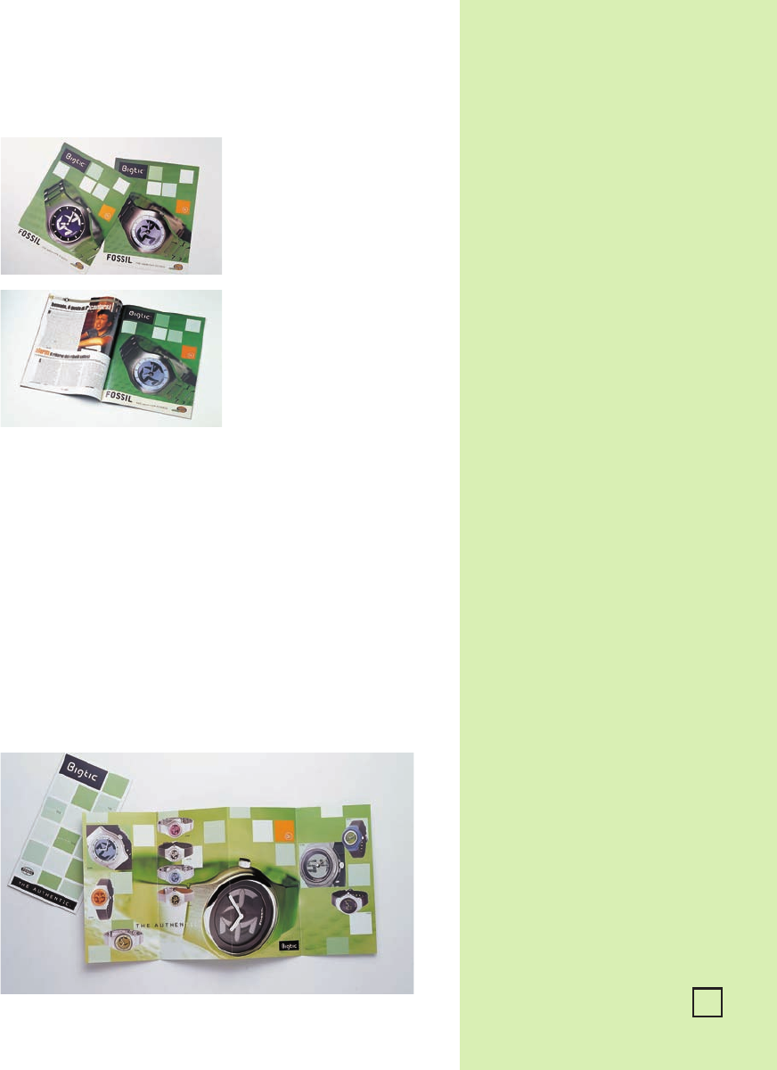
TOP AND BOTTOM LEFT:
Flyer and magazine
advertisement from
Italy.
BELOW: Bigtic interna-
tional brochure that was
used in several countries
outside of the U.S.
A Global Effort
Zhang and Vineyard, located in Fossil’s Texas headquarters, set the standards for the international
advertising and promotion and annually publish a
Standards Guide.
In this case, they provided files
and transparencies to other Fossil design departments around the world to replicate as needed.
Simplifying matters is that collateral material is always designed to a common size so that posters,
countertop displays, and so forth, have the same dimensions regardless of the product line. In some
cases, foreign design offices are allowed to use their own discretion in executing the materials so they
can be adapted to individual environments, while maintaining consistency with the established
design. So uniform is the collateral from country to country that it is hard to distinguish where various
materials come from as evidenced by the top-of-counter standee from Japan, flyer and magazine
advertisement from Italy, in-store displays from Italy’s Coin department store, and Bigtic international
brochure that was used in several countries outside of the U.S.
Fossil is acutely aware that to succeed, a global presentation must transcend language barriers, espe-
cially when selling across borders and when so much of the company’s collateral material is shared. A
case in point is a television commercial created by Fossil’s U.S. design team for placement on German
and Italian television and as advertising in cinemas there prior to showing the feature film. As in all the
collateral, the primary message of the television spot was Bigtic’s futuristic/techno appeal.
289
Job:12-84823 Title:RP-Graphic Design That Works
(NEW)
175# Dtp:174 Page:289
284-293_84823 12/10/05 2:03 PM Page 289

Text (DS)
Screen grabs from a
television commercial
created by Fossil’s U.S.
design team for place-
ment on German and
Italian television and as
advertising in cinemas
there prior to showing
the feature film.
290
Job:12-84823 Title:RP-Graphic Design That Works
(NEW)
175# Dtp:174 Page:290
284-293_84823 12/10/05 2:03 PM Page 290
..................Content has been hidden....................
You can't read the all page of ebook, please click here login for view all page.