
Text (DS)
Job:12-84823 Title:RP-Graphic Design That Works
(NEW)
175# Dtp:22 Page:234
compugen
The Human Touch
Compugen wanted to re-brand and position themselves
as a company that merged computational technologies
with molecular biology and medicine. “They were well
known in the industry for being able to decipher
genetic information,” notes creative director Jonathan
Jason. “But they wanted to be positioned as being
more biology focused and less computational,
because they felt that it would put them more in touch
with their market. In order to position them this way, we
had to come up with an image that combined the two.”
The biggest challenge for the design team was how to
effectively communicate the highly complex company.
“We were asked to make their technology easy to
understand,” recalls Jason. “We spent a lot of time
researching—sitting with them for weeks, learning
about the biology and the technology aspects. We
viewed their labs, interviewed people, and researched
all of their competition.” Because the company’s
offerings were more sophisticated, the design team
chose to use metaphorical images to describe in a
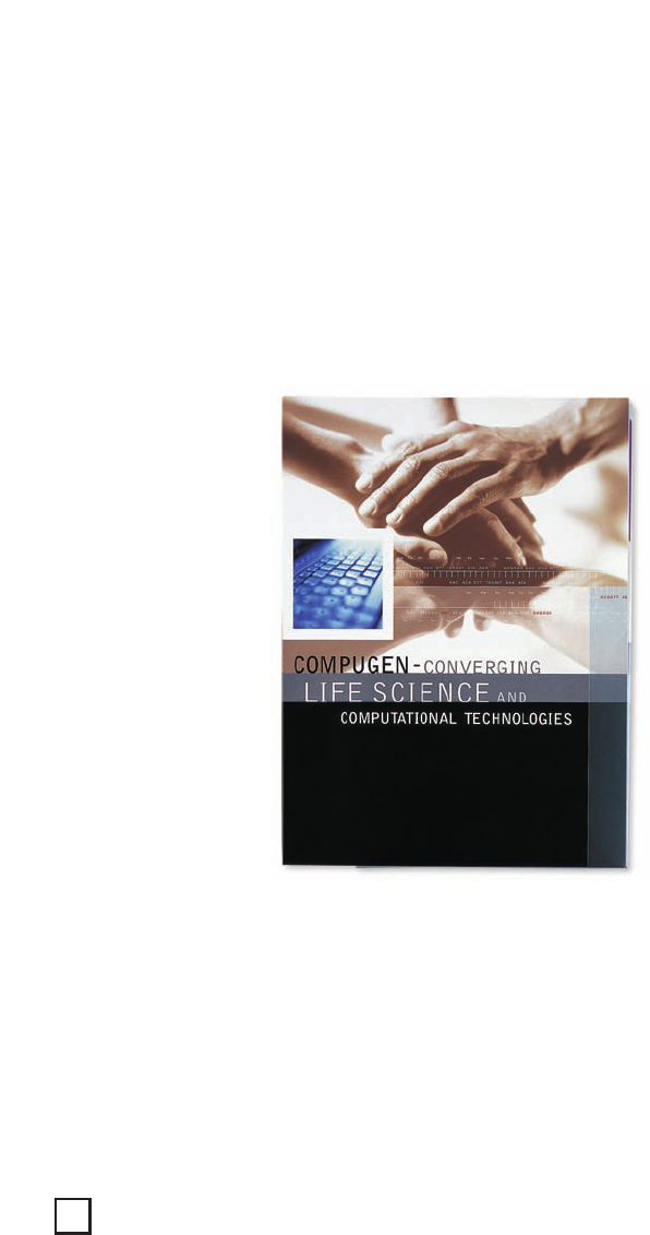
simple way what Compugen’s products do. On the
cover of the promotional package, various hands were
used to show the combining of different disciplines to
form a new discipline. “It’s an analogy of math and life
science that works together to provide solutions,”
notes Jason. “The hands bring in the human side of
what they do.” Throughout the piece, strings of genetic
information were combined with symbolic lifestyle
imagery to convey Compugen’s commitment to raising
the duration and quality of life by advancing drug
discovery and development. The overall marketing
package consists of a company profile brochure, two
product brochures, three product data sheets, and a
corporate annual report.
CLIENT:
Compugen is a pioneer in the
field of predictive life science
achieved through the convergence
of molecular biology and advanced
computational technologies.
FIRM:
Jason & Jason Visual
Communications
CREATIVE DIRECTOR:
Jonathan Jason
DESIGNER:
Meirav Tal-Arazi
PHOTOGRAPHER:
Yoram Reshef and various stock
COPYWRITER:
Audrey Gerber
ABOVE: The intriguing and graphic
marketing package symbolically
combines both the human and
mathematical aspects of the
company. Throughout the piece,
strings of genetic information are
seamlessly combined with
symbolic lifestyle imagery to
convey the overall message.
Graphic Design That Works
234
230-243_84823 12/10/05 3:01 PM Page 234

Text (DS)
Job:12-84823 Title:RP-Graphic Design That Works
(NEW)
175# Dtp:22 Page:235
NEW)
e:234
What Works
By using symbolic imagery and clear text, the design
team was able to successfully communicate
Compugen’s complex story and new corporate image—
positioning the company as a leader in the field of
predictive life science. “Jason & Jason created a clear
and distinctive new look for the company,” adds Tsipi
Haitovsky of Compugen. “All of the materials were very
well received, both within the company and by our
target audiences—investors, media, customers, and
those in the scientific community.”
ABOVE AND LEFT: Inside the
pocket folder is a company
profile brochure, two product
brochures, three product
data sheets, and a corporate
annual report. The laminated
pocket folder is printed in
four-color process plus
metallic ink. The die-cut
slots house both a mini CD-
ROM and a standard CD-ROM.
235
230-243_84823 12/10/05 3:01 PM Page 235
..................Content has been hidden....................
You can't read the all page of ebook, please click here login for view all page.