

Job:12-84823 Title:RP-Graphic Design That Works (LDW)
175# Dtp:163/120 Page:130
Text (DS)
The way a magazine’s design changes over its life can be a sign of the
times—a reflection of trendy fonts and colors or developments in printing
technology, for example.
But publication insiders know that a magazine’s evolution also reflects
more personal development. The comings and goings of editors, publishers,
and art directors, gradual shifts in audiences’ needs, changing ownership
of publishing companies, and the magazine’s financial growth or decline
have a great impact on how each magazine looks from year to year.
Magazine staffers may look back proudly over the work and love poured
into their publication over its history, whether it’s one year old or 50. But
they also may shake their heads in amazement at how far they’ve come.
Here’s a look at three magazines and how they’ve changed over their lives.
Evolution of a Magazine
above As the magazine encompassed a wider range
of new-age topics and readership grew, layouts be-
came more high concept. On this 1998 cover, a model
poses against a blurred background of moving people.
above Early
Yoga Journal
covers, such as this one in
1988, concentrated on personalities and illustration of
new-age issues rather than yoga itself, a reflection of
the magazine’s editorial mission.
above After a redesign in 2000, yoga once again took
center stage. Photographs of people posed against
plain backgrounds create a natural balance and move-
ment for covers.
130-141 84823 10/12/05 3:15 PM Page 130

Job:12-84823 Title:RP-Graphic Design That Works (LDW)
175# Dtp163/120 Page:131
Text (DS)
DW)
e:130
New Age Reader to Slick Consumer Health Magazine
When
Yoga Journal
was launched in 1975, yoga was a
fringe practice in the United States, generally reserved
for the truly spiritual.
A mouthpiece of the California Yoga Teachers Associa-
tion for more than 20 years, the magazine was a modest
affair in its first decade. Pages were black-and-white
and no-frills, laid out in simple grids with little variation
in the placement of headlines, photos, and captions.
Because
Yoga Journal
catered to a specialized audi-
ence with many common interests besides yoga, how-
ever, the magazine’s singular focus unraveled. “The
subject matter strayed far afield,” says editor in chief
Yoga Journal
above Departments and
features were still run-
ning in black and white
in 1990, including the
“Asana” section on begin-
ning yoga poses. Pages
were generally two- or
three-grid layouts with
text wrapped around
boxed photographs.
left above Designs
began to transcend their
usual boundaries. For in-
stance, photographs of
poses in the “Asana” sec-
tion moved out of their
small boxes to help bal-
ance of the department’s
two pages.
left below A constant
throughout
Yoga Jour-
nal’s
changing history,
the “Asana” department
came into its own with
the redesign. Richly col-
orful photographs of
bending, flowing shapes
create effective negative
space, which helps bal-
ance pages.
Kathryn Arnold. “It covered new-age topics of all kinds,
reaching out to a readership of cultural creatives.” As
the magazine’s topics branched out and attracted more
readers, design became more complex. Artists began
taking more liberty with page design, breaking away
from simple columns of text running around photo
boxes and using color.
By 1998, the magazine’s nonprofit owners decided to
sell
Yoga Journal
to a publishing company, and newly
available resources helped the magazine grow. Editors
and designers revisited the publication’s purpose. In
recent years, yoga had become an American
lifestyle—more as exercise than spiritual expression.
It made sense, therefore, that
Yoga Journal
should
once again focus on the topic that started it all. “We
had to make the magazine accessible, editorially and
visually, to attract a broader audience,” says design di-
rector Jonathan Wieder.
The relaunch of
Yoga Journal
in 2000 included a re-
design that accentuated yoga. On the covers, graceful
yoga positions speak for themselves without back-
grounds or novelty fonts. Inside, instructional and in-
spirational photographs drive the book’s simple, natural
flow. Pages changed from glossy to matte for a more
modern look and to better represent photographs.
The pure, serene covers help
Yoga Journal
stand out
against more cluttered faces on the newsstand, which,
along with a new direct-mail marketing campaign and
the nation’s overall obsession with yoga, has driven
readership. Subscriptions rose 50 percent between
1999 and 2000.
131
130-141 84823 10/12/05 3:15 PM Page 131

Job:12-84823 Title:RP-Graphic Design That Works (LDW)
175# Dtp:163/120 Page:132
Text (DS)
Experimental Puzzle to Adventurous, Attractive Layout
Blue
emerged during a monumental era in magazine
design—the mid-1990s, which birthed the transcen-
dent pages of such magazines as
Wired
and
Raygun.
The travel magazine’s founding art director was David
Carson, the famous magazine designer (and
Raygun
art director), known for his experimental use of text.
True to this model,
Blue’s
layouts always pushed
boundaries. Text boxes shoved and jutted into each
other, white type lay against light images, and photos
were reduced to tiny slivers. Crazed pages fit with un-
even pieces were followed by startlingly lucid layouts.
Just like the best adventures, pages always kept read-
ers guessing—even if they were also squinting to
read type.
“If you look at the first issues, you will see type that is
too small to read and text is running over images,
which also challenged readability,” says art director
Christa Skinner.
Blue
even defied such conventions as
folios, so readers had a hard time finding articles from
the table of contents.
The magazine won several awards for its groundbreak-
ing design, but some readers complained that it was
hard to read. In
Blue’s
second issue, Skinner made a
few changes, such as incorporating page numbers into
the middle of layouts. By the next few issues, care had
been taken to make text legible while still allowing it
to subvert the norm.
Readers also clamored for larger pictures, so although
Blue
still experiments with cropping and sizing, it al-
lows some gorgeous images to spread their wings
across entire pages. This is also noticeable on the cov-
ers, which began to feature strong, single images as
time passed.
Blue’s
trademark is its use of boxes to contain text or
simply add a mark of color. This is another trait that’s
matured since the magazine’s inception, developing
from choppy, awkward squares to natural inserts that
facilitate an easy dialog with the reader.
The alterations to
Blue
’s design satisfied the demands
of readers and attracted new ones. Newsstand sales
immediately shot up 10% when the magazine intro-
duced its first cover using the “more commercial ap-
proach”—literal adventure subject matter combined
with innovative graphics, according to editor in chief
Amy Schrier.
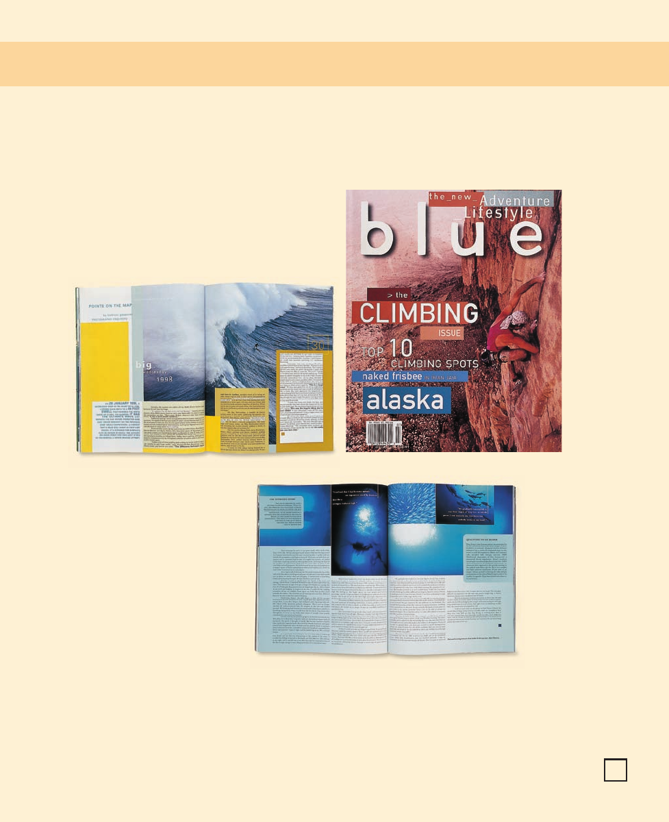
below Legibility became
a priority. Here, dark blue
contrasts with the white
spray of the surf image
and the black body copy;
lighter blue department
heads stand out from the
darker part of the photo.
Blue
left An early cover is a
grid of interesting images
and blocked color.
above The first issue of
Blue
reinforced its theme
with symbolic images,
such as this all-blue letter
from the editor. Type was
tiny and sometimes illegi-
ble against color or im-
ages in the background.
132
130-141 84823 10/12/05 3:15 PM Page 132
Job:12-84823 Title:RP-Graphic Design That Works (LDW)
175# Dtp163/120 Page:133
Text (DS)
DW)
e:132
above Early use of boxes
was choppy.
right In more recent
issues, the boxes have
come into their own and
are now a modern, ele-
gant feature of the layout.
right Single spectacular
images found their way
onto
Blue’s
covers in
later issues.
133
130-141 84823 10/12/05 3:15 PM Page 133

Job:12-84823 Title:RP-Graphic Design That Works (LDW)
175# Dtp:163/120 Page:134
Text (DS)
Busy and Bright to Suave and Sophisticated
Code
is a good example of how a brand-new magazine
finds itself during its first years of publication. Debut-
ing in mid-1999, the magazine was passed among cre-
ative directors before finally arriving at its final
look—for the time being, at least.
In its first several issues, the magazine alternated be-
tween wild breakouts of color and sleek, conservative
layouts. The front-of-the-book department, “Decode,”
was perhaps the most experimental. It used cut-out
colored text boxes against images or different colored
backgrounds and bright layers of color behind entire
pages. Type varied from a smooth sans serif to a serif
with extremely tight leading. Pages were busy, bright,
and varied.
The well stuck to black and white, with two columns of
body copy and beautiful full-page fashion shoots. Fea-
tures experimented with type, to some extent, but usu-
ally stayed with a tiny serif face. Back departments
also evolved from a simple two-column format to
pages surrounded by heavy double black rules.
In the summer of 2000, a new creative director
stepped in and altered the magazine’s look. Patterned
after European style for a hipper, younger look, the
new design wiped out the frenetic color in the front of
the magazine and replaced it with clean pages, lots of
white space, and a chunky all-caps sans-serif typeface.
The back of the book shed the smothering black border
and used thinner, open-ended rules.
above Early issues of
Code
frequently experi-
mented with type. In
this profile of actor For-
est Whitaker, font size,
color, leading, and style
are all over the board
throughout the body of
the article.
above Tabs of color be-
hind headlines and body
copy were characteristic
of the department “De-
code,” the section in the
front of the book, in
Code’s
first issues.
left Designers began
sectioning off back-of-
the-book departments
with heavy double rules
along the margins.
Code
134
130-141 84823 10/12/05 3:15 PM Page 134
..................Content has been hidden....................
You can't read the all page of ebook, please click here login for view all page.