

Text (DS)
Job:12-84823 Title:RP-Graphic Design That Works
(NEW)
175# Dtp:22 Page:262
the seattle supersonics
CLIENT:
The Seattle Supersonics are a
professional basketball team.
FIRM:
Hornall Anderson Design Works
CREATIVE DIRECTOR:
Jack Anderson
ART DIRECTORS/DESIGNERS:
Mark Popich and
Andrew Wicklund
PHOTOGRAPHERS:
Alex Hayden, Jeff Reinking/NBA
Photos, and various stock
Classic Basketball
The Sonics had come under new ownership that was
interested in rebranding the team. The new owners’
vision was to bring the fans back into the game. By
showing inspirational imagery and sincere text, the
brochure identifies and connects with the fan base. The
bold use of type and image makes the piece easy to
read and the communications clear. “We knew right
away that this piece had to be open and honest. It
couldn’t be full of tricks and gimmicks,” details creative
director Jack Anderson. “It had to be genuine in its touch
and message where each page talks about renewing
passion, responsibility, commitment, and respect.” As
part of the new brand, the team’s logo, uniforms, tickets,
and overall color scheme were all changed. “We basical-
ly went back to the colors that they used to have—
green and yellow. We also brought back the arch,”
ABOVE: The pocket folder,
with its bold messaging,
entices the reader to open
it. Inside sits the renewal
brochure wrapped by a
bellyband.
Graphic Design That Works
262
258-273_84823 12/10/05 3:11 PM Page 262
Text (DS)
Job:12-84823 Title:RP-Graphic Design That Works
(NEW)
175# Dtp:22 Page:263
NEW)
e:262
recalls Anderson. “Years ago, there was honesty about
the team. It was a rich heritage that we wanted to
bring back.”
Throughout the renewal brochure, four-color photos
are interesting intermixed with an array of monochro-
matic imagery—giving it that classic look. The simple,
genuine, and heartfelt brochure was sent to season-
ticket holders to renew their subscription. “The Sonics
had come off a bad season. There was a new ownership
and talk of significant trades,” recalls Anderson. “At
the time, people were wondering if they could justify
buying season tickets again.” Because a huge part of
the team’s income stream comes from season-ticket
sales, this communications devise was very important
not only to the new management but to the future of
the team.
What Works
The integrity and honesty of the piece helped to
inspire fans to recommit to their beloved team for
another season. “The fan base had some drift and
continued fall off in the past,” claims Anderson.
“This piece helped to stop the flow on that. The
whole program has become a model for other
teams to follow.”
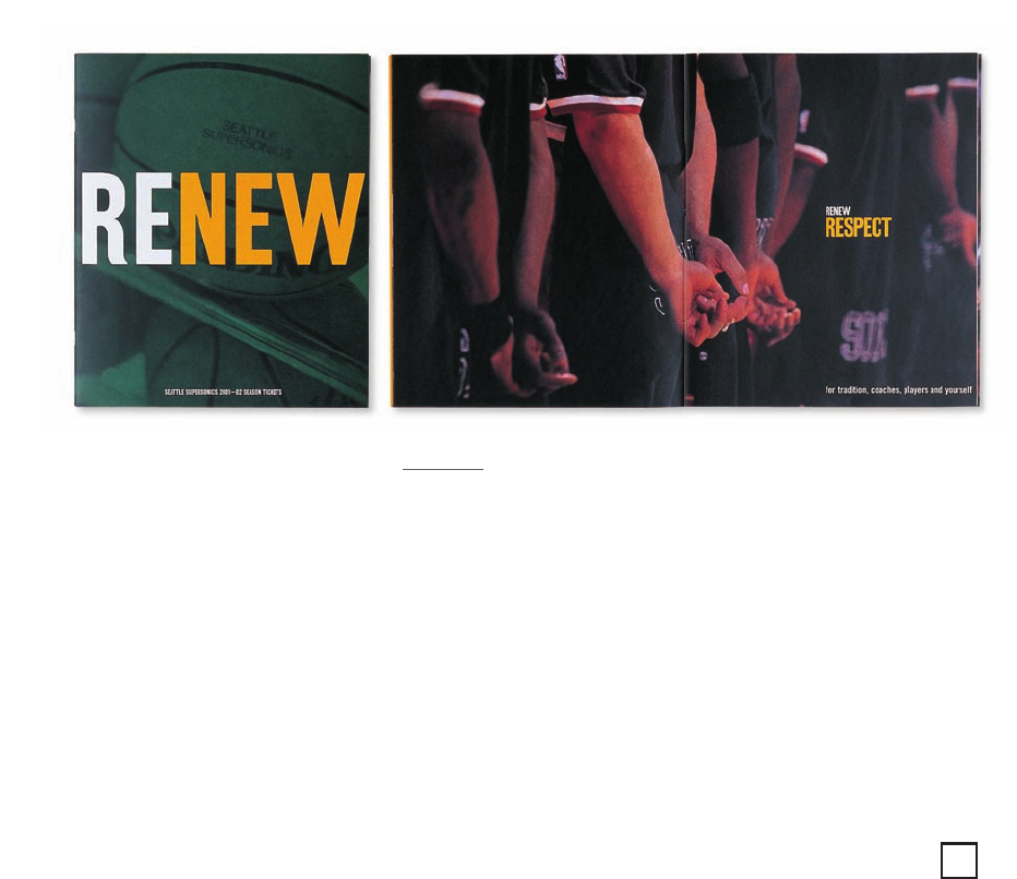
ABOVE: Beginning with a renewal
theme, the cover is bold and
simple with the background
acting as a textural support.
Each spread communicates a
different aspect of the overall
message. The brochure is
printed in four-color process
plus two PMS colors for the
team’s new colors—green
and yellow.
263
258-273_84823 12/10/05 3:11 PM Page 263
..................Content has been hidden....................
You can't read the all page of ebook, please click here login for view all page.