In addition to the ability to print views, Microsoft Project comes with more than 40 built-in reports that you can simply select, preview, and print. These reports compile the most commonly used sets of information needed to manage a project, coordinate resources, control costs, analyze potential problems, and communicate progress.
When you select and generate a report, information is drawn from selected fields throughout your project. That information is laid out in the predetermined report design or template, in either discrete or summarized form, depending on the specific report. You can generate an up-to-date report mere minutes before the start of a meeting, and the report instantly reflects the very latest changes you made or that team members have submitted.
You can generate two categories of reports: text-based reports and visual reports. The text-based reports compile information into a tabular format within Microsoft Project. Visual reports, which are new in Microsoft Office Project 2007, automatically compile and export project information to either Excel or Visio, where it is presented in a graphic such as a column chart or flow diagram.
To see the list of available text-based reports, click Report, Reports. The Reports dialog box appears, showing six report categories (see Figure 12-4).
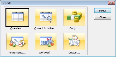
Figure 12-4. There are five categories for 22 built-in text-based reports, plus a Custom category for designing your own report.
The text report categories are:
Overview
Current Activities
Costs
Assignments
Workload
Custom
Each category focuses on a specific type of information. You might find that certain reports are best-suited to one type of audience, whereas other reports are better for another type of audience. For example, Cost reports might be most appropriate for meetings with the finance department, whereas you might prefer to distribute Assignment reports to team leads.
To generate these reports, Microsoft Project gathers information from a particular time period, from certain tables, and with a particular filter applied as appropriate for the requirements of the specific report. Information is formatted with bands, highlights, fonts, and other professional layout considerations.
To select and print a text report, follow these steps:
Click Report, Reports.
In the Reports dialog box, double-click the category you want.
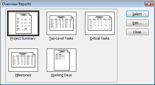
A dialog box appears, showing the available reports in that category (see Figure 12-5).
Double-click the report you want.
If a dialog box prompts you for more information, such as a date range, enter it and then click OK.
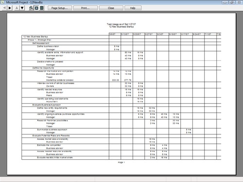
The report appears in a Print Preview window (see Figure 12-6). Click any portion of the report to zoom in on it. Click a second time to zoom back out again. On the Print Preview toolbar, click Page Setup to change the page orientation, scaling, margins, header, or footer.
When you’re ready to print the report, click Print on the Print Preview toolbar.
In the Print dialog box that appears, select the page range and number of copies you want to print and then click OK.
Just as text reports present project information in a tabular format, visual reports present project information, well, visually. When you generate a visual report, specific project data is compiled and sent to Excel or Visio. A PivotTable or PivotDiagram structure specifies how the data is to be displayed in the chart or diagram.
For an Excel visual report, a PivotTable is generated, from which a chart, such as a column or pie chart, is drawn.
A Visio visual report generates a PivotDiagram, a collection of boxes or other shapes arranged in a tree structure.
In either case, you can change the arrangement of the source data to display the information from different perspectives as needed.
To see the list of built-in visual reports, click Report, Visual Reports. The Visual Reports – Create Report dialog box appears (see Figure 12-7).
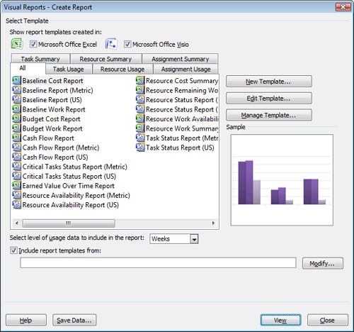
The visual report categories are:
Task Summary
Resource Summary
Assignment Summary
Task Usage
Resource Usage
Assignment Usage
The summary reports are more high-level, while the usage reports have specific detail.
To generate a visual report, follow these steps:
Click Report, Visual Reports.
In the Visual Reports – Create Report dialog box, click the tab for the report category you want.
You might find it easier to simply click the All tab and see the list of all 22 visual reports in one place.
If you only want to see the list of Excel visual reports, clear the Microsoft Office Visio check box. If you only want to see the list of Visio reports, clear the Microsoft Office Excel check box.
Click the report you want. Icons next to each report name indicate whether it’s an Excel or Visio report template.
An icon representing the report appears in the Sample box.
In the Select Level Of Usage Data To Include In The Report box, select the period of time you want to use. The default is Weeks.
Click View.
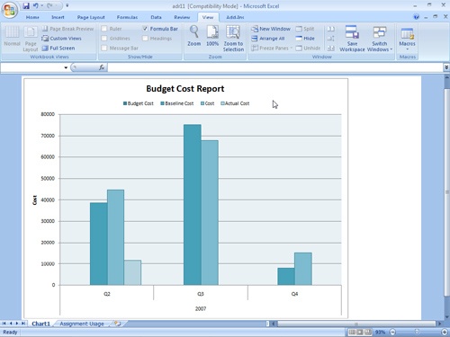
Microsoft Project gathers the information required by the selected report template, builds the OLAP (Online Analytical Processing) cube (the set of fields that will be used), opens the template in the target application—either Excel or Visio—and finally displays the visual report in that application (see Figure 12-8).
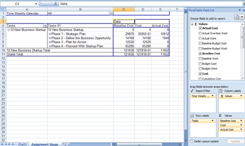
In Excel, if you want to view or change the PivotTable on which the report is based, click the second tab below the worksheet. It’s named something like Assignment Usage or Task Summary (see Figure 12-9).
To print a report in Excel 2007, click the Microsoft Office Button and then click Print.
To print a report in Excel 2003 or in Visio, click Print on the Standard toolbar.
If you want to save an Excel 2007 report, on the Quick Access Toolbar next to the Microsoft Office Button, click Save.
If you want to save an Excel 2003 or Visio report, click Save on the Standard toolbar.