
Selecting and Customizing a Chart Type
When you create a new chart, Excel lets you select from 73 chart types in 14 categories (although a significant number of these choices are actually just minor variations of others in the same category). You can also choose from a gallery of 20 built-in custom chart types, and you can create and save your own chart types as well. The type of data you're planning to plot usually dictates which type of chart you should choose.
Choosing a Standard Chart Type
When you start the Chart Wizard, the first step is to specify what type of chart you want to create. After you create a chart, you can easily change it to a new type; right-click the chart area or plot area and select Chart Type, or click the Chart Type button on the Chart toolbar to display the Chart Type dialog box. The following sections discuss all the standard Excel chart types and describe how you can best use them.
Column
This type of chart shows a comparison between values in one or more series, often over time. For example, you can show how your company's sales compare with its competitors over the past five years. Stacked column charts further divide the total for each column, so you can also measure how each geographic region performed for each company. Select a column chart when you want to show comparisons between different data points, especially those that change over time. Avoid this chart type if each series includes so many data points that you'll be unable to distinguish individual columns.
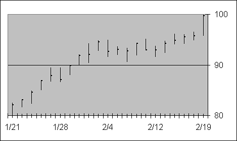
Bar
Think of a bar chart as a column chart turned on its side, with values along the horizontal axis and categories on the vertical axis. It de-emphasizes time comparisons and highlights winners and losers. Figure 24.8, for example, graphically illustrates how well each region has performed in a competition where the goal is to hit $150,000 in sales.
Figure 24.8. Bar charts highlight winners and losers. In this example, it's easy to see which region is in the lead.

Line
This chart type displays a trend, or the relationship between values over a time period. For example, Figure 24.9 plots a year's worth of monthly high temperatures for four U.S. cities. By placing temperatures on the value axis and using the category axis as the time scale, the dips and rises in the line show when the weather is getting cooler or warmer. Select a line chart when you have many data points to plot and want to show a trend over a period of time. Avoid this chart type when you're trying to show the relationship between numbers without respect to time, and when you have only a few data points to chart.
Figure 24.9. Line chars are most useful for showing trends over a period of time.

Pie
Pie charts show the relative size of all the parts in a whole—for example, the ethnic composition of a city. Pie charts have no x- or y-axis, and only one data series can be plotted. Use pie charts when you have only a few numbers to chart and want to show how each number contributes to the whole. Avoid this chart type when your data series includes many low numbers that contribute a very small percentage to the total. In this case, individual pie slices will be too small to compare.
XY (Scatter)
use a scatter chart to show correlations between different series of values when the element of time is unimportant—usually used for scientific analyses. For example, plotting daily high temperatures and ice cream sales over the course of a year will no doubt show clusters of high sales on hot days. Figure 24.10 shows a scatter chart that measures the correlation between risk and reward in stock investments (note the use of trendlines in both series). You can also create charts that plot two groups of numbers as one series of XY coordinates; this is the principle behind the price-performance charts you sometimes see in computer magazines. The correct arrangement of data on the worksheet, especially sorting, is crucial when creating this chart type.
Figure 24.10. Scatter charts help to illustrate correlations between two sets of data. We've used trendlines in this example to make the relationship even clearer.

Area
This chart type shows lines for parts of a series, adding all the values together to illustrate cumulative change. Unlike line charts, which emphasize the rate of change, area charts show the amount and magnitude of change. The area chart in Figure 24.11, for example, shows how much each division of a company contributes to total profits over the course of a year.
Figure 24.11. Area charts graphically illustrate cumulative changes—this example shows the year-long contribution of four company divisions.

Doughnut
The doughnut chart is similar to a pie chart, except that it can contain more than one data series. Each ring of the doughnut chart represents a data series.
Radar
Each category in a radar chart has its own value axis that extends from the center of the chart. Lines connect all the values in the same series.
Tip from 
Are you baffled by some of these chart types? You're not alone. According to Microsoft, both doughnut and radar chart types are popular among Excel users in the Far East but are rarely used in the United States and Europe.
Surface
Select this chart type to add a topographic layer over a column or area chart. Instead of assigning a color to each series, this chart type assigns different colors to similar values. The result resembles a topographic map, which can be used to show relationships among large amounts of data that might otherwise be hard to see.
Bubble
Bubble charts are similar to scatter charts, except they contain three series of data rather than two. Instead of placing a uniform-sized dot at the point where each pair of x- and y-values intersect, the data markers are bubbles whose size is determined by the values in a third series. Bubble charts often are used to present financial or market research information.
Stock
Four built-in chart types make tracking open/high/low/close prices over time possible, as in the example in Figure 24.12. Combination chart types in this category enable you to plot volume traded as well. You also can adapt these chart types for scientific use, to show high-low values in experimental data. When choosing one of these chart types, read the text under the Sample window carefully to ensure you've arranged your data correctly. The Office Assistant displays an error message if you have too many or too few columns, or if they are in the wrong order.
Figure 24.12. Each line in this stock chart shows the high, low, and closing prices for a selected ticker symbol on a specific day.
Cone/Cylinder/Pyramid
For the most part, these are simply glitzy versions of standard 3D column and bar charts. Options enable you to control whether each data marker tapers to a point or is tapered to the highest value in the series.
Using Combination Charts
The list of standard Excel chart types includes several combination charts, which mix two chart types in a single graphic. The Line-Column chart type, for example, lets you format one series of data along a line and another in columns; you'll find this versatile chart type on the Custom Types tab of the Chart Types dialog box, along with other built-in custom designs.
In the Stock category on the Standard Types tab of the same dialog box, you'll find combination charts that let you plot high, low, and closing stock prices on a line, with trading volume in columns. In this case, you use two value axes, one to the left of the chart area and the other on the right.
The Pie-of-Pie and Pie-of-Bar combination charts, both available as subtypes in the Pie category, offer a clever solution when you have so many data points that your chart is difficult to read. As the example in Figure 24.13 shows, you can use a Pie-of-Bar chart to combine several smaller slices into a single large slice, and then show the detail in a separate chart connected to the original.
Figure 24.13. Use a Pie-of-Bar chart to keep small slices of the pie from getting lost.

 If you're having trouble formatting your combination chart, see
"Formatting Combination Charts" in the
"Troubleshooting" section at the end of this chapter.
If you're having trouble formatting your combination chart, see
"Formatting Combination Charts" in the
"Troubleshooting" section at the end of this chapter.
To create either of these combination chart types, open the Chart Type dialog box and select the Pie type; then select the appropriate chart subtype from the list on the right and click OK. To adjust which slices of the pie will go in the secondary (pie or bar) chart, right-click either pie and select Format Data Series. Then click the Options tab and adjust the settings as shown in Figure 24.14.
Figure 24.14. Use this dialog box to shift slices of a pie from the primary chart to the secondary chart.

Using the Split Series By list, you can tell Excel to use a specific number of slices, or all slices below a certain value or percent. To move slices from the primary to the secondary chart, select the Custom option in this list; then close the Options dialog box and drag slices directly on the chart.
Creating and Saving Custom Chart Types
If you've extensively customized a chart, you can save its formatting settings and chart options in a named format. All the custom chart types you save appear on the Custom Types tab of the Chart Type dialog box. When you choose a custom chart from this list, Excel applies all the saved options and format settings from the selected chart type to the current chart. This is an especially effective technique for managing a collection of format charts you use regularly. It's also an effective way to maintain a consistent style across charts within a company.
The Custom Types tab actually shows two groups of custom charts, drawn from a built-in gallery and a user-defined gallery:
Click the Built-in option to see all the chart types in the Excel gallery, a collection of mostly combination charts. This file, Xl8galry.xls, is added to your system as part of the default Excel installation. On a typical installation for a U.S. English system, you'll find the built-in gallery in C:Program FilesMicrosoft OfficeOffice101033.
Note
The filename in the previous paragraph is not a typo. Even though Excel 2000 was version 9.0 and Excel 2002 is version 10, the collection of built-in chart types uses the same format as those found in Excel 97 (version 8.0); to maintain compatibility, the file uses the Xl8 prefix.
→ For an explanation of the default storage location of this and other Office files, see "Choosing a Default Local Storage Location".
Click the User-defined option to see a list of all user-defined charts. These details are stored in a file called Xlusrgal.xls, which Excel creates the first time you define a custom chart type. You'll find this file in the Application DataExcel folder in your personal profile.
Tip from 
When you save a custom chart type, your entry in the user-defined gallery stores all formatting and chart options, including titles. If you want to enter a new title each time, replace the title text with a generic placeholder before saving the custom chart type.
To create a custom chart type, first select the chart sheet or embedded chart object whose format settings and options you want to save, and then follow these steps:
Click the Chart Type button on the Chart toolbar, or right-click the chart area or plot area and select Chart Type from the shortcut menu.
In the Chart Type dialog box, click the Custom Types tab; in the area labeled Select From, select User-defined. Excel filters the list to display only the Default chart type and other custom chart types you've previously created, as shown in Figure 24.15.
Figure 24.15. Click the User-defined option to see a list of all custom chart types you've previously created.

Click the Add button to display the Add Custom Chart Type dialog box shown in Figure 24.16.
Figure 24.16.

Excel's built-in gallery of chart types is a wildly inconsistent collection of several good- looking examples mixed with others that are staggeringly ugly. Although most users don't know it, you can edit this collection, and you can also add your own custom charts to the built-in gallery. Customizing the built-in gallery is a particularly good way to distribute standard chart types throughout a department or an entire corporation, while preventing users from modifying or deleting the chart types.
Tip from 
To delete a custom chart type you've created, select its entry in the Custom Types tab, and then click the Delete button. You can't directly rename or modify a saved custom chart type; instead, apply the chart type to a new chart, modify it as necessary, save the resulting chart type under a new name, and then delete the existing chart type.
Custom chart types are stored as individual chart sheets in Xl8galry.xls (for built-in custom chart types) and Xlusrgal.xls (for user-defined chart types). Use the following techniques to manage the contents of the chart gallery:
To rename or delete one or more chart types from the built-in gallery, open Xl8galry.xls, right-click the sheet you want to delete, and then click Rename or Delete.
To add a new chart type to the built-in gallery, first save the new chart type in the user-defined gallery, being sure to give it a name and description. Then open Xl8galry.xls and Xlusrgal.xls and copy the chart tab from Xlusrgal.xls to Xl8galry.xls. Save both files.
 If you cannot open the chart gallery, see
"Opening the Chart Gallery" in the
"Troubleshooting" section at the end of this chapter.
If you cannot open the chart gallery, see
"Opening the Chart Gallery" in the
"Troubleshooting" section at the end of this chapter.
Creating a Default Chart
The absolute quickest way to create an Excel chart is to select a data range and press F11. This creates a chart using all Excel's default chart options—on a clean installation of Office 2002, this is the Column chart type. If you prefer to use a different chart type as your default, open the Chart Type dialog box, select the chart type you want to use from either the Standard or Custom tab, and click the Set As Default Chart button. The next time you press F11, Excel will create a chart sheet using the current region or selected data with the chart options in your default chart type.
To reset the default chart type, open the Chart Types dialog box and click the Custom Type tab. Select the User-defined option in the Select From box; then click Default in the Chart Type list, and click the Delete button.