
Display Modes
,ListPicker is displayed in three modes: normal, expanded, and full screen.
When in normal mode, the ListPicker is inactive and does not have focus, and displays its selected item while hiding the rest.
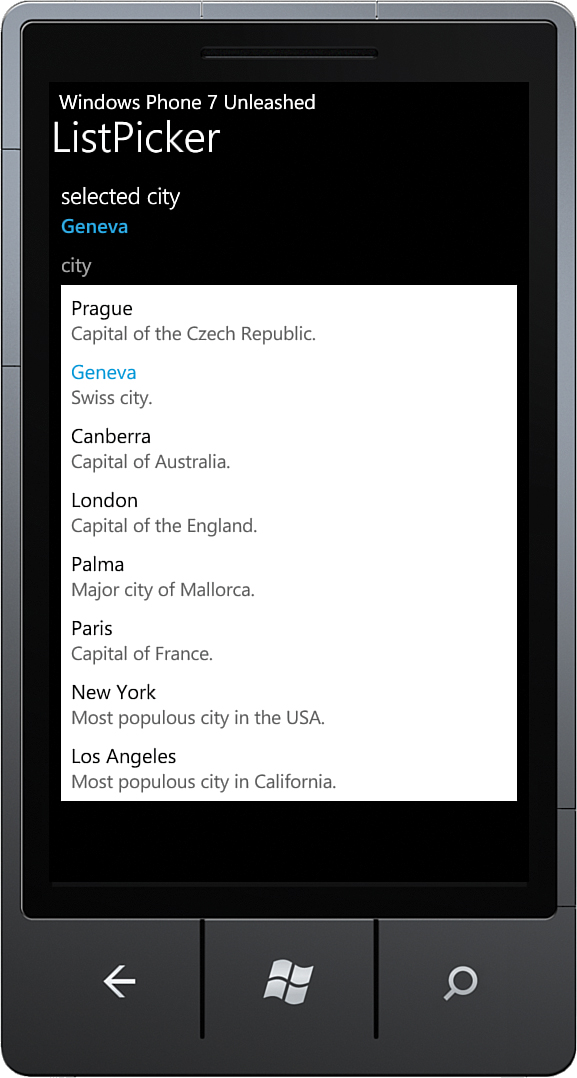
In expanded mode, the ListPicker resizes itself to display all items. This works best when there are only a few items to display. Page content is positioned to accommodate the size of the expanded ListPicker, and then is repositioned when the ListPicker contracts when an item is selected (see Figure 9.1).
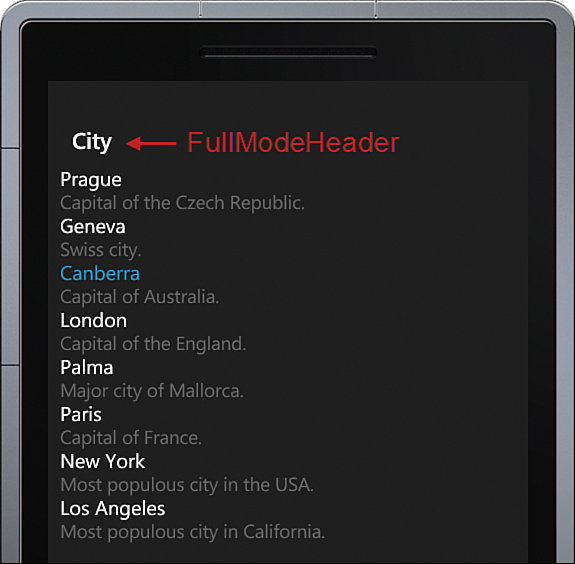
When in full-screen mode, the ListPicker presents options using a pop-up, which hides the rest of the page content. Full-screen mode is appropriate when the number of options to choose from is large (see Figure 9.2).
The ListPicker.ItemCountThreshold property determines the maximum number of items for which expanded mode is used. If the number of items exceeds this value, full-screen mode is used instead of expanded mode. ItemCountThreshold default value is five.
You can determine the current state of a ListPicker via its ListPickerMode property. ListPickerMode may be one of the following values:
 Normal—Only the selected value is visible.
Expanded—The ListPicker is displaying all its items by expanding inline and displacing other page content.
Full—A dedicated pop-up displays all items.
The ListPicker sample uses the MVVM pattern. The ListPickerViewModel creates and exposes a list of City objects, which is then presented using a ListPicker in the view.
The City class has a Name and a Description property (see Listing 9.1).
public class City
{
public string Name { get; private set; }
public string Description { get; private set; }
public City(string name, string description)
{
Name = name;
Description = description;
}
}
The viewmodel creates several City objects as shown:
readonly IEnumerable<City> cities = new List<City>
{
new City("Prague", "Capital of the Czech Republic."),
/* Removed for brevity. */
new City("Los Angeles", "Most populous city in California.")
};
public IEnumerable<City> Cities
{
get
{
return cities;
}
}
The second task of the viewmodel is to keep track of the currently selected City, using a property named City.
The view contains a ListPicker whose ItemsSource property is bound to the viewmodel’s Cities property. In addition, the ListPicker.SelectedItem property uses a two-way data binding to the City property, so that when the user selects an item in the ListPicker, the City property is set to the selected value. See the following excerpt:
<toolkit:ListPicker ItemsSource="{Binding Cities}"
ItemCountThreshold="20"
SelectedItem="{Binding City, Mode=TwoWay}"
Header="city"
FullModeHeader="city">
<toolkit:ListPicker.FullModeItemTemplate>
<DataTemplate>
<StackPanel>
<TextBlock Text="{Binding Name}"
FontSize="{StaticResource PhoneFontSizeNormal}" />
<TextBlock Text="{Binding Description}"
FontSize="{StaticResource PhoneFontSizeSmall}"
Foreground="#ff666666" />
</StackPanel>
</DataTemplate>
</toolkit:ListPicker.FullModeItemTemplate>
<toolkit:ListPicker.ItemTemplate>
<DataTemplate>
<StackPanel>
<TextBlock Text="{Binding Name}"
FontSize="{StaticResource PhoneFontSizeNormal}" />
<TextBlock Text="{Binding Description}"
FontSize="{StaticResource PhoneFontSizeSmall}"
Foreground="#ff666666" />
</StackPanel>
</DataTemplate>
</toolkit:ListPicker.ItemTemplate>
</toolkit:ListPicker>
You see that a custom DataTemplate is defined for both the Expanded and Full ListPickerMode values. If the ListPicker is populated with a list of strings (or objects whose ToString method affords an appropriate representation of the object), providing a custom DataTemplate for each of these modes is in most cases not necessary, because the built-in templates suffice.
The FullModeHeader property defines the content placed at the top of the item list when the ListPickerMode is equal to Full. The FullModeHeader property can be defined not only as a string, but also using a DataTemplate, much like the ItemTemplate and FullModeItemTemplate. The FullModeHeader property is not required (see Figure 9.3).
