
- About This eBook
- Title Page
- Copyright Page
- Contents at a Glance
- Table of Contents
- Preface
- About the Author
- Dedication
- Acknowledgments
- We Want to Hear from You!
- Reader Services
- Part I: Windows Phone App Development Fundamentals
- Chapter 1. Introduction to Windows Phone App Development
- Chapter 2. Fundamental Concepts in Windows Phone Development
- Understanding the Role of XAP Files
- The Windows Phone Capabilities Model
- The Threading Model for XAML-Based Graphics and Animation in Windows Phone
- Understanding the Frame Rate Counter
- The Windows Phone Application Analysis Tool
- Reading Device Information
- Applying the Model-View-ViewModel Pattern to a Windows Phone App
- Property Change Notification
- Using Commands
- Argument Validation
- A Platform-Agnostic Dialog Service
- Consuming Local Web Applications
- Summary
- Chapter 3. Understanding the Application Execution Model
- Chapter 4. Controlling Page Orientation
- Part II: Essential Elements
- Chapter 5. Using Content Controls, Items Controls, and Range Controls
- Chapter 6. Mastering Text Elements and Fonts
- Understanding Text Element Types
- Displaying Text Using the TextBlock
- Controlling Font Properties
- Understanding the Built-In Fonts
- Using Third-Party Fonts via Font Embedding
- Receiving Input Using a TextBox
- Receiving Password Text Using a PasswordBox
- Displaying Rich Content Using a RichTextBox
- Placing Text on the Clipboard
- Summary
- Chapter 7. Employing Media and Web Elements
- Displaying Images with the Image Element
- Providing a Drawing Surface with the InkPresenter Element
- Playing Audio and Video with the MediaElement
- Harnessing the XNA Game Loop Via the GameTimer Class
- Saving Music to the Media Library
- Viewing High-Resolution Images with the MultiScaleImage Element
- Displaying Web Content with the WebBrowser Element
- Summary
- Chapter 8. Taming the Application Bar
- Chapter 9. Enriching the User Experience with the Windows Phone Toolkit Controls
- Getting Started with the Toolkit
- In-Place Selection Using the ListPicker
- Suggesting Text with the AutoCompleteBox
- Displaying a ContextMenu
- Selecting Date and Time Values with the DatePicker and TimePicker
- Providing Custom Looping Lists with the LoopingSelector
- Providing Touch Feedback with the TiltEffect
- Providing a Boolean Option with the ToggleSwitch
- Using Flexible Layouts with the WrapPanel
- Summary
- Chapter 10. Creating Jump Lists with the Long List Selector
- Chapter 11. Creating Expansive and Engaging Apps with the Pivot and Panorama
- Part III: Windows Phone App Development
- Chapter 12. Processing Touch Input
- Chapter 13. Portraying Your App with Live Tiles
- Chapter 14. Leveraging Built-In Apps via Launchers and Choosers
- API Overview
- Choosers and the Application Execution Model
- Launchers and Choosers in Detail
- Retrieve Driving Directions Using the BingMapsDirectionsTask
- Displaying a Location on a Map Using the BingMapsTask
- Navigating to a Connection Setting Page Using the ConnectionSettingsTask
- Selecting an Email Address with the EmailAddressChooserTask
- Preparing an Email with the EmailComposeTask
- Saving a Contact’s Email Using the SaveEmailAddressTask
- Navigating to an App on the Marketplace with the MarketplaceDetailTask
- Launching the Marketplace App with the MarketplaceHubTask
- Allowing the User to Review Your App Using the MarketplaceReviewTask
- Searching the Marketplace with the MarketplaceSearchTask
- Playing a Media File Using the MediaPlayerLauncher
- Placing a Call with the PhoneCallTask
- Selecting a Phone Number with the PhoneNumberChooserTask
- Saving a Contact’s Phone Number with the SavePhoneNumberTask
- Searching the Web with the SearchTask
- Sending Contacts a Link Using the ShareLinkTask
- Posting a Status Update to Social Networks Using the ShareStatusTask
- Preparing an SMS With the SmsComposeTask
- Navigating to a Web Page Using the WebBrowserTask
- Selecting a Contact’s Address Using the AddressChooserTask
- Saving a Contact to the Phone’s Contact List Using the SaveContactTask
- Taking a Photo with the CameraCaptureTask
- Inviting Game Players with the GameInviteTask
- Selecting a Photo from the Photo Hub Using the PhotoChooserTask
- Sharing Images with Other Devices Using NFC or with Other Registered Phone Services
- Creating a Ringtone with an Audio File Using the SaveRingtoneTask
- Contacts and Appointments
- Saving an Appointment Using the SaveAppointmentTask
- Summary
- Chapter 15. Receiving Messages from the Cloud Using Push Notification
- Push Notifications Types
- Benefits of Push Notification
- Understanding Push Notification
- Getting Started with Push Notification
- Subscribing to Push Notification
- Power Management and Push Notification
- Sending Push Notifications
- Toast Notifications
- Tile Notifications
- Raw Notifications
- Identifying Notifications in an HttpWebResponse
- Notification Classes
- Cloud Service Authentication
- Building a Stock Ticker Application
- Summary
- Chapter 16. Sensing Motion and Attitude
- Chapter 17. Building Location Aware Apps
- Chapter 18. Incorporating Map-Based Positioning
- Getting Started with the Map Control
- Overview of the Sample Map View
- Adjusting for Low Light Conditions
- Changing Cartographic Modes
- Panning and Zooming the Map Control
- Adjusting Pitch and Heading
- Location Tracking
- Overlaying Custom Map Content
- Calculating and Displaying a Route
- Modifying Page Elements Using Visual States
- Showing a Location with the Built-In Maps App
- Showing Directions with the Built-In Maps App
- Downloading Maps for Offline Use
- Summary
- Chapter 19. Supporting Multiple Cultures and Languages
- Chapter 20. Extending the Windows Phone Picture Viewer
- Chapter 21. Capturing Images and Video with the Camera
- Chapter 22. Recording Audio with the Microphone
- Chapter 23. Creating Speech Driven Experiences
- User Input with Speech Recognition
- Getting Started with Speech Recognition
- Overview of Recognition Grammars
- Recognizing Speech Using the Dictation and Web Search Grammars
- Recognizing Speech with Phrase List Grammars
- Recognizing Speech with SRGS Grammars
- Speech Recognizer Settings
- Providing a Custom Speech Recognition UI
- Recognizing Speech in Other Languages
- Launching Your App via Voice Commands
- Making the Phone Speak with Text-to-Speech
- Summary
- User Input with Speech Recognition
- Chapter 24. Unit Testing Apps
- Automated Testing
- Introduction to the Windows Phone Unit Test Framework
- Creating a Test Project
- Creating a Test Class
- Tag Expressions
- Metadata and Assertions
- TestClass Attribute
- TestMethod Attribute
- Metadata for Test Initialization and Cleanup
- Miscellaneous Metadata
- WorkItemTest: The Base TestClass Type
- Verifying Conditions with Assertions
- Verifying Collection Conditions with CollectionAssert
- Verifying String Conditions with StringAssert
- Hiding the Expressions Editor
- Testing Multiple Assemblies
- Testing Nonpublic Members
- A Testable Chat Client
- Inversion of Control (IoC)
- Testing Trial Conditions
- Testing with Launchers and Choosers
- Summary
- Chapter 25. Manage Payment Instruments Using Wallet Extensibility
- Part IV: Building Data Driven Apps
- Chapter 26. Validating User Input
- Defining Input Validation
- Input Validation Using Property Setters
- Defining Validation Visual States in Windows Phone
- Asynchronous and Composite Validation
- A Reusable Implementation of the NotifyDataErrorInfo Interface
- Provisioning for Asynchronous or Synchronous Validation
- Asynchronous Validation of All Properties
- An Example of Asynchronous Input Validation
- Detecting a Change of Data Context
- Adding INotifyDataErrorInfo Support to the ValidationSummary Control
- Incorporating Group Validation
- Summary
- Chapter 27. Communicating with Network Services
- Network Service Technologies
- Monitoring Network Connectivity
- Introduction to OData
- Consuming OData
- Using an OData Proxy
- Building an eBay OData Consumer Application
- Fetching Data When the User Scrolls to the End of a List
- Simulating Real-World Conditions with the Simulation Dashboard
- Moderating Data Usage with Data Sense
- Summary
- Chapter 28. Preserving App State and Settings
- Chapter 29. Storing App Data in a Local Database
- SQL Server Compact
- Deployment of Local Databases
- LINQ to SQL on the Phone
- LINQ to SQL Platform Differences
- Getting Started with Local Databases
- Sample Twitter Timeline Viewer
- Using the Column Attribute
- Data Context Change Tracking
- TwitterUser Class
- Multiplicity and the Association Attribute
- Twitter DataContext
- Database Utilities
- Connection Strings
- Leveraging a Custom Twitter Service
- Gathering the User’s Credentials with the Sign-In View
- Viewing Tweets with the Timeline View
- Viewing a Local Database Schema
- Database-First Using SqlMetal
- Deploying a Database to Isolated Storage
- Abstracting the Navigation Service
- Observing LINQ to SQL Queries with a Custom Log
- Updating a Database Schema
- Mapping an Inheritance Hierarchy
- Concurrency
- Summary
- Chapter 30. Auto-Launching with File and Protocol Associations
- Chapter 31. Extending the Search Experience
- Chapter 26. Validating User Input
- Part V: Multitasking
- Chapter 32. Conducting Background Activities with Scheduled Actions
- Chapter 33. Performing Background File Transfers
- Chapter 34. Coordinating Background Audio Playback
- Bibliography
- Index
Receiving Input with Buttons
In most Windows Phone XAML apps, buttons are the most commonly used element for receiving user input. Ordinarily, a button initiates an action when a user taps it. Unlike Silverlight for the browser, the minimum size of the Button has been increased, making it more amenable to touch. The shape is usually rectangular, and the standard layout allows for either text or an image to be displayed as content. Buttons support three visibility states: rest (the default state), pressed, and disabled. Unlike Silverlight for the browser, however, there is no visible focus state.
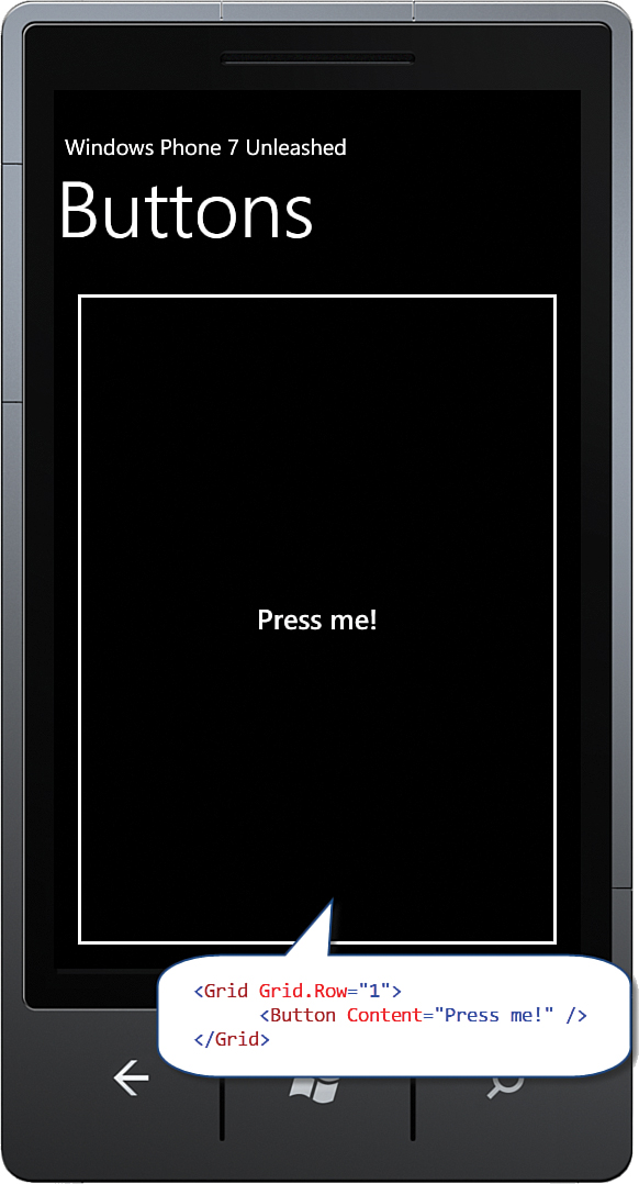
The inherited FrameworkElement.HorizonalAlignment and VerticalAlignment properties both default to Stretch. The Button’s Horizontal and Vertical size, therefore, depends on its parent’s size; the bigger the parent ContentControl the bigger the button. By placing a Button in a Grid, the Button is free to expand to inhabit the entirety of the space provided by the Grid (see Figure 5.4).
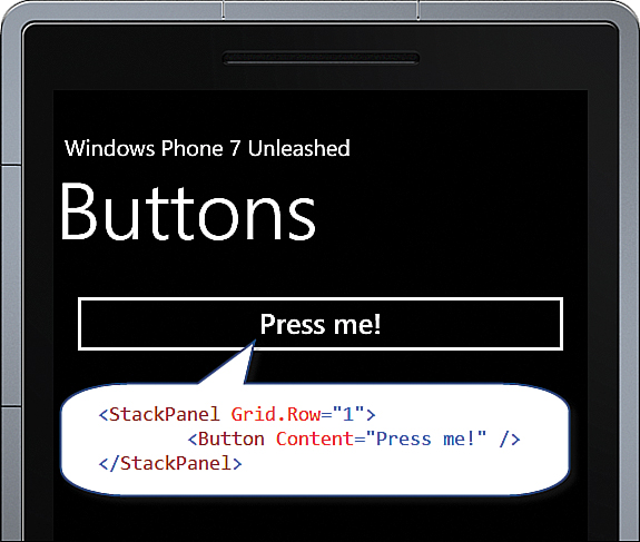
If the parent ContentControl happens to be a StackPanel, the button will not expand farther than the space allowed. By default, the StackPanel arranges its child controls vertically. The StackPanel inhabits the entire width of its parent control, but only uses as much vertical space as it needs (see Figure 5.5).
To constrain the button size to the size of its content, set its HorizontalAlignment and VerticalAlignment properties to something other than Stretch. An effective way to do this is by using a style, as shown in the following example:
<Style x:Key="ButtonStyle" TargetType="ButtonBase">
<Setter Property="HorizontalAlignment" Value="Left" />
<Setter Property="VerticalAlignment" Value="Top" />
</Style>
The style can then be applied like so:
<Button Content="Press me!" Style="{StaticResource ButtonStyle}" />
-
No Comment