
- About This eBook
- Title Page
- Copyright Page
- Contents at a Glance
- Table of Contents
- Preface
- About the Author
- Dedication
- Acknowledgments
- We Want to Hear from You!
- Reader Services
- Part I: Windows Phone App Development Fundamentals
- Chapter 1. Introduction to Windows Phone App Development
- Chapter 2. Fundamental Concepts in Windows Phone Development
- Understanding the Role of XAP Files
- The Windows Phone Capabilities Model
- The Threading Model for XAML-Based Graphics and Animation in Windows Phone
- Understanding the Frame Rate Counter
- The Windows Phone Application Analysis Tool
- Reading Device Information
- Applying the Model-View-ViewModel Pattern to a Windows Phone App
- Property Change Notification
- Using Commands
- Argument Validation
- A Platform-Agnostic Dialog Service
- Consuming Local Web Applications
- Summary
- Chapter 3. Understanding the Application Execution Model
- Chapter 4. Controlling Page Orientation
- Part II: Essential Elements
- Chapter 5. Using Content Controls, Items Controls, and Range Controls
- Chapter 6. Mastering Text Elements and Fonts
- Understanding Text Element Types
- Displaying Text Using the TextBlock
- Controlling Font Properties
- Understanding the Built-In Fonts
- Using Third-Party Fonts via Font Embedding
- Receiving Input Using a TextBox
- Receiving Password Text Using a PasswordBox
- Displaying Rich Content Using a RichTextBox
- Placing Text on the Clipboard
- Summary
- Chapter 7. Employing Media and Web Elements
- Displaying Images with the Image Element
- Providing a Drawing Surface with the InkPresenter Element
- Playing Audio and Video with the MediaElement
- Harnessing the XNA Game Loop Via the GameTimer Class
- Saving Music to the Media Library
- Viewing High-Resolution Images with the MultiScaleImage Element
- Displaying Web Content with the WebBrowser Element
- Summary
- Chapter 8. Taming the Application Bar
- Chapter 9. Enriching the User Experience with the Windows Phone Toolkit Controls
- Getting Started with the Toolkit
- In-Place Selection Using the ListPicker
- Suggesting Text with the AutoCompleteBox
- Displaying a ContextMenu
- Selecting Date and Time Values with the DatePicker and TimePicker
- Providing Custom Looping Lists with the LoopingSelector
- Providing Touch Feedback with the TiltEffect
- Providing a Boolean Option with the ToggleSwitch
- Using Flexible Layouts with the WrapPanel
- Summary
- Chapter 10. Creating Jump Lists with the Long List Selector
- Chapter 11. Creating Expansive and Engaging Apps with the Pivot and Panorama
- Part III: Windows Phone App Development
- Chapter 12. Processing Touch Input
- Chapter 13. Portraying Your App with Live Tiles
- Chapter 14. Leveraging Built-In Apps via Launchers and Choosers
- API Overview
- Choosers and the Application Execution Model
- Launchers and Choosers in Detail
- Retrieve Driving Directions Using the BingMapsDirectionsTask
- Displaying a Location on a Map Using the BingMapsTask
- Navigating to a Connection Setting Page Using the ConnectionSettingsTask
- Selecting an Email Address with the EmailAddressChooserTask
- Preparing an Email with the EmailComposeTask
- Saving a Contact’s Email Using the SaveEmailAddressTask
- Navigating to an App on the Marketplace with the MarketplaceDetailTask
- Launching the Marketplace App with the MarketplaceHubTask
- Allowing the User to Review Your App Using the MarketplaceReviewTask
- Searching the Marketplace with the MarketplaceSearchTask
- Playing a Media File Using the MediaPlayerLauncher
- Placing a Call with the PhoneCallTask
- Selecting a Phone Number with the PhoneNumberChooserTask
- Saving a Contact’s Phone Number with the SavePhoneNumberTask
- Searching the Web with the SearchTask
- Sending Contacts a Link Using the ShareLinkTask
- Posting a Status Update to Social Networks Using the ShareStatusTask
- Preparing an SMS With the SmsComposeTask
- Navigating to a Web Page Using the WebBrowserTask
- Selecting a Contact’s Address Using the AddressChooserTask
- Saving a Contact to the Phone’s Contact List Using the SaveContactTask
- Taking a Photo with the CameraCaptureTask
- Inviting Game Players with the GameInviteTask
- Selecting a Photo from the Photo Hub Using the PhotoChooserTask
- Sharing Images with Other Devices Using NFC or with Other Registered Phone Services
- Creating a Ringtone with an Audio File Using the SaveRingtoneTask
- Contacts and Appointments
- Saving an Appointment Using the SaveAppointmentTask
- Summary
- Chapter 15. Receiving Messages from the Cloud Using Push Notification
- Push Notifications Types
- Benefits of Push Notification
- Understanding Push Notification
- Getting Started with Push Notification
- Subscribing to Push Notification
- Power Management and Push Notification
- Sending Push Notifications
- Toast Notifications
- Tile Notifications
- Raw Notifications
- Identifying Notifications in an HttpWebResponse
- Notification Classes
- Cloud Service Authentication
- Building a Stock Ticker Application
- Summary
- Chapter 16. Sensing Motion and Attitude
- Chapter 17. Building Location Aware Apps
- Chapter 18. Incorporating Map-Based Positioning
- Getting Started with the Map Control
- Overview of the Sample Map View
- Adjusting for Low Light Conditions
- Changing Cartographic Modes
- Panning and Zooming the Map Control
- Adjusting Pitch and Heading
- Location Tracking
- Overlaying Custom Map Content
- Calculating and Displaying a Route
- Modifying Page Elements Using Visual States
- Showing a Location with the Built-In Maps App
- Showing Directions with the Built-In Maps App
- Downloading Maps for Offline Use
- Summary
- Chapter 19. Supporting Multiple Cultures and Languages
- Chapter 20. Extending the Windows Phone Picture Viewer
- Chapter 21. Capturing Images and Video with the Camera
- Chapter 22. Recording Audio with the Microphone
- Chapter 23. Creating Speech Driven Experiences
- User Input with Speech Recognition
- Getting Started with Speech Recognition
- Overview of Recognition Grammars
- Recognizing Speech Using the Dictation and Web Search Grammars
- Recognizing Speech with Phrase List Grammars
- Recognizing Speech with SRGS Grammars
- Speech Recognizer Settings
- Providing a Custom Speech Recognition UI
- Recognizing Speech in Other Languages
- Launching Your App via Voice Commands
- Making the Phone Speak with Text-to-Speech
- Summary
- User Input with Speech Recognition
- Chapter 24. Unit Testing Apps
- Automated Testing
- Introduction to the Windows Phone Unit Test Framework
- Creating a Test Project
- Creating a Test Class
- Tag Expressions
- Metadata and Assertions
- TestClass Attribute
- TestMethod Attribute
- Metadata for Test Initialization and Cleanup
- Miscellaneous Metadata
- WorkItemTest: The Base TestClass Type
- Verifying Conditions with Assertions
- Verifying Collection Conditions with CollectionAssert
- Verifying String Conditions with StringAssert
- Hiding the Expressions Editor
- Testing Multiple Assemblies
- Testing Nonpublic Members
- A Testable Chat Client
- Inversion of Control (IoC)
- Testing Trial Conditions
- Testing with Launchers and Choosers
- Summary
- Chapter 25. Manage Payment Instruments Using Wallet Extensibility
- Part IV: Building Data Driven Apps
- Chapter 26. Validating User Input
- Defining Input Validation
- Input Validation Using Property Setters
- Defining Validation Visual States in Windows Phone
- Asynchronous and Composite Validation
- A Reusable Implementation of the NotifyDataErrorInfo Interface
- Provisioning for Asynchronous or Synchronous Validation
- Asynchronous Validation of All Properties
- An Example of Asynchronous Input Validation
- Detecting a Change of Data Context
- Adding INotifyDataErrorInfo Support to the ValidationSummary Control
- Incorporating Group Validation
- Summary
- Chapter 27. Communicating with Network Services
- Network Service Technologies
- Monitoring Network Connectivity
- Introduction to OData
- Consuming OData
- Using an OData Proxy
- Building an eBay OData Consumer Application
- Fetching Data When the User Scrolls to the End of a List
- Simulating Real-World Conditions with the Simulation Dashboard
- Moderating Data Usage with Data Sense
- Summary
- Chapter 28. Preserving App State and Settings
- Chapter 29. Storing App Data in a Local Database
- SQL Server Compact
- Deployment of Local Databases
- LINQ to SQL on the Phone
- LINQ to SQL Platform Differences
- Getting Started with Local Databases
- Sample Twitter Timeline Viewer
- Using the Column Attribute
- Data Context Change Tracking
- TwitterUser Class
- Multiplicity and the Association Attribute
- Twitter DataContext
- Database Utilities
- Connection Strings
- Leveraging a Custom Twitter Service
- Gathering the User’s Credentials with the Sign-In View
- Viewing Tweets with the Timeline View
- Viewing a Local Database Schema
- Database-First Using SqlMetal
- Deploying a Database to Isolated Storage
- Abstracting the Navigation Service
- Observing LINQ to SQL Queries with a Custom Log
- Updating a Database Schema
- Mapping an Inheritance Hierarchy
- Concurrency
- Summary
- Chapter 30. Auto-Launching with File and Protocol Associations
- Chapter 31. Extending the Search Experience
- Chapter 26. Validating User Input
- Part V: Multitasking
- Chapter 32. Conducting Background Activities with Scheduled Actions
- Chapter 33. Performing Background File Transfers
- Chapter 34. Coordinating Background Audio Playback
- Bibliography
- Index
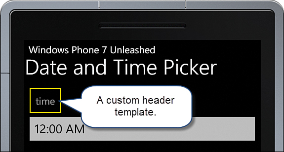
Adding a Control Header
,Many of the Toolkit controls allow you to customize the title text displayed above the control using a Header property. In addition, the HeaderTemplate property allows you to customize how the Header content is displayed. The following example provides a custom header template for a TimePicker:
<toolkit:TimePicker Value="{Binding Time, Mode=TwoWay}"
Header="time">
<toolkit:TimePicker.HeaderTemplate>
<DataTemplate>
<Border BorderThickness="2" BorderBrush="Yellow" Padding="10">
<TextBlock Text="{Binding}" />
</Border>
</DataTemplate>
</toolkit:TimePicker.HeaderTemplate>
</toolkit:TimePicker>
The DataTemplate places the Header text in a TextBlock, which is wrapped in a yellow border (see Figure 9.17).
-
No Comment